15 Gorgeous Front Door Colors for Cream House
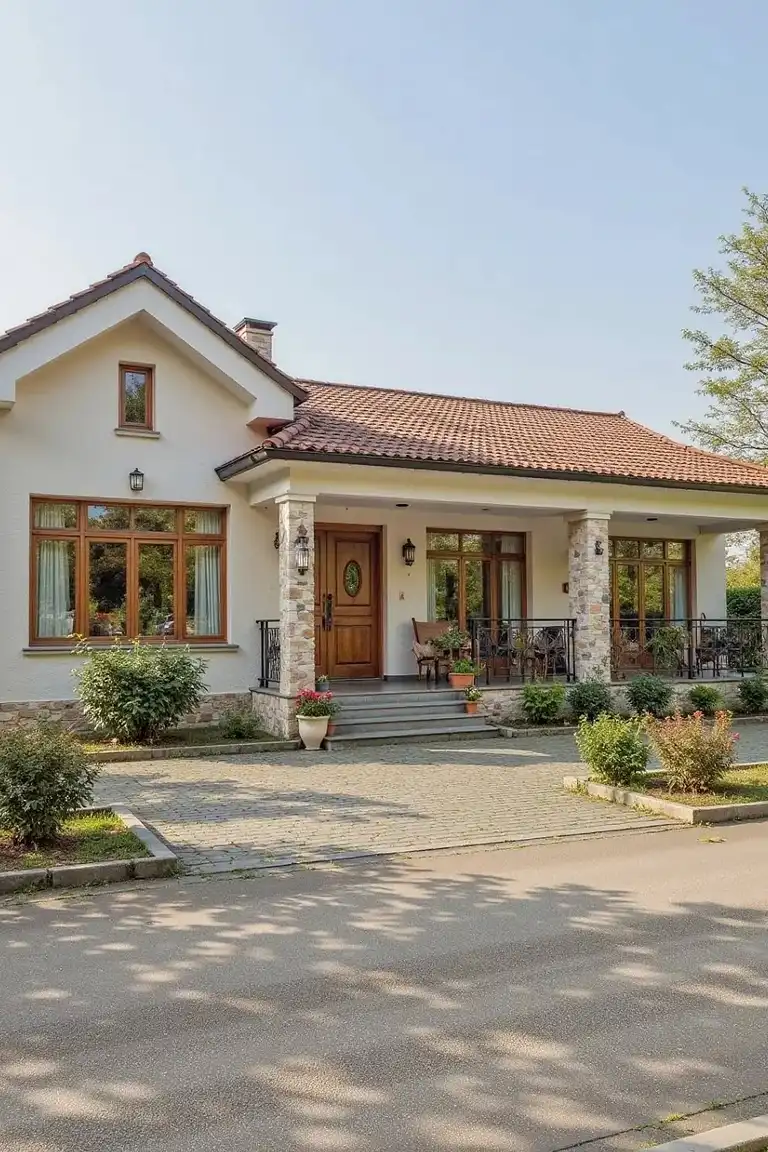
Stand on the sidewalk and look at a cream house. The walls are soft, the trim is quiet, and the whole place feels polite. Then your eyes land on the front door, and that one patch of color decides what you remember. A black door makes the house feel grand after dark.
A sage door makes it feel like a garden. A pink door makes you smile before you even knock. That is the power of a single coat of paint.
You do not need new siding, a new roof, or a full exterior makeover to change how your home feels from the street. These front door colors for cream house each bring a different mood, and the right one depends on your light, your garden, and the way you want your home to greet people. Walk through the fifteen below, notice which ones make you pause, and test your favorite on the real door before you buy a full can.
1. Classic Black
Source: Instagram
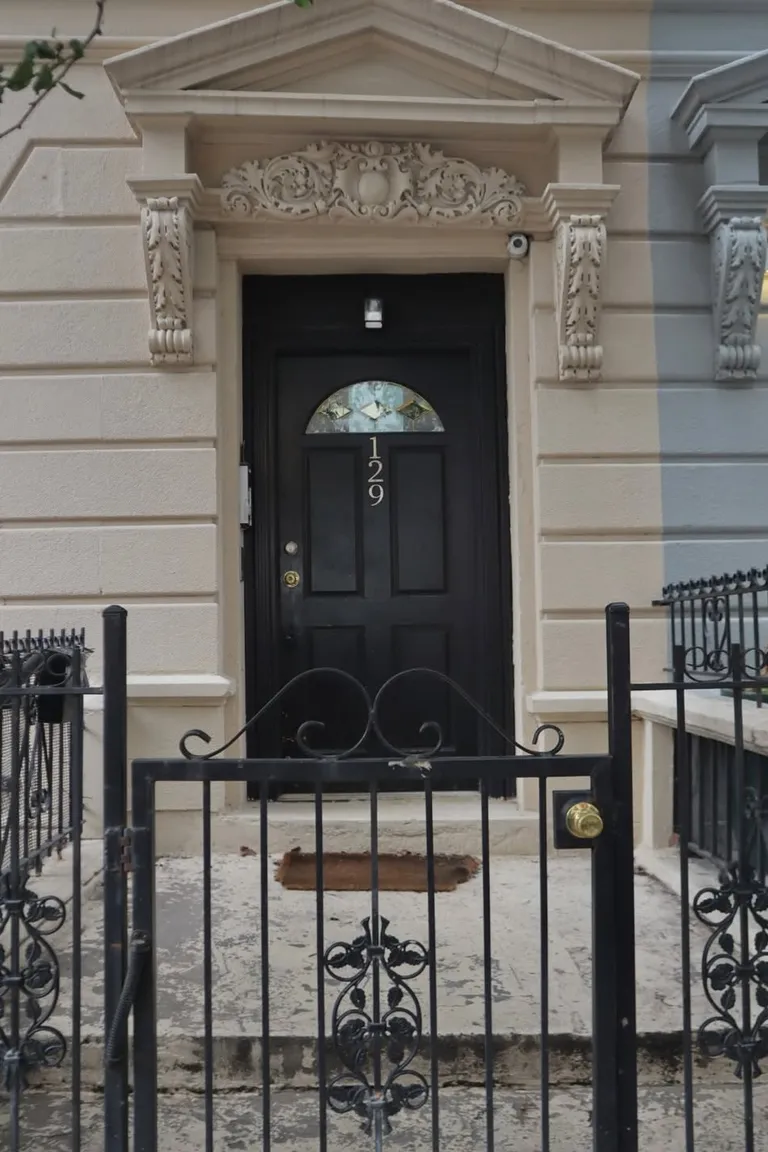
Wait until evening to judge a black door. In daylight it is dark, but once the porch light clicks on, the door turns into a frame for everything bright around it. House numbers glow against it. Guests find the entrance without thinking, because the dark shape pulls the eye straight to the lit doorway.
Shadows from porch posts fall across it and make the entrance feel deeper. On a cream house exterior, that contrast is the trick. The walls stay pale and gentle while the door holds the night. Come home after dark and you will see it at its best.
2. Deep Navy Blue
Source: Instagram
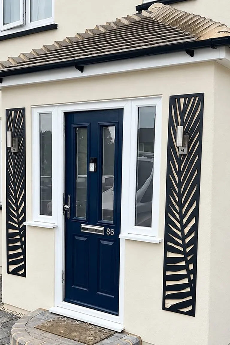
Black feels final. Navy feels like a decision. Both are dark, but navy keeps a thread of blue that shows itself when light hits the panels, and that thread changes the whole mood. Black can make an entrance feel formal and closed. Navy feels deep without feeling stern, so guests relax a little sooner.
If your house already has dark shutters or a dark roof, black may simply repeat what is there. Navy adds something new while staying quiet. Among front door ideas, this is the one for people torn between bold and safe. Stand back at dusk and watch which dark you keep looking at.
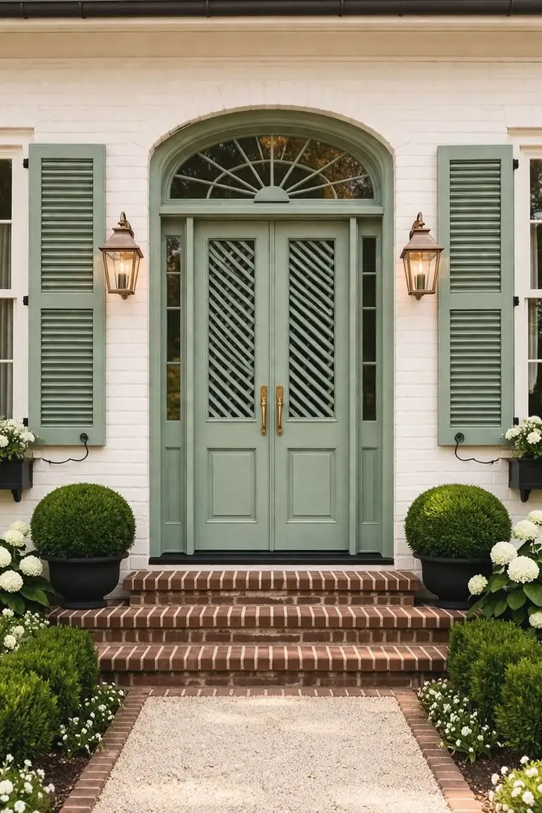
3. Sage Green
Source: Instagram
Plant the garden first, then match the door to it. Sage only works when green already lives around the entrance, so start with what grows beside the steps. Lavender lines the path in summer and smells sweet when you brush past it. Roses climb the wall and throw color against the cream siding.
An olive tree in a pot gives the entry a slow, old world calm. In spring the garden is pale and fresh, in summer it is full and humming, and by autumn the sage door ties the fading leaves together. Without planting, sage fades into nothing. With it, the door looks like it grew there.
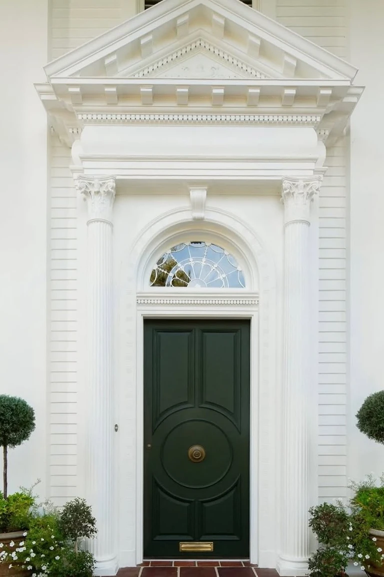
4. Forest Green
Source: Instagram
Some doors look like they have always been there. Forest green is that kind of color, deep and steady, the shade of an entry that has welcomed people for decades. It does not chase attention. It holds its ground while seasons pass around it.
A pair of evergreen pots by the steps is all the support it needs, green echoing green through winter and summer alike. The door stays the same while flowers come and go, and that constancy is the point. Years from now it will look no older than it does today, because it was never trying to be new.
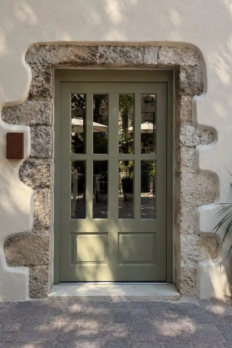
5. Olive Green
Source: Instagram
Olive belongs to hot afternoons. It is the color of shade under an olive tree, of dry hills and warm stone, and it brings that heat with it to a cream facade. Around it, terracotta pots turn the same sun baked orange as the soil, and pale stone paths stay cool underfoot. The whole entry feels like a place to sit out the middle of the day with a cold drink.
Olive never looks cold or crisp. It looks lived with, sun touched, and easy. Among front door paint colors, it is the one that makes a house feel warmer before you even step inside.
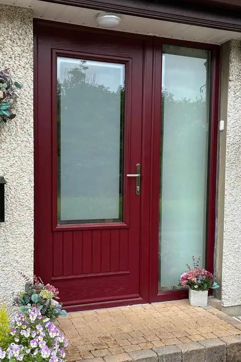
6. Burgundy
Source: Instagram
For years the house on the corner was the one nobody described. Cream walls, white trim, a tidy garden, and a door nobody remembered. Then one spring the owners painted it burgundy, and suddenly the whole street had something to say. Neighbors stopped to ask about the color.
The entrance looked warm in the evening and rich in the morning, and the house finally seemed finished, as if it had been waiting for that one bold note. Nothing else changed. No new plants, no new porch, no new roof. One door, one deep red, and a forgettable facade turned into a home people point to.
welcome.
7. Brick Red
Source: Instagram
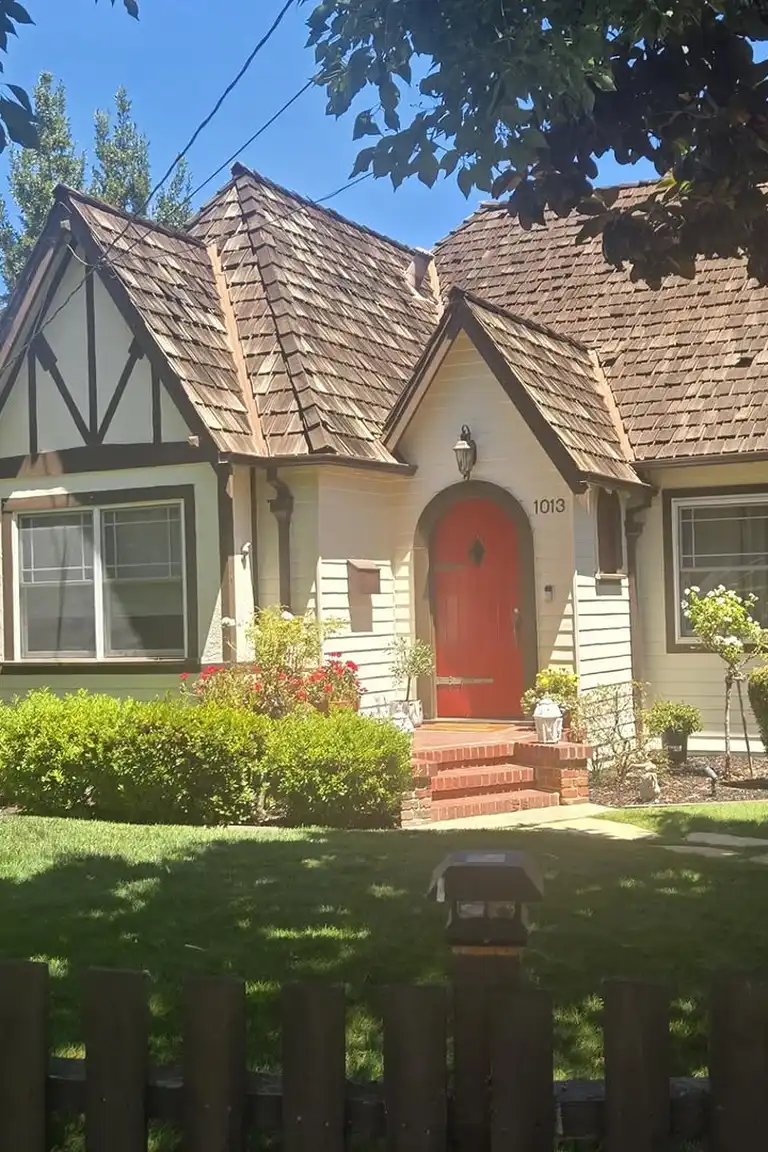
Listen to what the house already says. A brick path runs to the steps, a chimney stands in the same red, and maybe a low brick wall edges the garden. A brick red door simply answers those notes instead of introducing a new one. It makes the whole front feel connected, as if the door were cut from the same clay as the path under your feet.
That is why it adds curb appeal without effort. The eye travels from path to door without a jolt, and the entrance feels settled and sure. When a house already speaks brick, the wisest door is the one that speaks back.
8. Muted Teal
Source: Instagram
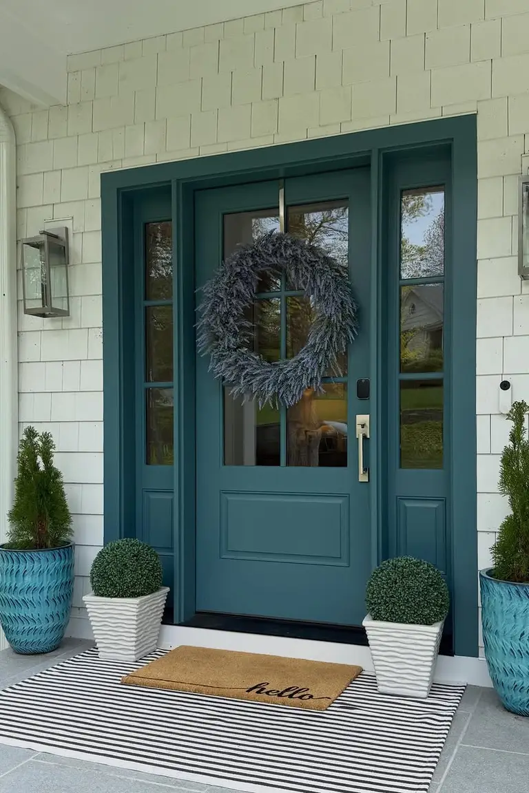
Morning is the first test. Early light catches a muted teal door and turns it fresh and blue green, the color of shallow water. By afternoon the sun warms it, and the green in it steps forward, softer and quieter than it looked at breakfast. Then evening shade settles over the porch, and the door deepens into something calm and coastal, almost gray in the last light.
That slow change is the whole reason to choose teal. It never sits still. It moves with the day, and every hour gives you a slightly different door to come home to.
9. Dusty Blue
Source: Instagram
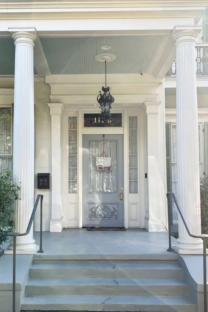
This is the door you paint when you want afternoons to slow down. Dusty blue does not announce itself. It sits soft against cream, like a favorite shirt faded by many summers, and invites you to linger on the porch a little longer. White flowers in a pot, a rocking chair, a glass of something cold, and the whole entry feels unhurried.
There is no drama here, and that is the charm. The house looks kind. The street looks calmer. And coming home feels less like arriving somewhere and more like settling into a place that already missed you.
10. Charcoal Gray
Source: Instagram
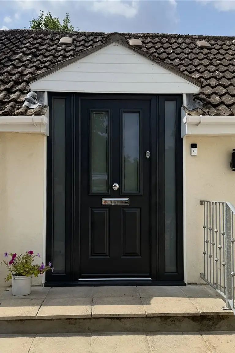
Charcoal does not try to impress anyone. It stands back, keeps its lines clean, and lets the shape of the door do the talking. No bright trim fighting for attention, no busy planting crowding the steps, just one dark plane broken by a straight handle and the shadow it casts. That restraint is what makes it modern.
The house looks considered rather than decorated, as if every element earned its place. On cream walls, charcoal reads like a pencil line around a sketch, defining the entrance without filling it in. Less, here, is genuinely more.
11. Warm Taupe
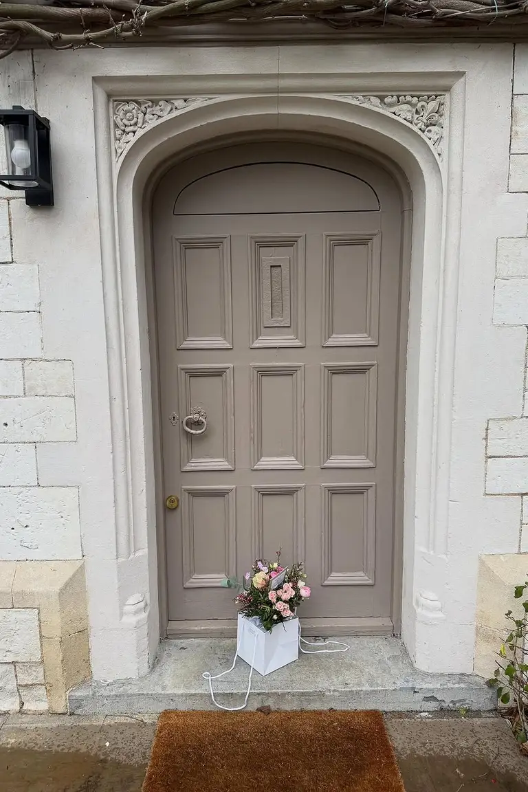
Source: Instagram
Taupe is the door you barely notice, and that is exactly the point. A brown gray that settles against cream without asking for a second glance. Guests walk up, knock, and step inside without ever thinking about the color, and nobody minds. The entrance feels calm and grown up, with nothing shouting and nothing clashing.
Taupe suits people who want their home to feel easy rather than showy, a place where the welcome is warm but quiet. It will never be the star of the street. It will simply never look wrong.
12. Chocolate Brown
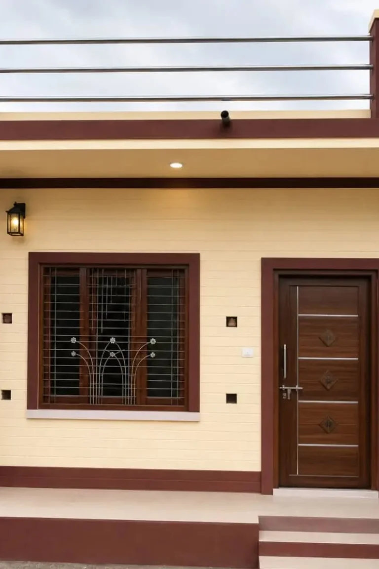
Source: Instagram
Run your hand along the panels before you paint them. A chocolate brown door rewards that kind of attention, because its richness lives in the wood itself, in deep grain, solid rails, and joints that were made to last. This is the door for people who love craft, who notice a well fitted frame and a handle that sits right in the palm.
Dark stain lets the timber show through, so the entry feels built rather than coated. In exterior color combinations that lean on stone, timber, and brick, chocolate brown is the anchor, grounding the whole front with quiet weight and honest work.
13. Terracotta
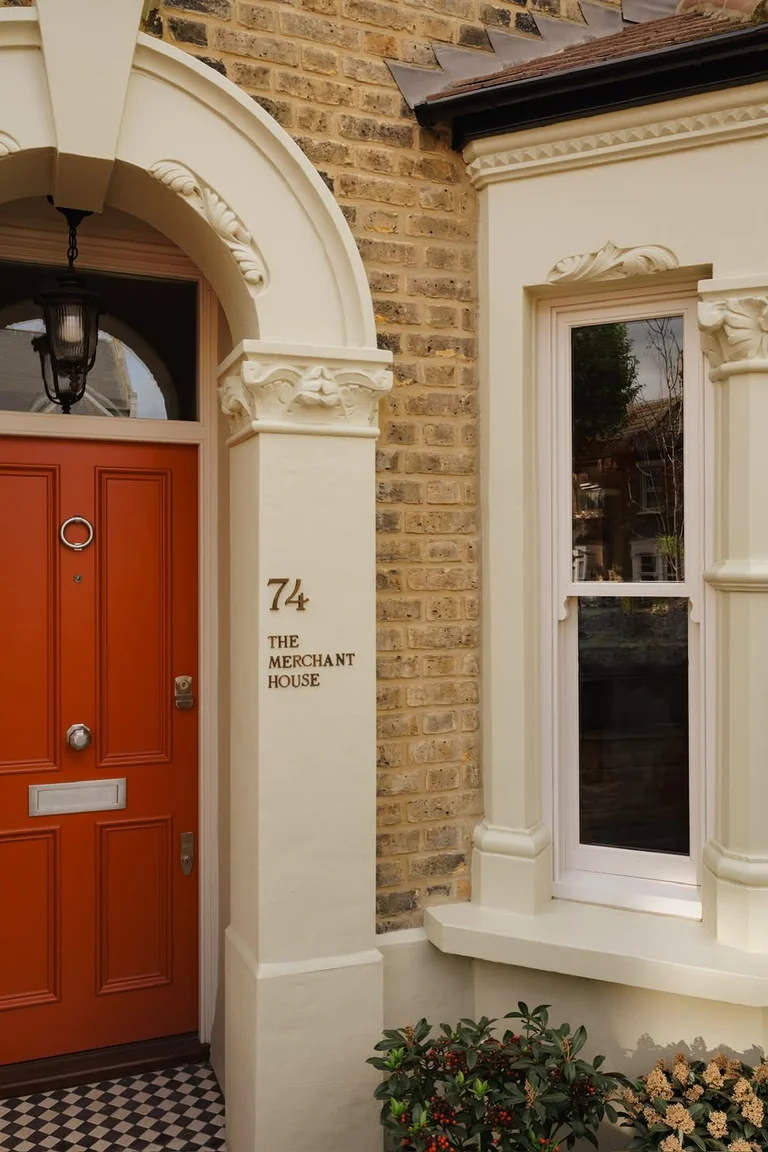
Source: Instagram
Terracotta needs heat to make sense. It is the color of clay baked hard in the sun, and on a cream house it brings that warmth straight to the entrance. Think of a courtyard at noon, pots glowing orange, stone warm under bare feet, and a door the color of the earth itself. That is the feeling terracotta gives, even on an ordinary street.
It never looks cool or formal. It looks sun touched and generous, like a house that keeps its doors open and its table full. In hot climates it belongs completely. Anywhere else, it borrows a little of that sun and brings it home.
14. Dusty Pink
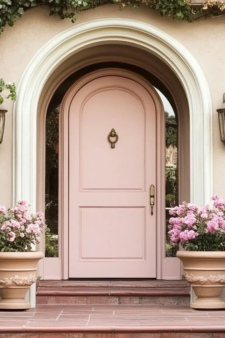
Source: Instagram
Pink is the door you choose for yourself, not for the street. Dusty pink does not shout, but it does say something: this house belongs to someone with taste and a sense of fun. Neighbors may raise an eyebrow at first, then find themselves smiling every time they pass.
The color is soft enough to sit happily beside cream, yet unusual enough that no two visitors describe the house the same way. It turns a plain facade into a small signature. If every other door on the road plays it safe, pink is how you sign your name.
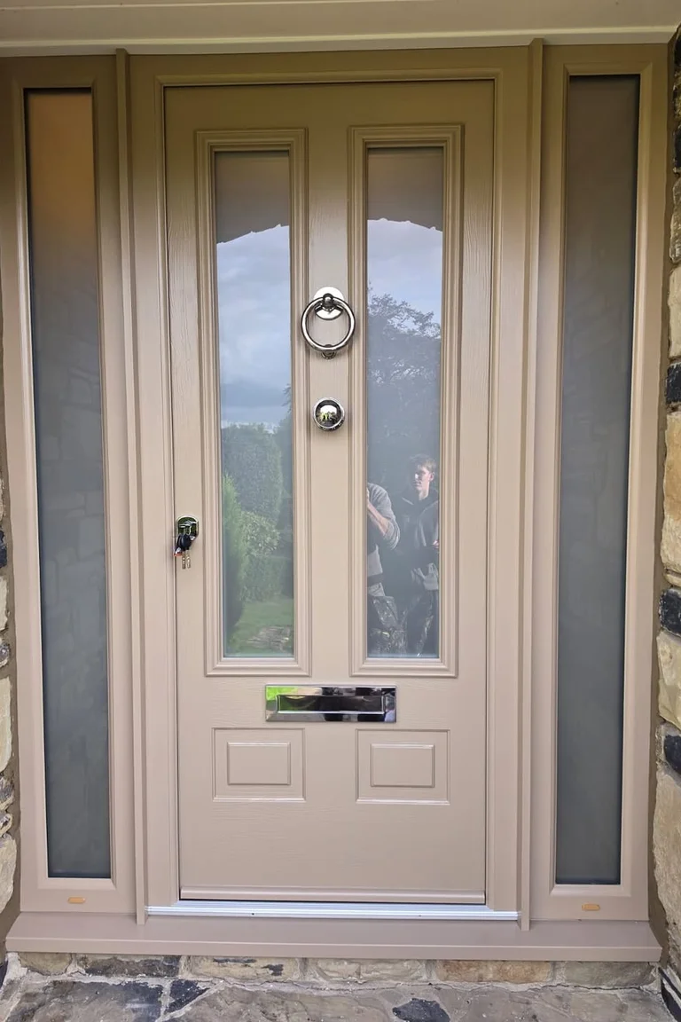
15. Soft Greige
Source: Instagram
Greige refuses to pick a side. It lives between gray and beige, and that in-between quality is both its charm and its puzzle. In bright sun it leans gray and cool, while in evening shade it warms toward beige, so the same door can look like two different choices in one day. That makes it the color for people who cannot decide, and honestly, that is most of us.
In house exterior color schemes that mix stone, timber, and pale walls, greige ties the pieces together without taking over. Stop trying to name it. Live with it a few days, and let the light decide for you.
| Light | How greige looks |
|---|---|
| Bright sun | Leans gray and cool |
| Evening shade | Warms toward beige |
Final Thoughts
Choosing comes down to four honest checks. First, look at your cream in daylight and notice whether it leans yellow or gray. Second, think about your house style and the mood you want visitors to feel. Third, look at the roof, garden, and walls already in place, and pick a door that talks to them.
Fourth, trust your own taste, because you will see this door every single day. These front door colors for cream house are starting points, not rules. Paint two samples on the real door, live with them for a few days, and save this list to your home decor board on Pinterest before you pick.