20 Kitchen Wall Colors That Bring Personality to Your Cooking Space
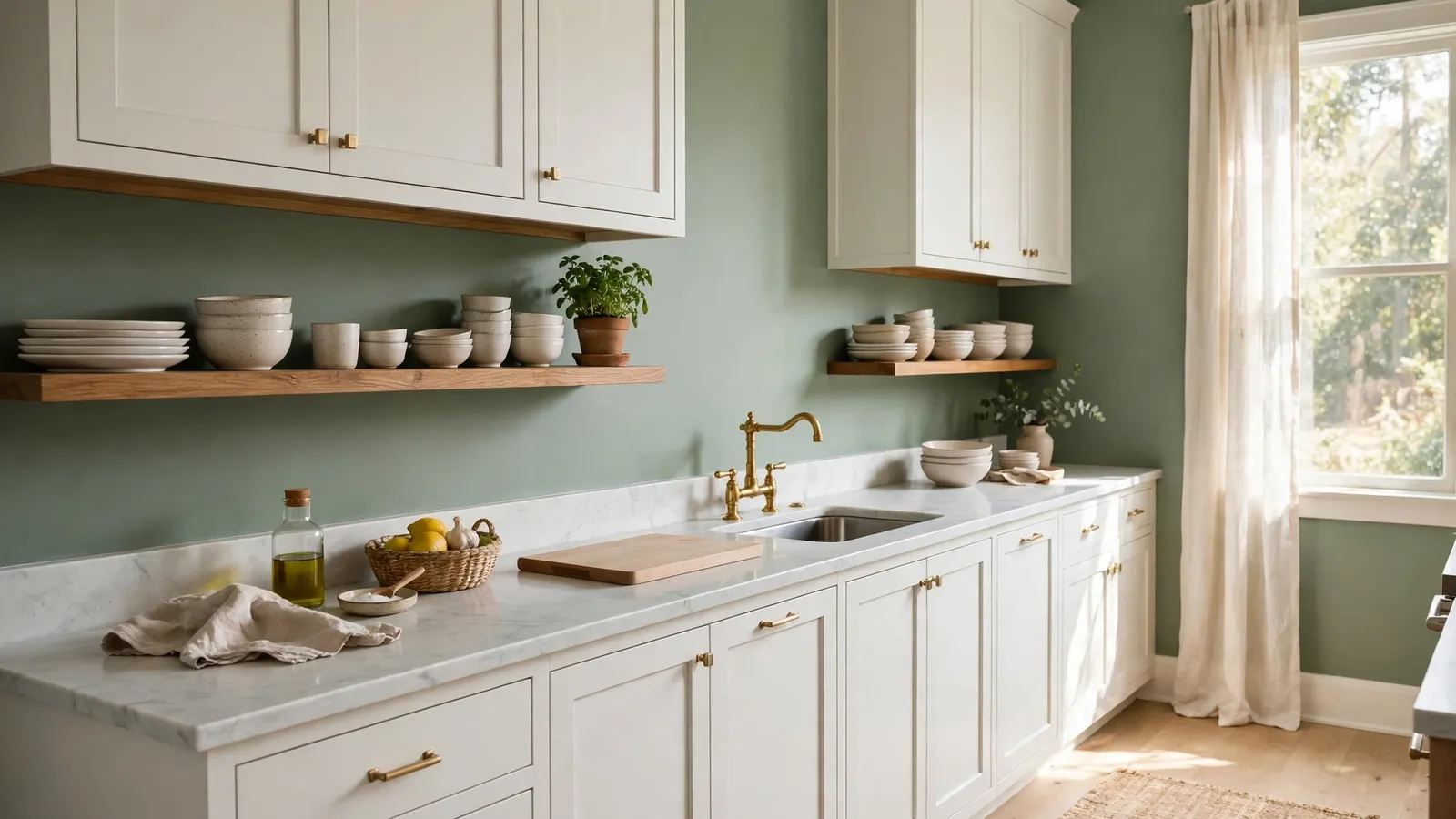
Cabinets take months to change and cost real money. Wall color takes a weekend and a few cans of paint, which makes it the cheapest personality a kitchen can get. The right shade can warm up cold white cabinets, calm down busy countertops, or give plain wood units a designed backdrop they never had. The wrong one fights everything in the room at once.
These kitchen wall color ideas run from soft neutrals to deep, moody shades, with pairing notes for cabinets, counters, backsplashes, and floors under each one. If you want full room palettes instead of single walls, these kitchen color schemes build on the same colors. Start with the light your kitchen actually gets, then pick your shade.
1. Sage Green Walls for a Calm, Earthy Kitchen
Source: Instagram
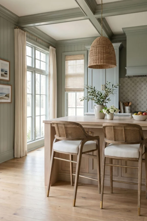
Sage green is the color that made plain kitchens feel designed again. The gray in it keeps it calm, the green keeps it alive, and it flatters the materials most kitchens already have: white and wood cabinets, marble and butcher block counters, and warm metal hardware.
Sage suits farmhouse, rustic, and modern rooms because it reads as a neutral with a point of view. In a bright room it looks fresh and pale; in a low light room it deepens, so pick a lighter sage if your kitchen faces north. Pair it with cream tiles or a white backsplash to keep the softness.
2. Navy Blue Walls for Bold Contrast
Source: Instagram
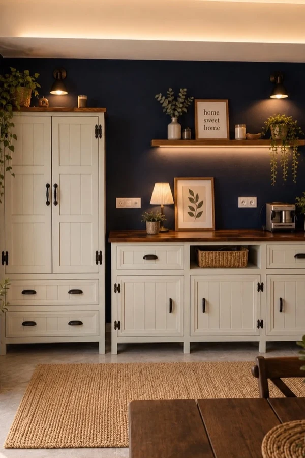
Navy blue walls give a kitchen instant depth, and they earn their keep by making white and light wood cabinets look crisp and expensive beside them. Navy is a cool color, so it balances warm rooms and south facing light well, and it hides the small marks that busy kitchens collect.
Keep counters and backsplash light, white quartz and pale tile are the classic partners, so the room reads bold rather than dark. Brass and gold hardware glow against navy; chrome can look cold. On wood floors, navy pulls out the warm tones and the whole room feels richer.
3. Warm White Walls That Never Feel Cold
Source: Instagram
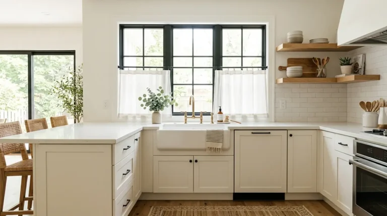
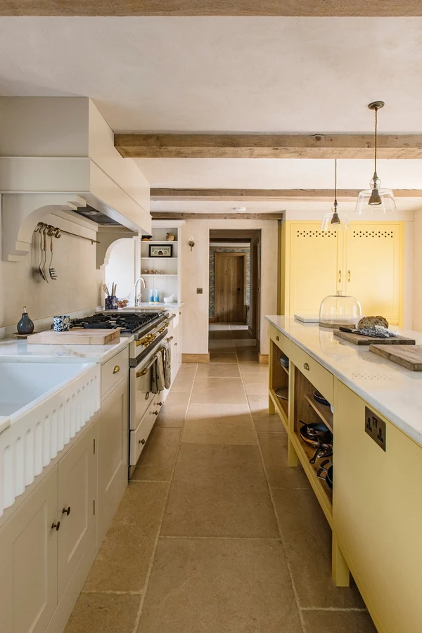
Warm white is the quiet classic: it brightens any kitchen, suits every cabinet color ever made, and never goes out of style. The trick is the warm part. Pure bright whites can look blue and chilly beside wood or cream cabinets, while a white with a drop of cream or beige in it glows in both daylight and evening light.
Warm white is the safest wall for renters and for kitchens with mixed finishes, since it lets counters and backsplash be the pattern. Test two whites side by side; against your cabinets, the right one will look clean and the wrong one will look dirty.
4. Terracotta Walls for Warmth and Appetite
Source: Instagram
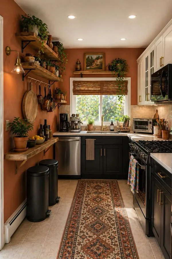
Terracotta brings the colors of clay, brick, and late afternoon sun into the kitchen, and few shades feel as welcoming around food and people. It pairs naturally with wood cabinets of almost any tone, cream and travertine counters, and handmade style tiles in the backsplash.
Terracotta suits rustic, Mediterranean, and farmhouse kitchens most, and it warms north facing rooms that never get direct sun. Keep floors lighter than the walls or choose a pale terracotta, since the color is strong. Black hardware and dark metal lights give it a modern edge; brass keeps it soft.
5. Olive Green Walls With a Grounded Feel
Source: Instagram
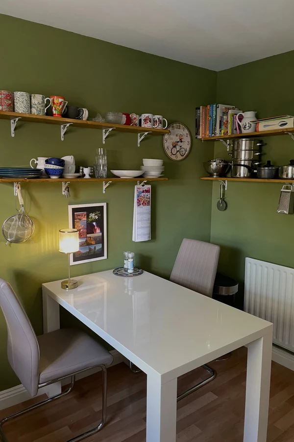
Olive green is sage’s deeper, warmer cousin, a yellow based green that feels grounded and a little old world. It loves medium and dark wood cabinets, stone counters with warm veining, and backsplashes in cream, zellige style tile, or aged brick.
Olive suits traditional, rustic, and contemporary kitchens that want color without brightness. Because it is a mid to deep tone, it works best in kitchens with decent daylight or good layered lighting. Brass, bronze, and black hardware all sit well on olive; keep chrome away, since its cool shine fights the warmth.
6. Charcoal Gray Walls for a Modern Edge
Source: Instagram
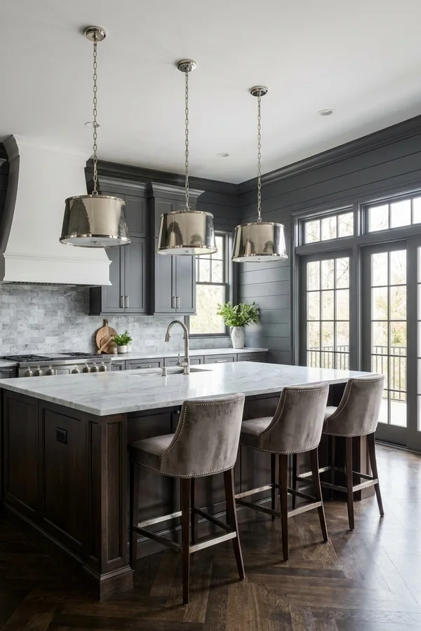
Charcoal gray walls give a kitchen a tailored, modern edge without the full commitment of black. The depth makes light cabinets, white counters, and stainless appliances look sharp, and it turns open shelves and brass rails into highlights.
Charcoal suits contemporary and modern farmhouse kitchens, and it is kind to busy rooms because it quiets patterned floors and busy backsplashes by contrast. It does drink light, so plan on good under cabinet lighting and keep the ceiling white. On the wall behind glass front cabinets or shelves, charcoal makes dishes and glassware read like a display.
7. Dusty Blue Walls for a Soft Coastal Feel
Source: Instagram
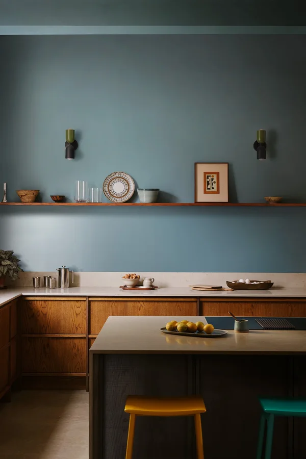
Dusty blue is a gray softened blue that feels calm, clean, and a little coastal without any beach theme. It pairs well with white and pale gray cabinets, marble and light quartz counters, and simple subway tile, and it cools down kitchens that get strong warm sun.
Dusty blue suits traditional, farmhouse, and transitional rooms, and it is gentle enough for small kitchens that cannot carry a dark shade. Silver, chrome, and brushed nickel hardware match its cool tone; white ceramics and blue patterned tiles layer in easily. On wood floors, choose mid tones, since very dark floors can make dusty blue look washed out.
8. Butter Yellow Walls for a Cheerful Morning Kitchen
Source: Instagram
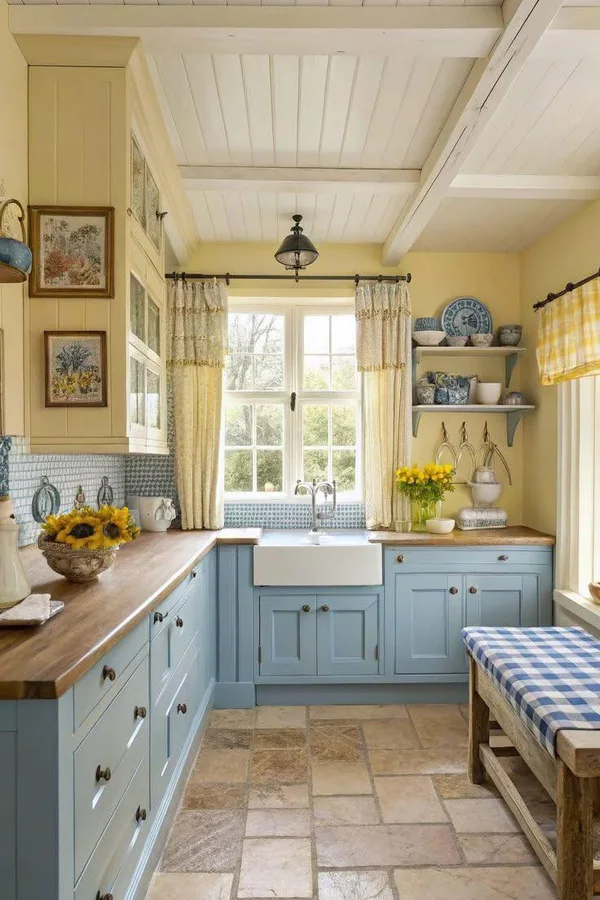
Butter yellow is sunlight you can paint. A soft, creamy yellow lifts dark corners, flatters white and cream cabinets, and makes breakfast feel like an event in rooms that face away from the sun. Keep the yellow buttery rather than bright; strong yellows shout in daylight and tire the eye.
Butter yellow suits farmhouse, cottage, and traditional kitchens, and it pairs with white counters, pale wood, and simple tile so the wall stays the cheerful note. Blue and white ceramics are its classic partner, a small nod to country kitchens that never dates.
9. Soft Beige Walls That Work With Everything
Source: Instagram
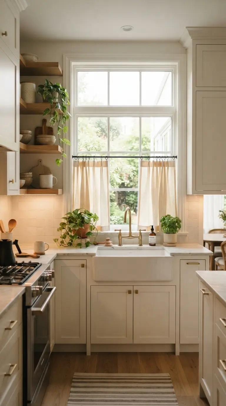
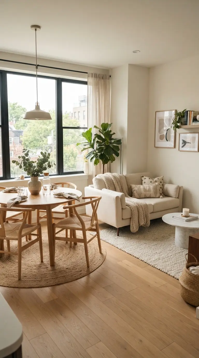
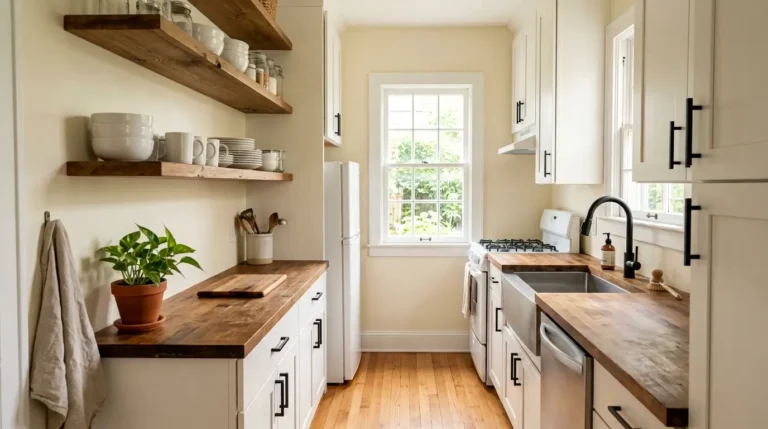
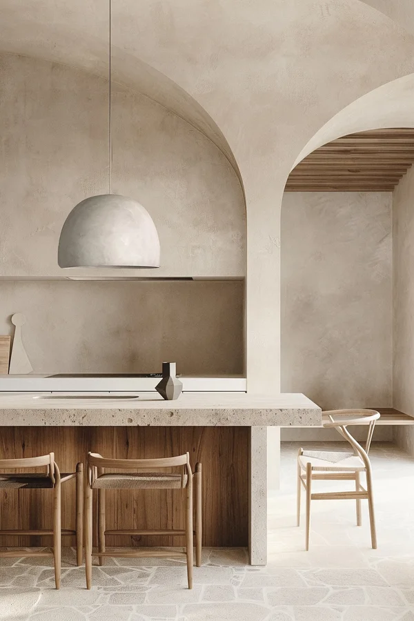
Soft beige is the diplomat of kitchen colors: it gets along with wood cabinets, white cabinets, black counters, stone counters, and almost any floor. A beige with a warm, slightly golden base keeps the room from feeling gray and flat, which is the one risk with neutrals.
Beige suits every style on this list because it steps back and lets texture lead: woven stools, wood shelves, patterned tile. In low light rooms choose a lighter beige so the walls do not go muddy, and add contrast through hardware and textiles rather than a second paint color.
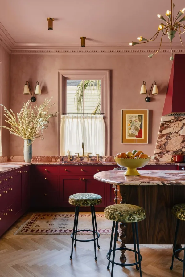
10. Muted Pink Walls for a Soft, Warm Glow
Source: Instagram
Muted pink, the dusty blush end of the family, gives a kitchen a warm glow that flatters faces around the table and makes white cabinets look gentle instead of stark. The gray in the pink keeps it grown up; this is a plaster tone, not a candy one.
Muted pink pairs with marble counters, brass hardware, and pale wood, and it suits contemporary, cottage, and eclectic kitchens. It is a kind choice for north facing rooms, since it adds the warmth the light lacks. Keep the backsplash plain white or cream so the pink stays the single soft note.
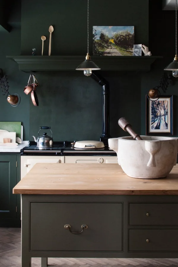
11. Deep Forest Green Walls for Drama
Source: Instagram
Forest green is the deep, saturated green of tailored rooms and old libraries, and in a kitchen it feels rich rather than loud. It is the classic partner for brass hardware, marble counters, and dark wood, and it makes white dishes on open shelves look like a shop display.
Forest green suits traditional, contemporary, and moody modern kitchens with good light; in a dim room, limit it to one or two walls and warm the lighting. Keep the backsplash simple, white or marble, since the wall is already the event. Floors in mid to dark wood complete the grounded feel.
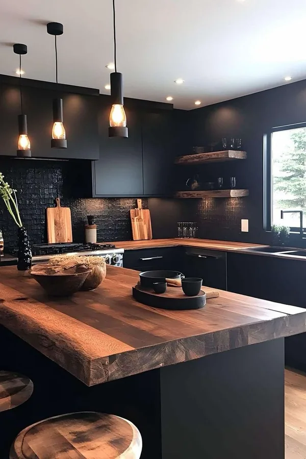
12. Classic Black Walls for a Dramatic Kitchen
Source: Instagram
Black walls are a bigger step than most people need, but in the right kitchen they are unforgettable. Black makes light wood and white cabinets glow by contrast, swallows visual clutter, and turns a plain room into a designed one. It works best with strong daylight or layered lighting, pale counters, and a light ceiling, and it suits contemporary and industrial kitchens most.
One black wall behind the range or shelves is the safer version of the same idea. Use a washable matte or eggshell finish, since black shows every splash and fingerprint more than mid tones do.
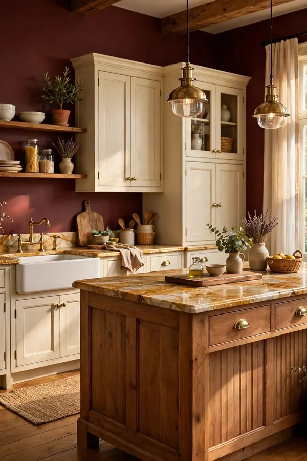
13. Rich Burgundy Walls for a Cozy, Formal Feel
Source: Instagram
Burgundy walls bring the mood of a dining room into the kitchen: deep, warm, and a little formal. The shade flatters cream and warm white cabinets, dark wood, and stone counters with brown or gold veining, and it makes brass and copper glow.
Burgundy suits traditional and rustic kitchens, eat in kitchens most of all, since the color is at its best around a table in evening light. It is strong, so balance it with a pale backsplash and keep window walls lighter if the room is small. Patterned floors in cream and rust tones sit comfortably with it.
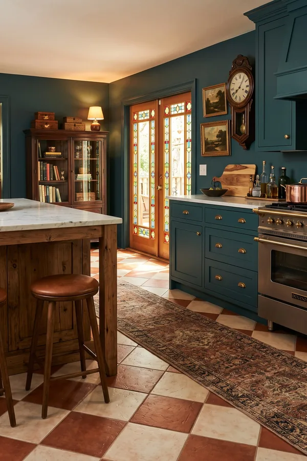
14. Teal Walls for Bold Blue Green Energy
Source: Instagram
Teal sits between blue and green and brings both: the calm of blue with the life of green, at full strength. It is a joyful wall for white and light wood cabinets, white counters, and simple tile, and it suits contemporary, eclectic, and mid century style kitchens.
Teal is strong enough that one or two walls often beat four; the eating end of the kitchen is a good place for it. Warm metals, brass and copper, are its best partners, and warm wood floors keep it from feeling cold. In small doses, on the wall behind shelves, teal makes white dishes pop.
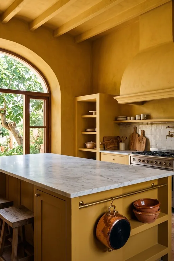
15. Mustard Gold Walls for Warm Character
Source: Instagram
Mustard gold is the warm, earthy version of yellow: deeper than butter, calmer than bright gold, and full of character. It suits rustic, farmhouse, and eclectic kitchens, pairs with dark and medium wood cabinets, cream counters, and patterned tile, and it glows in afternoon light.
Mustard can overpower a small room at full strength, so consider it for the walls around the eating area or as the single color behind open shelves. Black hardware sharpens it; woven textures and plants keep it friendly. With white cabinets, mustard reads cheerful; with wood, it reads rich.
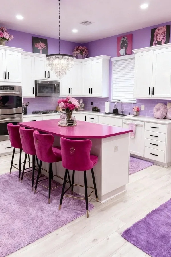
16. Soft Lavender Walls for a Gentle Cool Note
Source: Instagram
Soft lavender is the quiet surprise on this list: a pale, gray leaning purple that cools a warm kitchen and feels fresh beside white cabinets and light stone counters. It suits cottage, contemporary, and light traditional kitchens, and it is at its best in rooms with warm sun, where its cool tone balances the light.
Keep partners simple: white tile, pale wood, and silver or glass accents, since lavender does not need competition. A grayer lavender reads as a neutral and is the safer pick; a pinker one reads sweeter and suits a country style room.
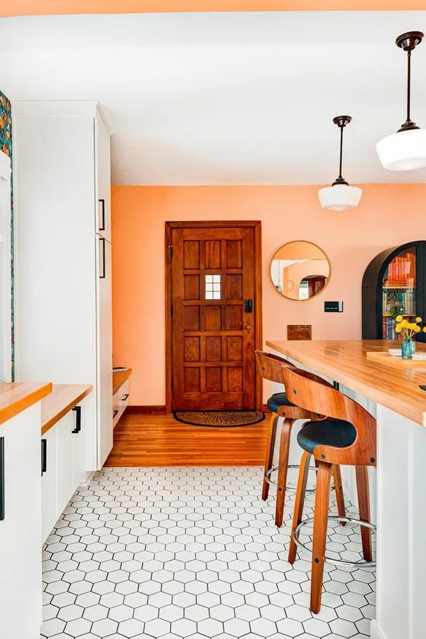
17. Peach Walls for a Warm, Friendly Glow
Source: Instagram
Peach walls give a kitchen the glow of ripe fruit and candlelight combined: warm, friendly, and softer than orange or terracotta. Peach flatters white and cream cabinets, light wood, and white counters, and it suits farmhouse, cottage, and retro leaning kitchens.
It is a kind color for rooms that get little sun, since it lends the warmth the light withholds. Keep the backsplash white or cream and let green plants be the contrast; peach and green are natural partners. If peach feels sweet, choose a shade with more beige in it for a clay tinted version.
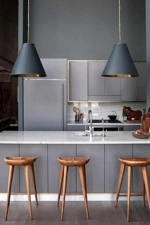
18. Slate Blue Gray Walls for Quiet Depth
Source: Instagram
Slate blue gray is the mid tone for people who want color that behaves like a neutral. Deeper than dusty blue and grayer than navy, it gives white and gray cabinets a calm backdrop, suits marble and concrete look counters, and works in modern, transitional, and Scandinavian style kitchens.
Slate is steady in changing light, which makes it a safe pick for rooms used from dawn to midnight. Brass warms it, black sharpens it, and pale wood floors keep it from going cold. It is also a forgiving wall for open shelves, since dishes of every color sit well on it.
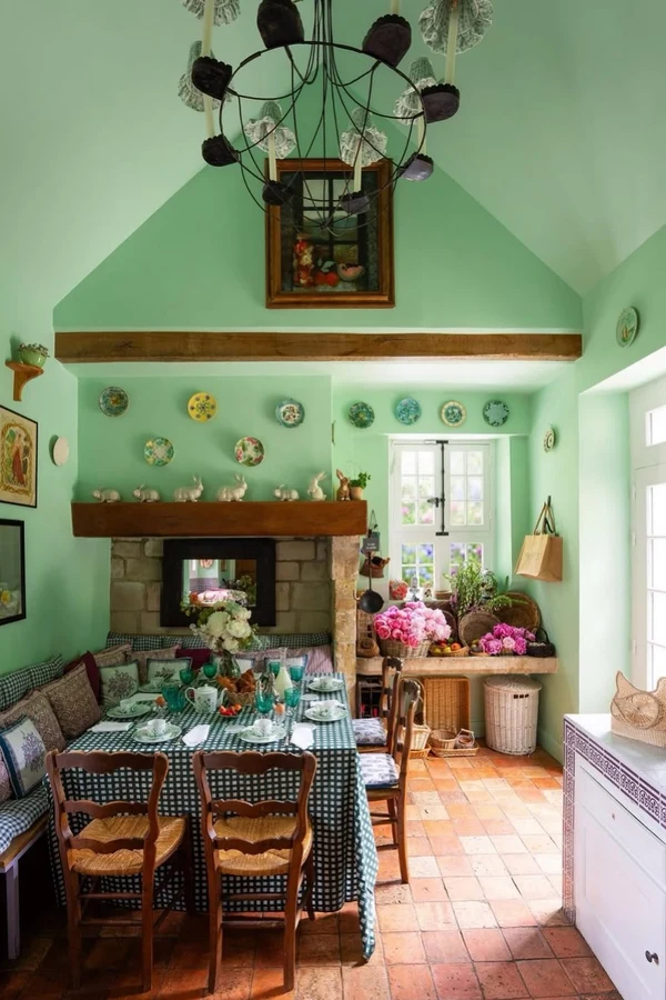
19. Mint Green Walls for a Fresh Retro Feel
Source: Instagram
Mint green is the pale, bright green of old diners and farmhouse sinks, and it still feels fresh today. It lightens small kitchens, suits white and cream cabinets, and pairs with white tile, pale counters, and chrome or stainless finishes for a clean retro note.
Mint is a cool color, so it is happiest in sunny rooms; in a gray light room it can turn chilly, and a slightly warmer mint fixes that. Wood shelves and woven accents keep it from feeling like a cafe. This is a cheerful, low risk color that photographs well and ages kindly.
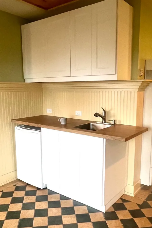
20. Two Tone Walls for the Best of Both
Source: Instagram
Two tone walls solve the light versus drama argument: a color on the lower half or on the cabinet run walls, warm white above and on the window walls. The color grounds the room where the work happens, and the white keeps the light bouncing where you need it.
The split can follow a chair rail, a tile line, or simply the height of the upper cabinets. This approach suits every style on the list and is the safest way to use a deep shade in a small kitchen. Keep the two colors in the same warmth family so the join looks planned.
Frequently Asked Questions
What is the best wall color for a small kitchen?
Light and mid tones both work if the contrast is right. Warm white, soft beige, dusty blue, and mint keep a small kitchen bright, while one deeper wall in sage, slate, or navy adds depth without shrinking the feel. Keep counters or cabinets light, and the room will read open.
Which kitchen wall colors work with white cabinets?
Almost all of them, which is why white cabinets are so popular. Sage, navy, terracotta, charcoal, and forest green give the strongest contrast; warm white and beige give a soft, layered look. Choose by the mood you want and the light you have, then match hardware to the wall’s warmth.
How do I pick a wall color that suits my cabinets and counters?
Start with the biggest fixed surface, usually the cabinets, and note its undertone: warm wood and cream lean warm, gray and bright white lean cool. Pick a wall color from the same family, then check it against the counter and floor swatches together. Paint one large test patch and judge it in your real light.
What wall colors make a dark kitchen feel brighter?
Warm light colors do the most: warm white, butter yellow, peach, and pale sage all lend light a dark room lacks. A washable satin finish reflects a little more light than flat matte. Adding under cabinet lighting often brightens a kitchen more than any paint, so do both if you can.
Should kitchen walls be matte or satin?
Kitchens get steam, splashes, and fingerprints, so washable finishes win. Satin or eggshell on walls wipes clean and still looks soft; save flat matte for low splash areas or deep colors where sheen would show every roller mark. Always choose a paint made for kitchens and bathrooms if the room gets steamy.
Conclusion
Kitchen walls are the fastest personality change in the house, and the safest, since paint is cheap to redo. Pick by light first, cabinets second, and mood third: sage and olive for calm earthiness, navy, charcoal, and forest green for depth, terracotta, mustard, and peach for warmth, and warm white or beige when the room itself should stay quiet.
These kitchen wall color ideas all follow the same rule: the wall supports the cabinets, counters, and the people cooking. Save this list to your kitchen board on Pinterest, order three swatches, and paint one big patch this week.