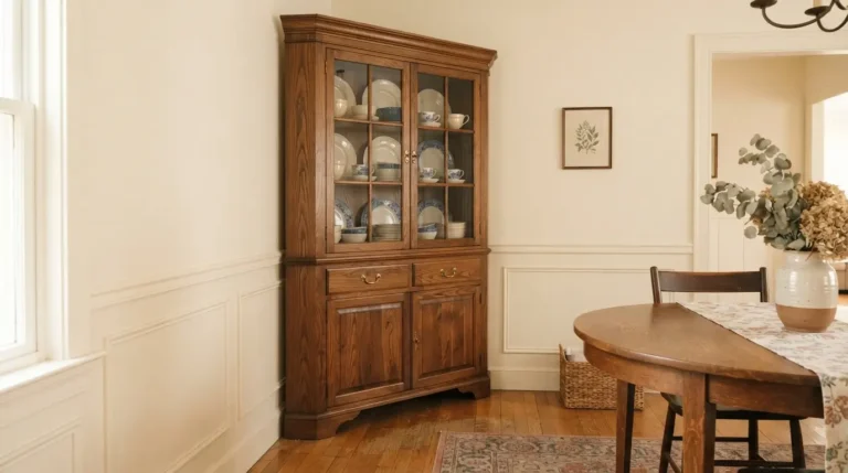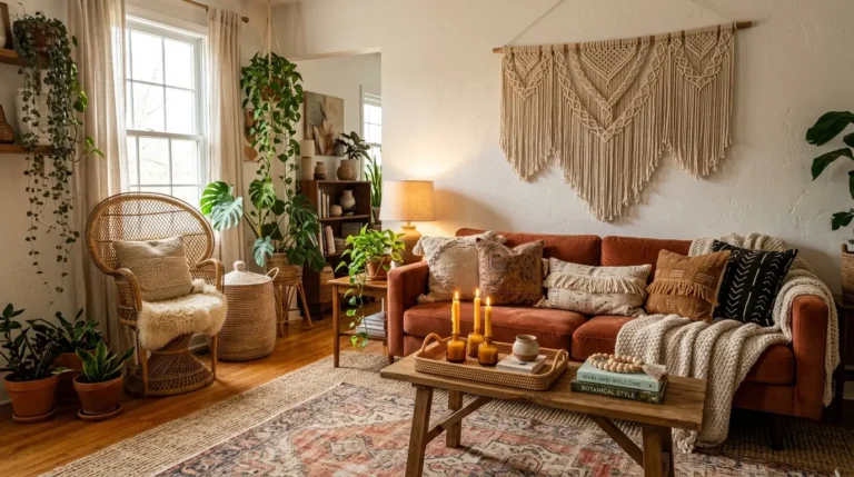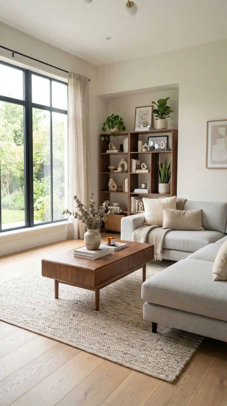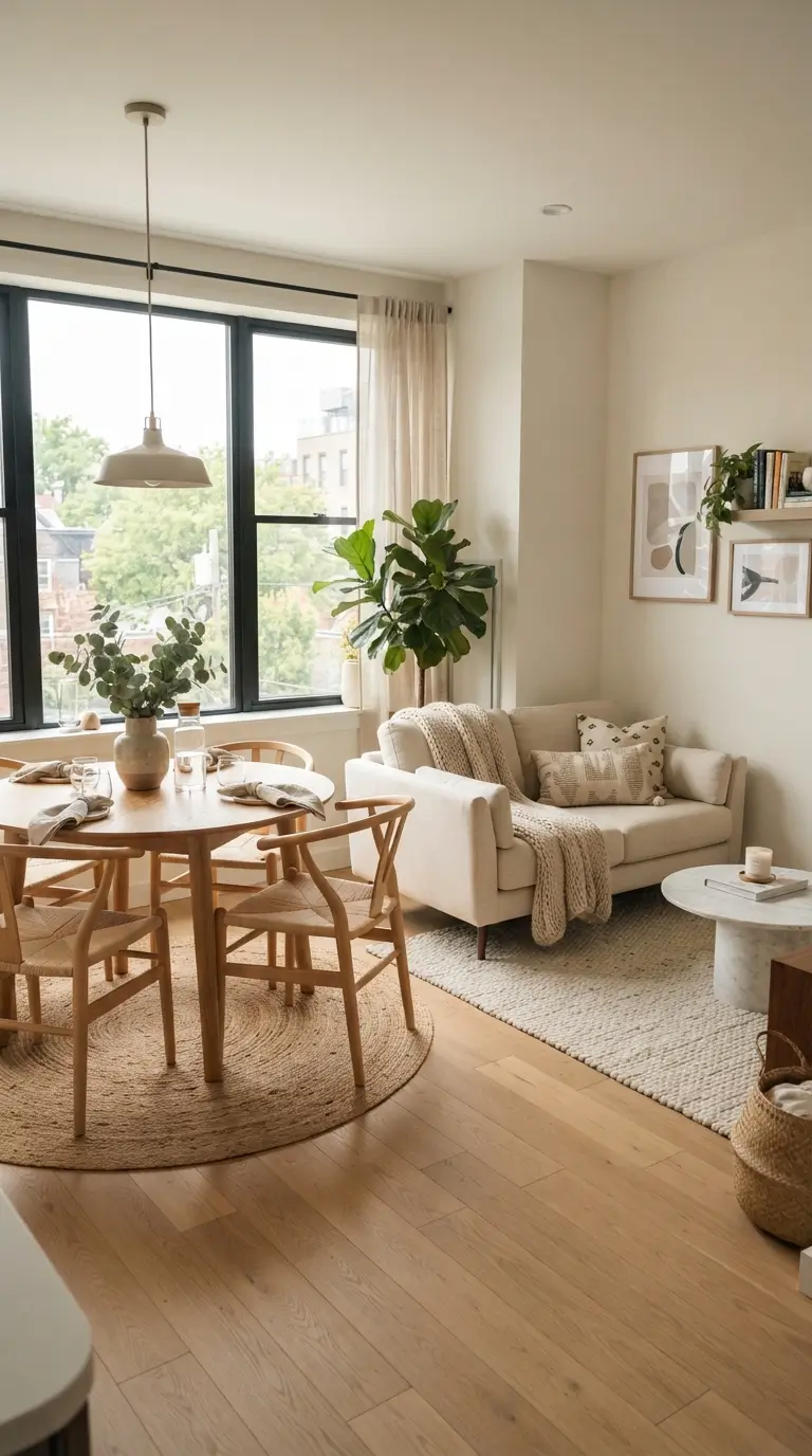
21 Shelf Wallpaper Ideas to Instantly Refresh Your Shelves
Peel-and-stick wallpaper is hands down one of the fastest ways to make your shelves look styled on purpose. You do not need a new bookcase, new decor, or even new paint. You just need a roll of wallpaper, a sharp pair of scissors, and about an hour. Lining the back panel or the sides of a shelf adds color, pattern, and depth that makes everything sitting on it look better, and because most of these papers are renter friendly, you can peel them off when your taste changes. In this guide, you will find 21 shelf wallpaper ideas that actually work in real homes, from subtle linen textures to bold botanical prints, with practical tips on prepping, measuring, and installing so the finished result looks smooth, not lumpy. You will also learn which patterns hide imperfections, how to handle dark or narrow shelves, and the renter friendly tricks that keep your security deposit safe. Whether your shelves live in the living room, kitchen, bathroom, or a kid’s bedroom, there is an idea here that fits.
1. Soft Linen Weave for a Calm, Lived-In Backdrop
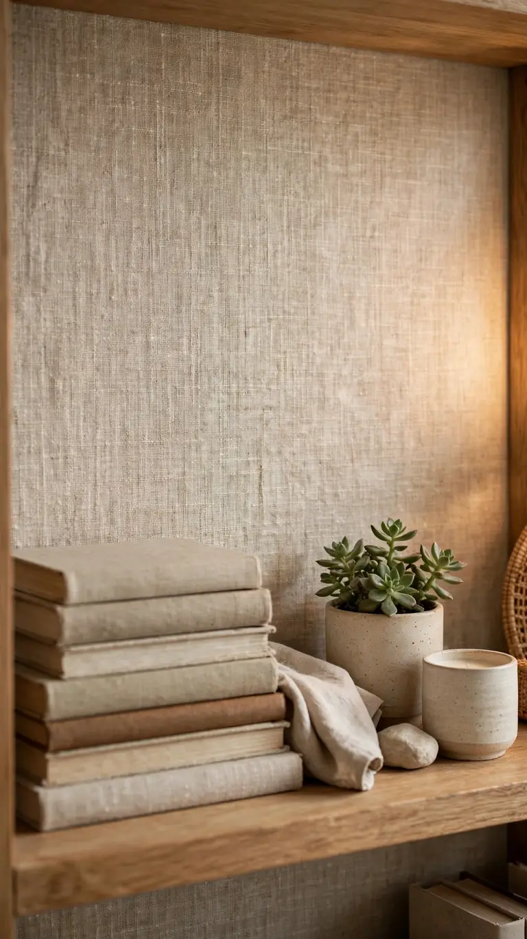
A linen weave pattern is the perfect starter project if you have never worked with peel-and-stick wallpaper before. The subtle woven texture hides tiny imperfections in the shelf’s back panel, so you do not need a flawless surface, and it gives flat, basic bookcases a soft, upholstered feel. Choose a warm off white or oatmeal tone to brighten a dark corner, and then style the shelves with books, a small plant, and one or two ceramic pieces. The neutral backdrop lets the objects do the talking while the shelves feel instantly more finished. Before you order, hold a swatch up in the room’s natural light, because linen patterns can read warmer or cooler depending on the light.
The forgiving nature of this pattern is also why it is so popular for rental apartments. Because the print has no lines that must match up, you can cut each panel to fit a single shelf section and no one will notice where one piece ends and the next begins. Measure the inside back panel of each shelf bay, subtract about an eighth of an inch on each side so the paper lays flat without bunching at the corners, and smooth it on from top to bottom with a dry cloth. If you make a crease, just peel that section back gently and reapply. Most quality peel-and-stick papers reposition a few times without losing their grip.
2. Faux Shiplap Lines for Instant Farmhouse Warmth
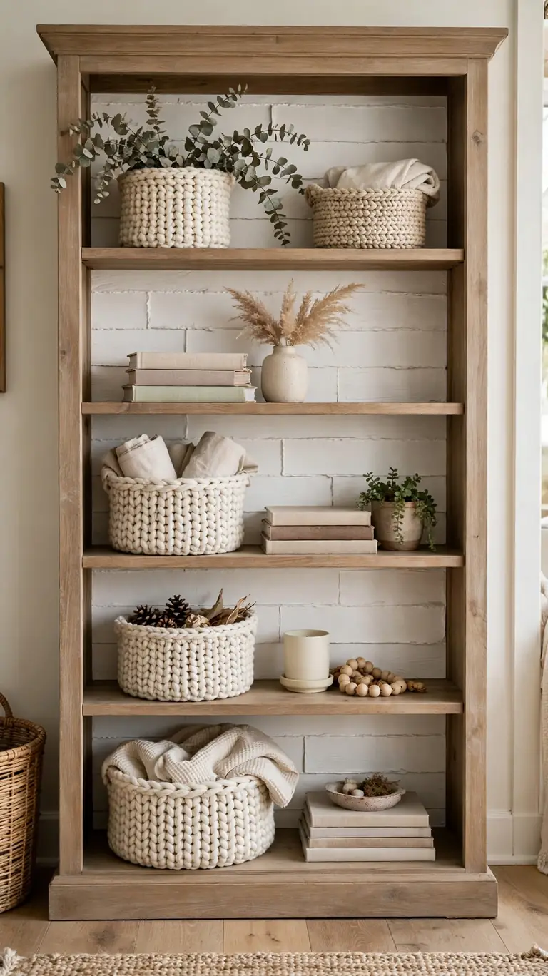
Nothing changes the mood of a plain bookshelf like horizontal shiplap lines. A faux shiplap wallpaper gives you that farmhouse texture without the cost or the sawing, and it works especially well on deep bookcases in living rooms and entryways. Pick a soft white or very light gray so the shelf contents still pop, and keep the lines running horizontally to make narrow shelves feel wider. Pair it with chunky knit baskets, stacked coffee table books, and a small framed print leaning against the back. The combination reads cozy and collected rather than themed, which is the goal.
When installing, the single most important step is keeping the plank lines level. Use a small spirit level or even a phone level app, and mark a faint pencil line across the shelf back as your guide before you stick anything down. Start at the top and work down, smoothing from the center outward so air bubbles push toward the edges. If your shelves have adjustable shelf pins, measure the largest back panel first and install the paper while the adjustable shelves are removed. That way you get one clean, continuous run of shiplap instead of paper cut around pegs.
3. Classic Stripes to Make Low Shelves Look Taller
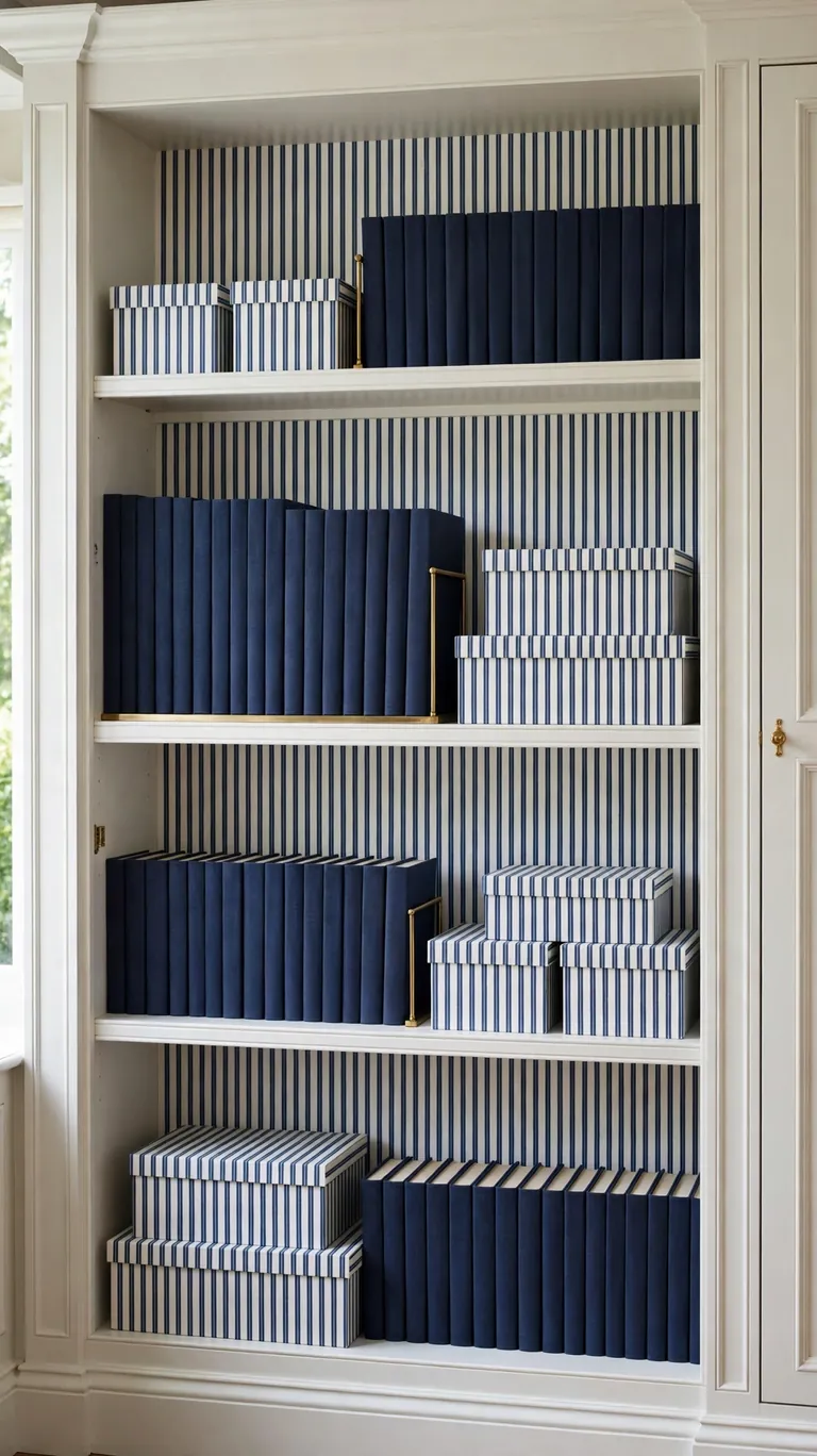
Vertical stripes are a designer trick for shelves that feel squat or crowded. The eye follows the lines upward, so a short bookcase suddenly looks a little taller and more elegant. A classic ticking stripe or a narrow pinstripe in navy and white, black and cream, or sage and white adds structure without overwhelming the room. This is a great choice for hallway bookcases, office shelving, and anywhere you want a traditional, tailored feel. Style it with uniform book spines or matching storage boxes to keep the look intentional and calm.
Stripe alignment is where beginners go wrong, so take your time here. Cut all your panels from the same roll position so the stripe spacing matches from one shelf section to the next, and use the factory edge of the paper as your plumb line. Tape the panel lightly at the top with painter’s tape, step back, and check it looks straight before you commit. Because stripes show every crooked edge, trim with a metal ruler and a sharp craft knife rather than scissors for the final cuts. Wipe the shelf back with a damp cloth first and let it dry completely, since dust is the main reason stripes end up wrinkled.
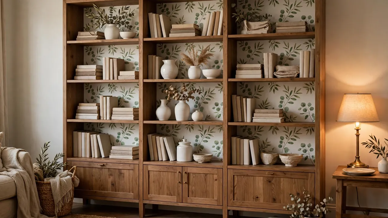
4. Botanical Print Behind White Ceramics
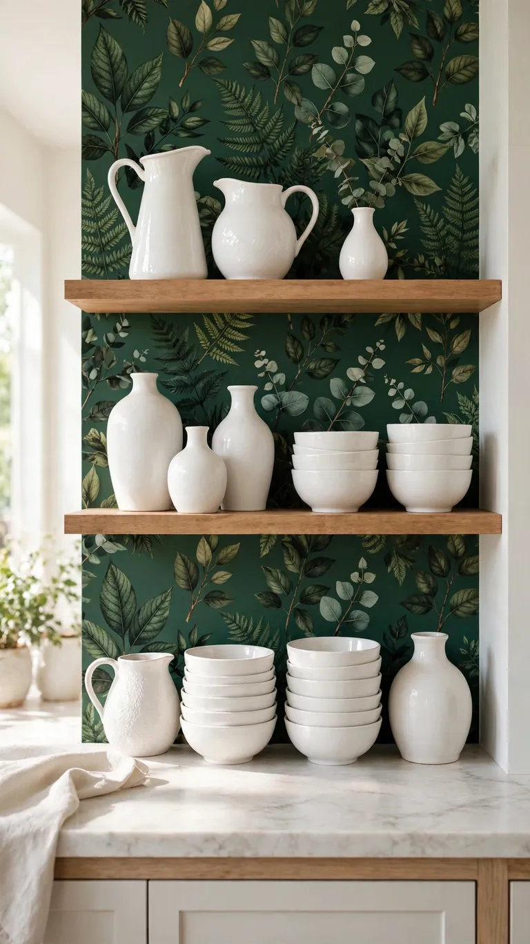
A botanical wallpaper turns the back of a shelf into a little greenhouse moment. Deep green leaves on a cream or blush background make white and cream ceramics glow, and the contrast is genuinely striking even with very simple objects. A vase, two pitchers, and a stack of white bowls is all you need. This idea works beautifully on kitchen open shelves and dining room hutches where you already keep dishes and glassware, because the pattern gives everyday items a styled backdrop they would never get against plain wood.
Scale matters with botanical prints, so choose a medium scale leaf for average size shelves. Tiny prints can look busy once dishes go in front of them, and oversized prints can get lost behind the objects. Before committing, tape the cut panels up with painter’s tape and live with them for a day or two, restocking the shelf the way you normally would. If the leaves still peek through nicely between your dishes, you have the right scale. Apply the paper in calm conditions too, since humid kitchen air can make cheap adhesive gummy, so do the installation on a dry day with the windows cracked.
5. Warm Terracotta for Cozy, Glowing Depth
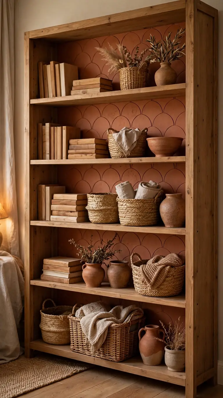
Terracotta is one of those colors that makes a room feel instantly warmer, and it is especially good on shelves in north facing rooms that never quite feel bright. A solid or subtly mottled terracotta wallpaper behind the shelves creates depth, so even budget decor looks richer against it. It pairs beautifully with natural wood tones, woven baskets, brass candlesticks, and cream ceramics. If your living room shelves have been looking flat and washed out, this single change can be the fix.
Because solid colors show seams more than busy patterns, measure twice and cut generously. Leave an extra inch on every side when you cut, press the paper into the corners firmly, and then trim the excess with a craft knife for a crisp edge. Work in good daylight so you can spot bubbles before they set. On shelves that hold heavy items like books, let the paper settle for a day before you reload the shelf, which gives the adhesive its full bond. The result reads like a custom painted inset, but you can peel it away in minutes if you ever want a change.
6. Vintage Map Print for a Collected Library Feel
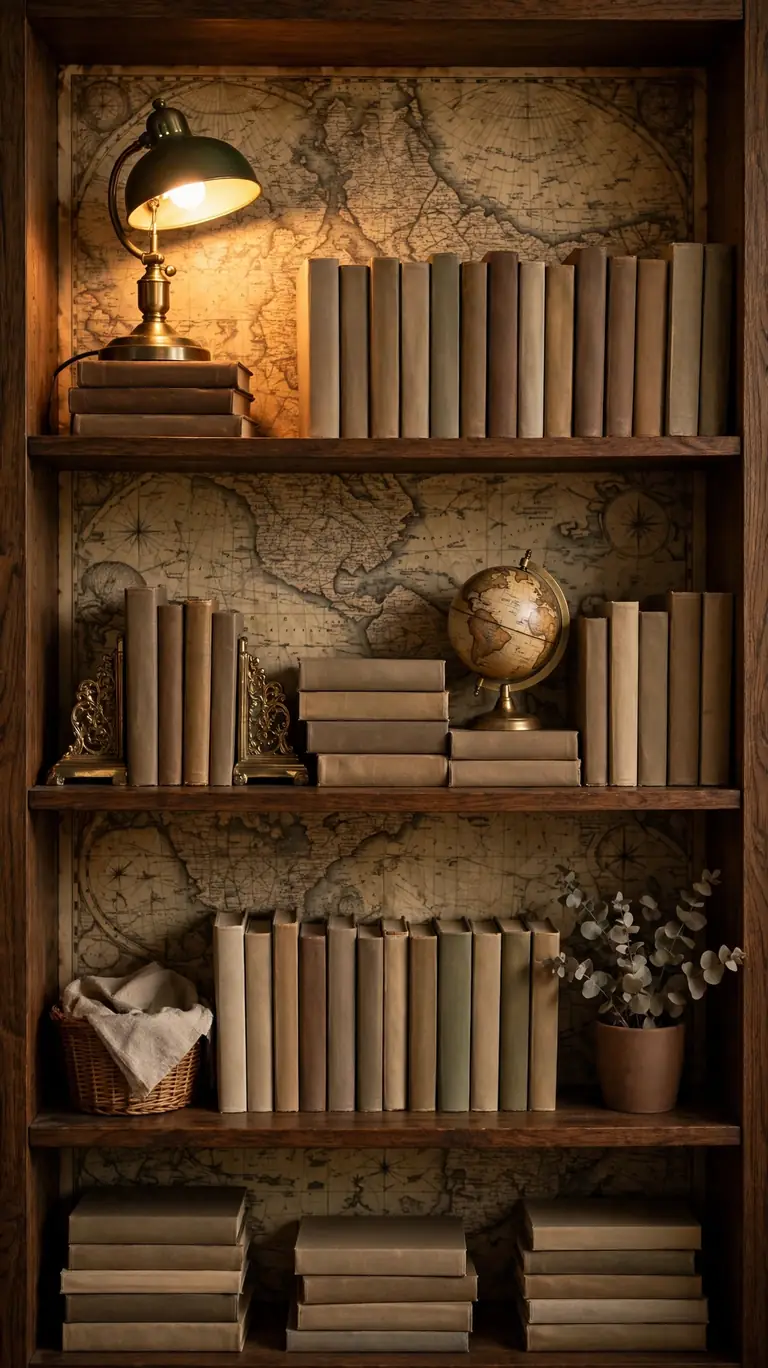
A vintage map print makes a bookshelf feel like it belongs to someone interesting. Sepia coastlines and faded borders give the back panel an old world library feel that works perfectly behind rows of novels and travel memoirs. This is a strong pick for home offices, reading nooks, and kids’ rooms where you want a bit of adventure. Keep the rest of the styling simple: books, a small globe, a wooden box. The map is doing the heavy lifting, so you do not need much else.
Map prints usually come in large scale designs, which means you get less pattern repeat per panel. Plan your cuts so the most detailed parts of the map, like coastlines and compass roses, land in the visible centers of each shelf section rather than getting hidden behind thick books. Lay the cut panels on the floor first and arrange them like a puzzle until you like the composition. Then number the back of each panel with a pencil so you know which one goes where. This little planning step is the difference between shelves that look intentional and shelves that look randomly papered.
7. Marble Effect for an Upscale Kitchen Shelf
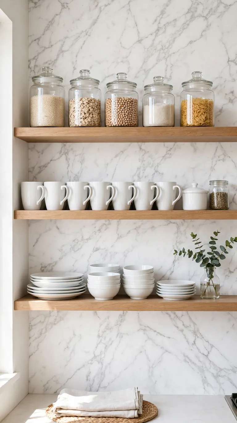
Marble effect wallpaper gives kitchen open shelves a high end look without the slab cost. A white marble pattern with soft gray veining behind everyday dishes, mugs, and glass jars makes the whole kitchen feel a notch more refined. It also photographs beautifully, which matters if you love a pretty kitchen. Use it on the back panel of open shelves above a coffee station or next to the stove, and keep the items styled in a tight color palette of white, glass, and one accent so the veining stays the star.
Kitchen shelves need a wallpaper that can handle a little grease and humidity, so look for a vinyl coated or washable peel-and-stick paper rather than a basic paper type. Wipe the shelf back with a degreasing cleaner before installation, and let it dry fully. After applying, seal the bottom edge of each panel with a thin bead of clear silicone or a line of transparent tape, because this is where cooking splashes tend to creep under the paper. If a spot gets grimy, most vinyl coated papers wipe clean with a damp cloth, which keeps the marble looking crisp for years.
8. Black and White Gingham for Cottage Charm
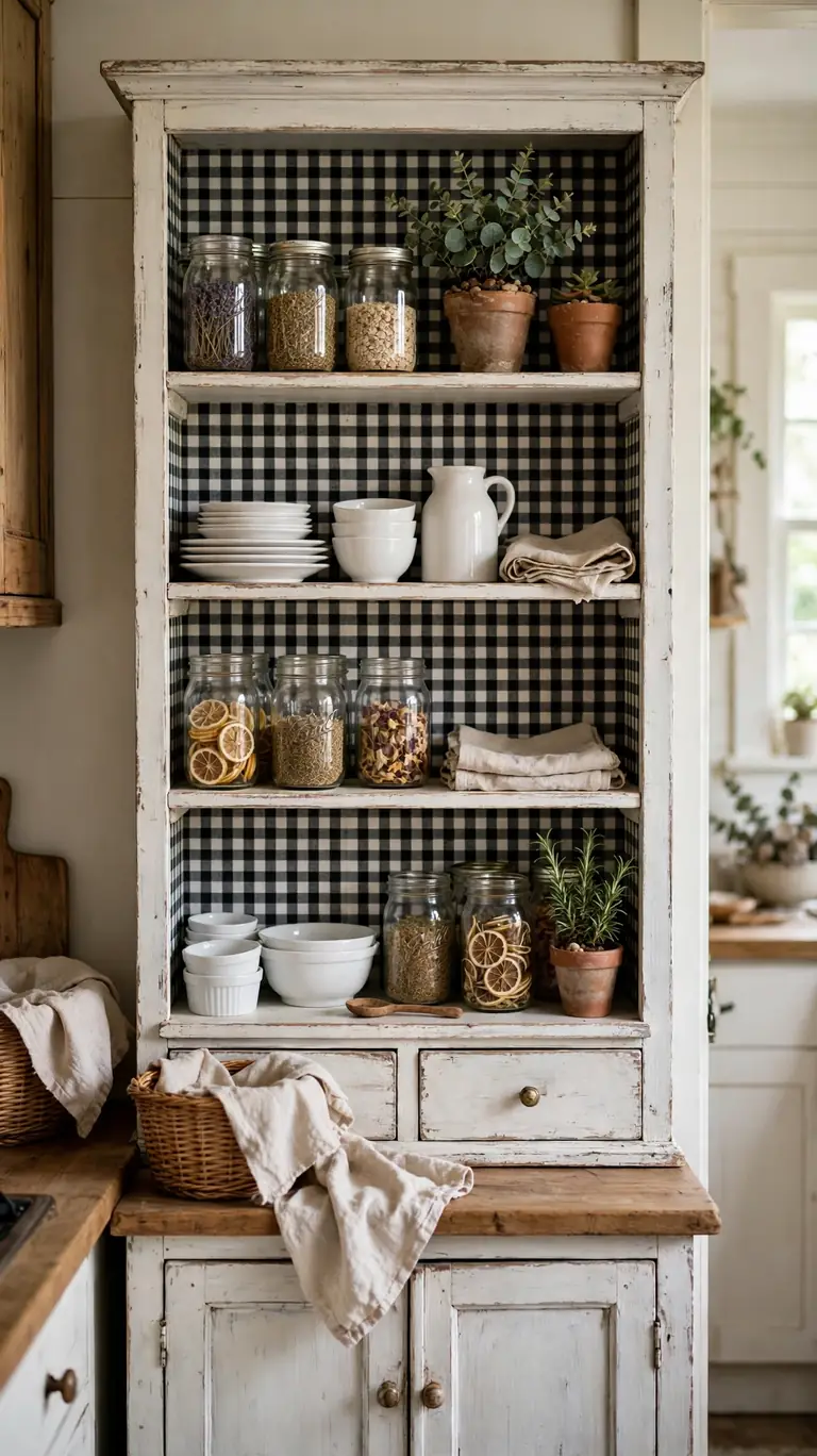
Gingham is pure cottage charm, and a black and white check is the version that stays fresh instead of looking like a picnic basket exploded. Use it on a small hutch, a plate shelf, or the inside of a pantry bookcase, and style it with mason jars, white dishes, and a little wooden crate or two. The check adds pattern and energy without needing any color coordination, which makes it one of the easiest patterns to style around. It works year round, not just in summer.
Gingham is a geometric pattern, so straight installation is non negotiable. The trick that saves most beginners is to find the paper’s grid lines and align them to a level pencil line at the top of the shelf back. Do not trust the shelf itself to be square, because most bookcases are slightly off, and following a crooked shelf makes the check look crooked too. Follow your level line instead. Cut panels one at a time and check each against the line before smoothing. When the checks line up perfectly across shelf sections, the finished look is crisp enough to pass for custom carpentry.
9. Deep Emerald for Drama With Brass Accents
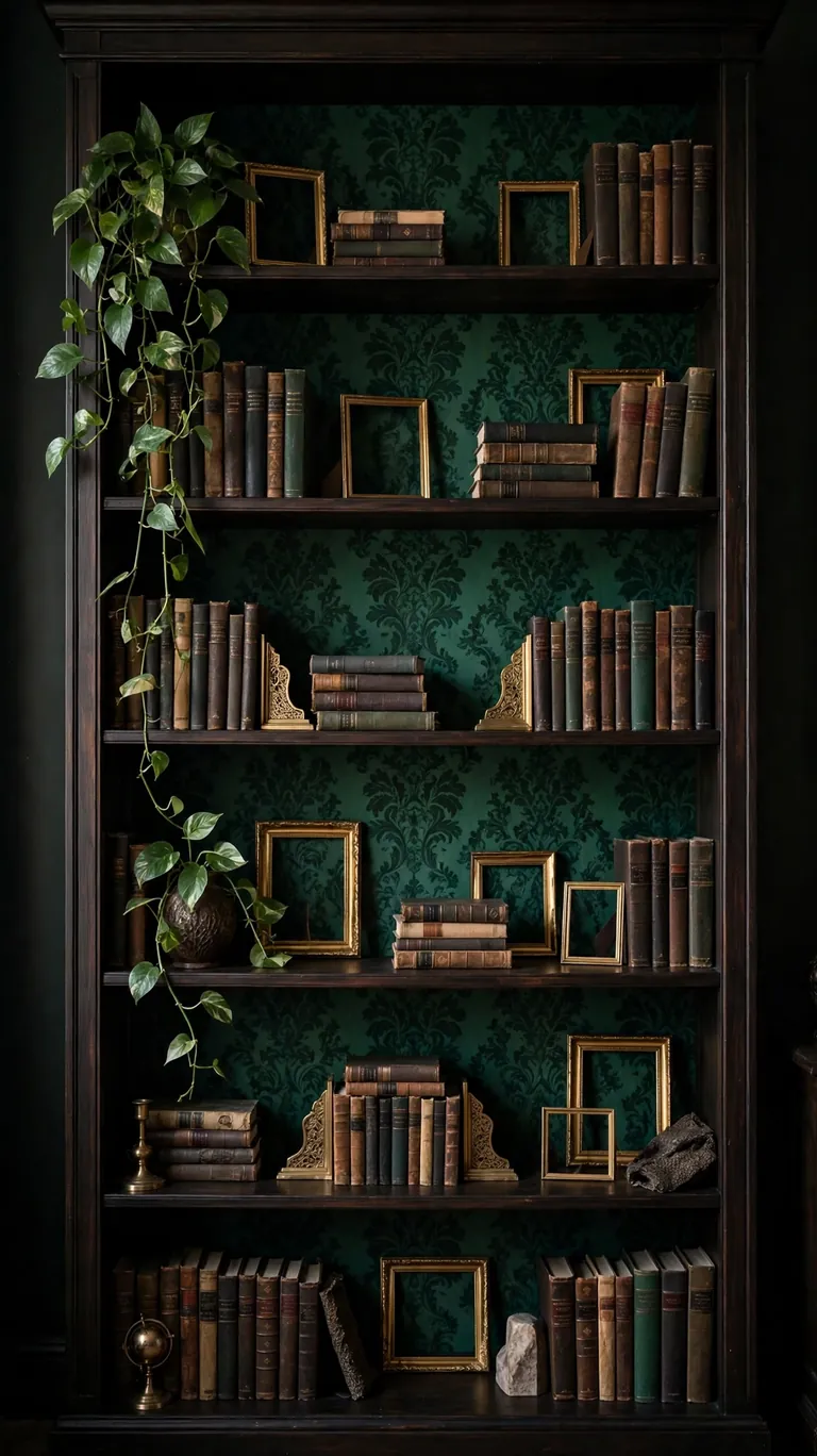
Deep emerald green behind shelves is pure drama in the best way. The rich color makes brass frames, gold bookends, and warm wood tones glow, and it turns an ordinary bookcase into a focal point of the room. This works especially well in living rooms and home bars where you want a moody, collected atmosphere. Style it with a mix of books, a brass lamp or candle holder, and something living like a trailing pothos. The green on green layering of the plant against the paper looks incredibly lush.
Dark papers like emerald show every bubble and wrinkle because light catches them differently, so installation technique matters more here. Use the hinge method: peel the backing away from just the top few inches, press that strip in place perfectly, then peel and smooth downward a few inches at a time. Keep a felt squeegee or a credit card wrapped in a soft cloth handy to push air out as you go. If you get a stubborn bubble, prick it with a pin and press it flat rather than pulling the whole panel up. The pinprick disappears into the dark pattern completely.
10. Soft Watercolor Wash for an Artistic Backdrop
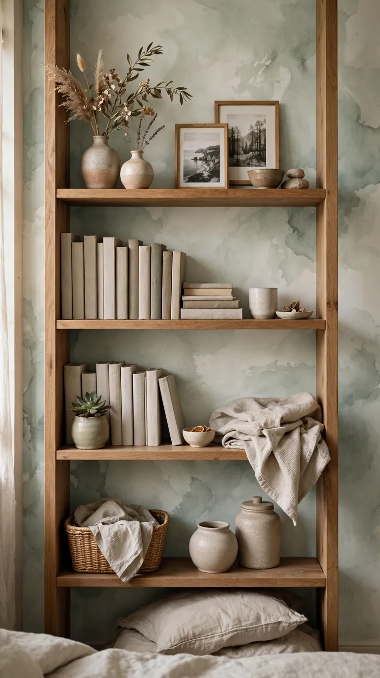
A watercolor wash pattern looks like an artist brushed color straight onto your shelf back. Soft washes in sage, blush, dusty blue, or warm gray create a gentle gradient that feels handmade and calm. This is a lovely choice for bedroom shelves, nursery bookcases, or any spot where you want color without the rigidity of a geometric print. Style it with neutral linens, a few framed photos, and small ceramic trinkets, and let the wash be the artistic statement.
The dreamy nature of watercolor prints makes them very forgiving to install, since there are no lines to match and no motifs to center. That said, the direction of the wash matters. Decide whether you want the wash to read darker at the bottom or lighter at the bottom, and keep that direction consistent across all shelf sections. Cut all panels with the same orientation by marking an arrow on the backing of each piece before you start. Apply with light pressure and avoid overstretching the paper, because stretched watercolor prints can warp and lose their soft gradient look.
11. Line the Cubby Interiors of a Cube Organizer
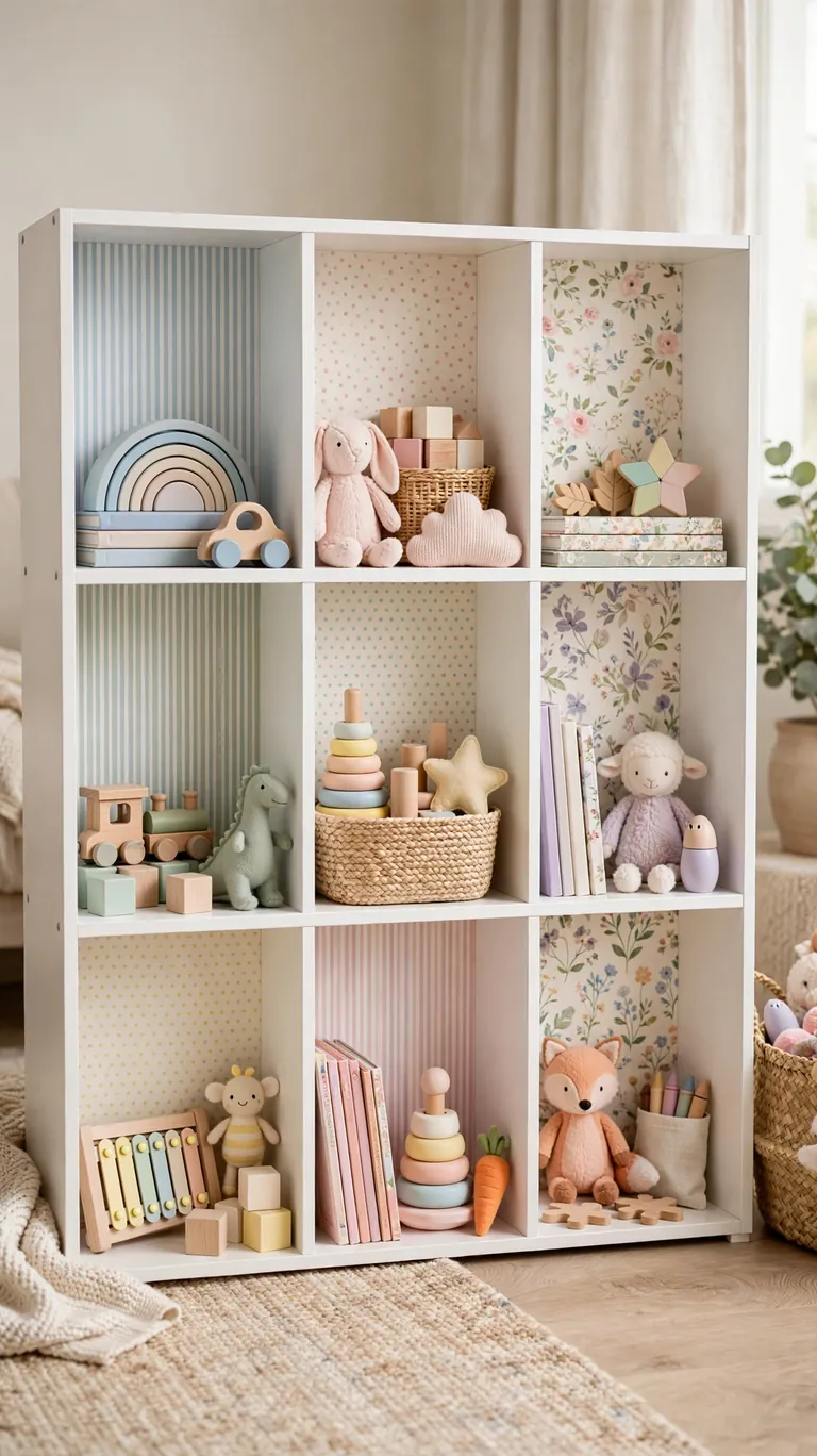
Cube organizers are everywhere, and lining each cubby with wallpaper transforms them from basic storage into actual decor. The trick is treating every cubby as its own little framed vignette. You can use one pattern throughout for a cohesive look, or mix two or three coordinating patterns for a playful, collected feel. A soft stripe paired with a small dot and a solid linen looks great together. This is perfect for kids’ rooms, craft rooms, and entryway storage where the cubes hold baskets, toys, and everyday clutter.
Each cubby is small, which makes measuring quick, but the small size also means your cuts need to be precise. Make a simple paper template of one cubby interior first, test fit it, and then use it to trace every panel. This is much faster than measuring each cube individually. Press the paper into the corners with a bone folder or the back of a spoon so it sits cleanly into the edges. If you are mixing patterns, lay all the cut panels out on the floor in their final arrangement and photograph it, so you can reproduce the layout exactly when you start sticking.
12. Geometric Hexagons for a Modern Entryway
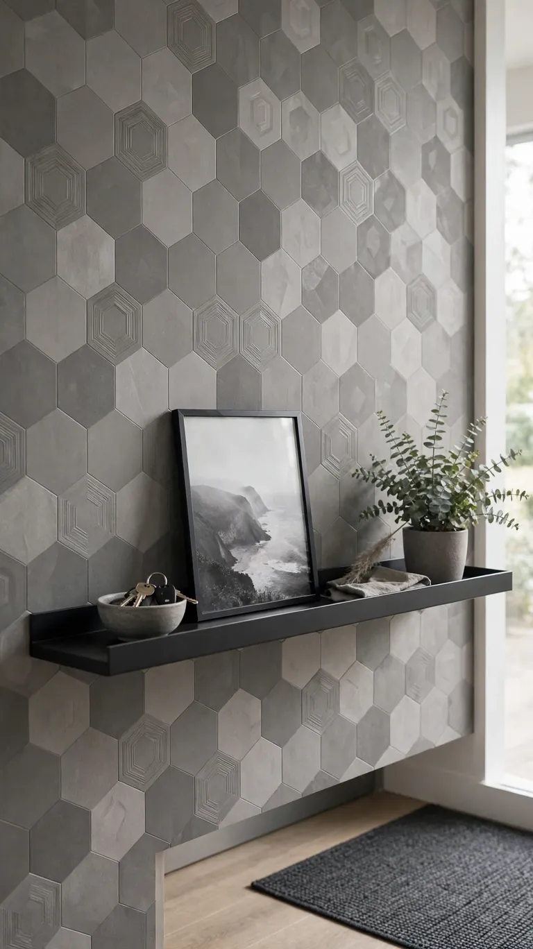
Hexagons and other geometric prints bring a clean, modern energy to entryway shelves, console tables, and mudroom cubbies. A tone on tone geometric in gray, beige, or soft black adds texture without competing with the keys, mail, and bags that actually live there. It is a practical pattern too, because busy geometrics hide scuffs and fingerprints better than solid colors. Style the shelf minimally with a small bowl for keys, a framed photo, and one plant.
Geometric patterns need careful pattern matching where panels meet, especially if your shelf back is wider than one roll width. Look for papers with a straight match rather than a drop match, because straight matches are much easier for beginners. Mark the repeat point on the roll with a sticky note before you cut, so every panel starts at the same point in the pattern. When you butt two panels together, overlap them by a hair and cut through both layers with a sharp knife for a nearly invisible seam. Step back after each panel to check the geometry looks continuous.
13. Faux Wood Planks for Rustic Warmth
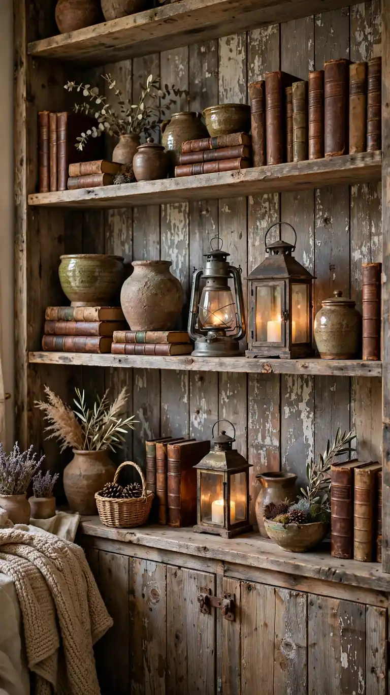
Faux wood plank wallpaper gives shelves the warmth of real reclaimed wood with none of the weight or the splinters. It is ideal for living room bookcases and kitchen shelves where you want a rustic, cabin like feel but your actual shelves are painted or laminate. Choose a weathered gray brown for a modern rustic look, or a honey oak tone for something warmer. Style it with iron accents, leather bound books, and chunky pottery to complete the story.
The key to making faux wood look convincing is plank alignment. Cut your panels so the plank seams run continuously across the shelf back, and avoid placing a seam right in the middle of the most visible shelf section if you can help it. Rotate the paper 180 degrees on alternate panels if the print allows, because real reclaimed wood has variation and a repeated pattern gives the trick away. Matte finish papers look far more realistic than glossy ones for wood effects. Run your hand over the finished surface, because if it feels plasticky to you, it will look plasticky in photos too.
14. Chinoiserie for an Elegant Vignette Shelf
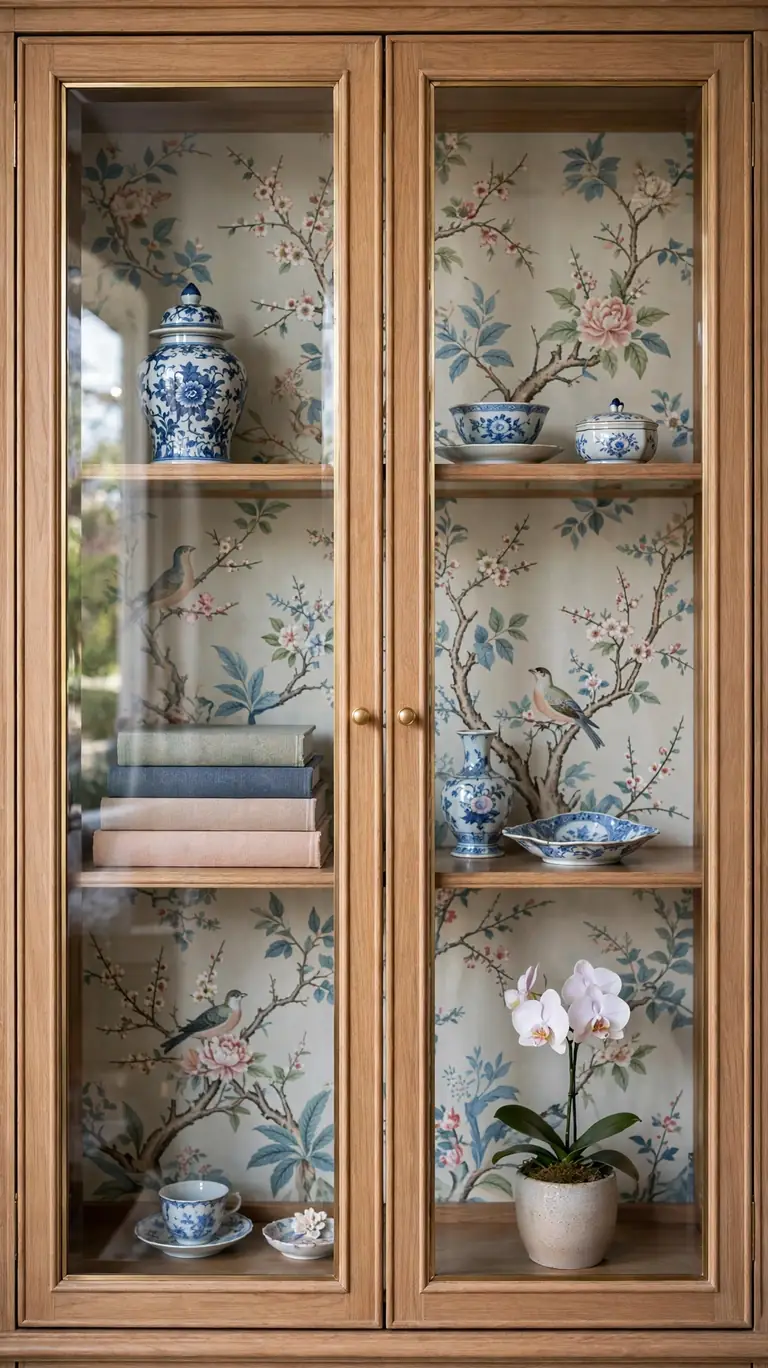
A chinoiserie wallpaper panel turns a single shelf into an elegant vignette worthy of a styled photo. Delicate birds, branches, and blossoms on a pale background create a refined, collected look that elevates everything in front of it. Use it on one standout shelf, like a glass front cabinet, a hallway console, or the top shelf of a bookcase, rather than papering every shelf in the room. Less is more here. Style it with porcelain, a small stack of art books, and a single orchid or flowering branch.
Because chinoiserie prints are detailed and often large scale, placement is everything. Treat the shelf back like a framed piece of art and center the most beautiful motif, like a bird or a flowering branch, in the visible space between your objects. Dry fit with painter’s tape and arrange your objects in front before you stick anything down. Once you are happy with the composition, take a photo for reference and install for real. Use a sharp blade and a steady hand for trimming, because frayed edges on a detailed print are very noticeable.
15. Muted Sage for a Calm Bathroom Shelf
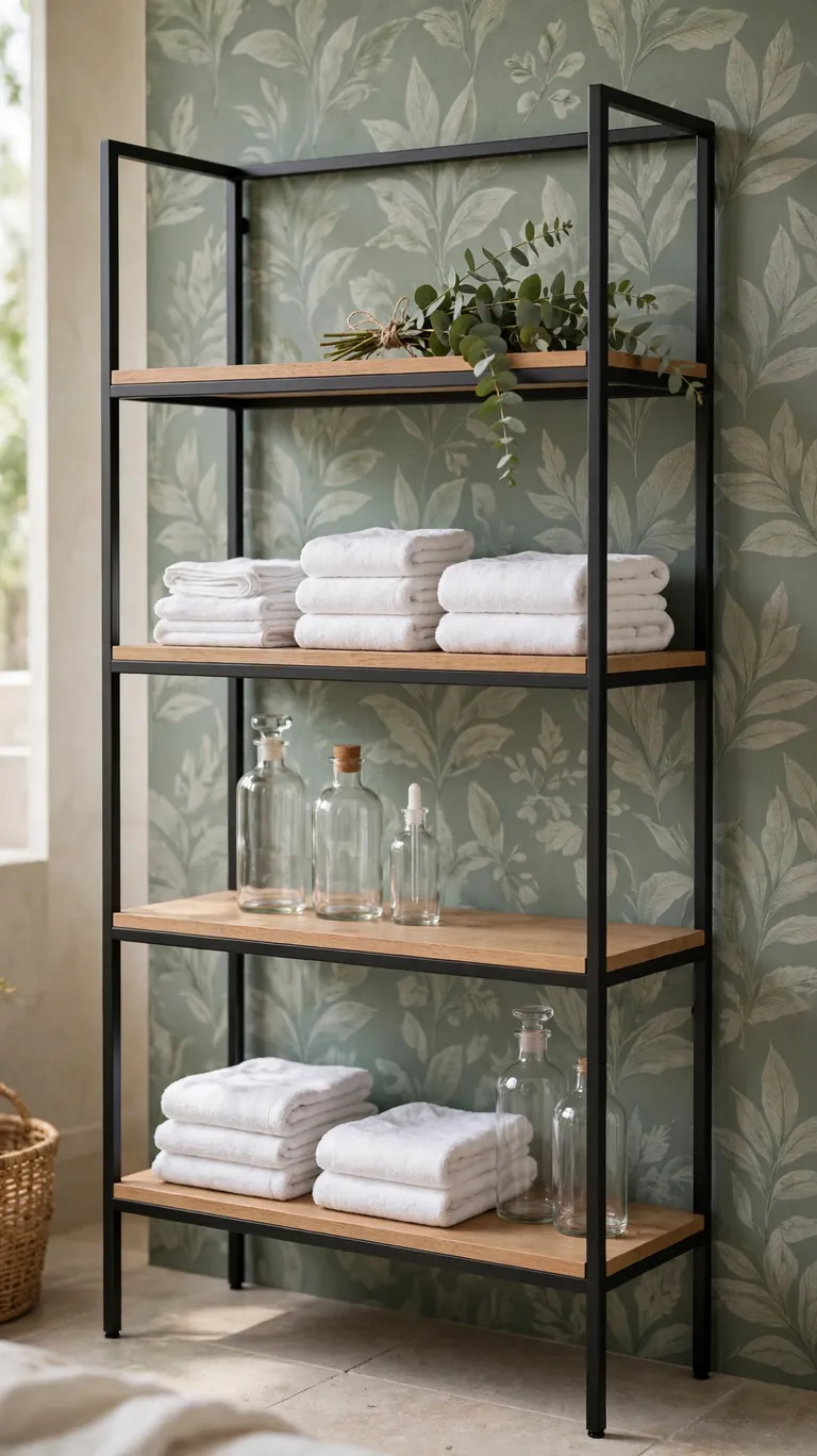
Bathroom shelves get ignored in most decorating plans, but a muted sage wallpaper on the back of a medicine cabinet shelf or an over toilet etagere makes the whole bathroom feel spa like. Sage pairs naturally with white towels, clear glass bottles, and brushed nickel or matte black fixtures. It is calming without being cold, which is exactly what you want in a bathroom. A solid sage or a sage with a very subtle texture works best, since bathroom shelves are small and busy patterns can feel cluttered.
Bathrooms are the toughest room for peel-and-stick paper because of steam and humidity. Choose a vinyl or waterproof rated paper, and make sure the bathroom fan runs during and after showers. Before installing, wipe the shelf with rubbing alcohol to remove any soap residue or moisturizer film, which are the hidden culprits behind peeling edges in bathrooms. Press the edges down firmly and consider running a thin line of clear waterproof tape along the bottom edge where steam tends to collect. Check the corners every few months and press them back down if they start to lift.
16. Playful Terrazzo Speckles for a Kid’s Shelf
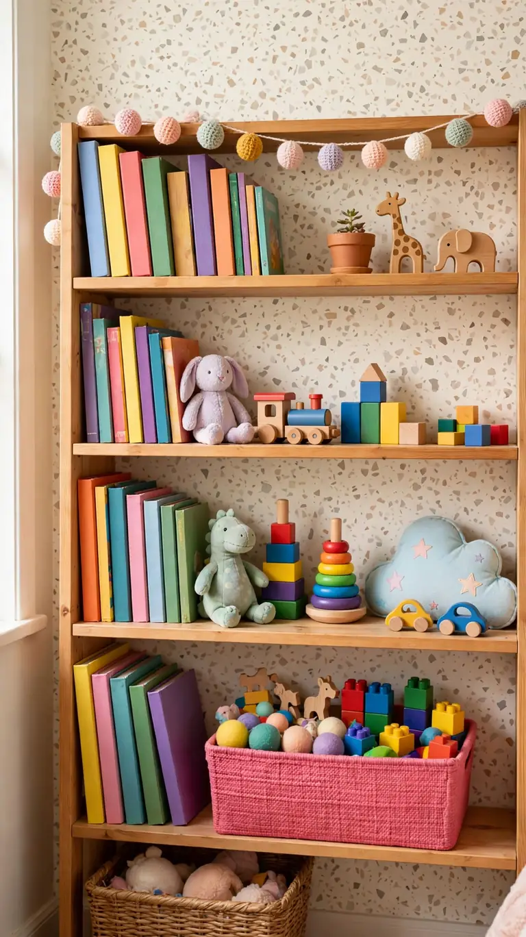
Terrazzo speckles are a fun, forgiving pattern for kids’ bedroom shelves and playroom storage. The scattered confetti like dots hide fingerprints, scuffs, and the general chaos of a child’s room, and the playful pattern makes even a basic white bookcase feel cheerful. Pick a terrazzo with a cream base and multicolor speckles, then let your child pick one color from the paper to repeat in a storage bin or a piece of art. It makes them feel part of the decorating, which means they might actually keep the shelf tidy.
Kid shelves take abuse, so installation durability matters as much as looks. Choose a thick, scrubbable peel-and-stick paper that can handle being wiped down, and press it on with extra firm pressure, especially at the edges. For extra staying power on shelves that get bumped by toys, add a thin bead of removable mounting putty or double sided tape behind the top edge of each panel as backup. The random speckle pattern means you can patch a damaged section with a small cut piece and no one will ever spot the repair. Keep a leftover scrap in a drawer for exactly this purpose.
17. Art Deco Fans for Glamorous Flair
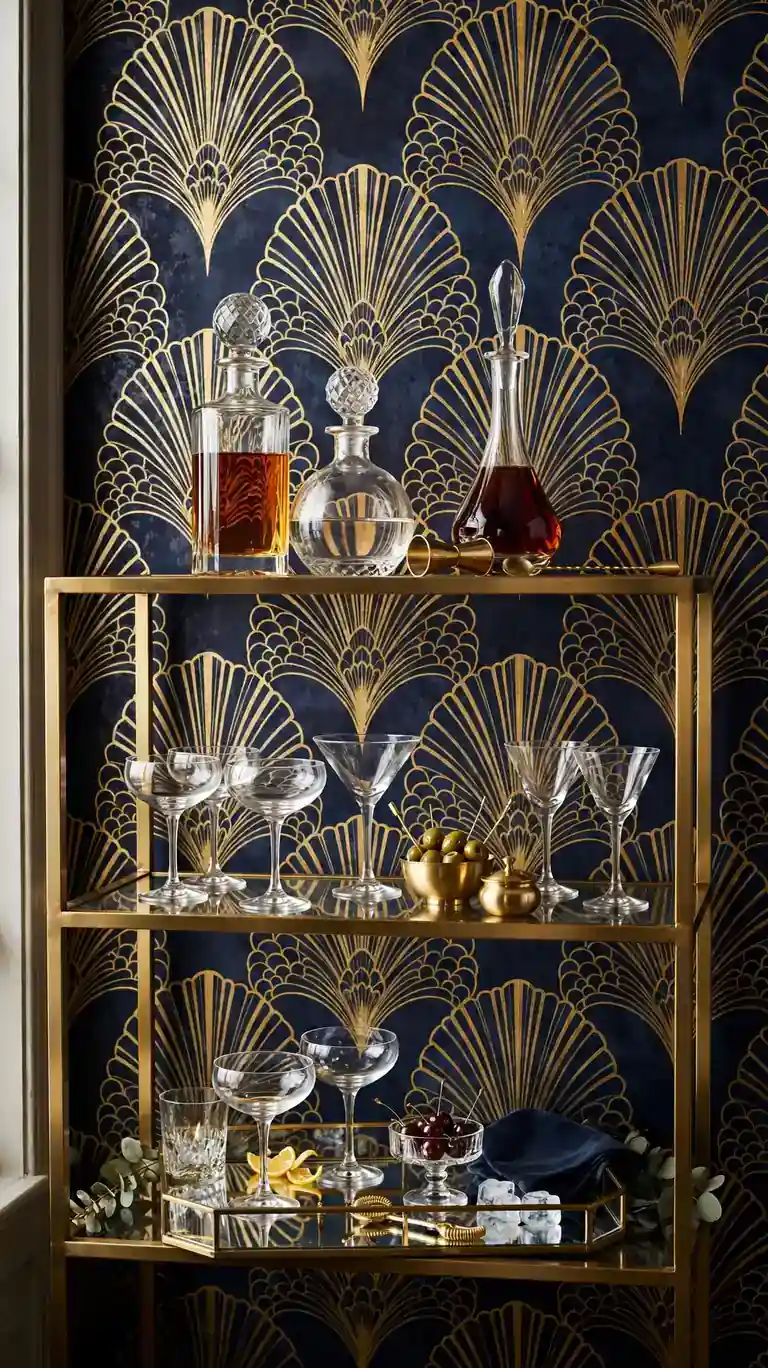
Art deco fan patterns bring instant glamour to a bar cart shelf, a glass cabinet, or a bedroom bookcase. Gold fans on a navy, black, or emerald background look stunning behind decanters, cocktail glasses, and framed photos. This is a pattern that loves the spotlight, so use it where the shelf gets noticed, like a dining room hutch or a living room display cabinet. Style it with mirrored trays, crystal, and metallic accents to lean into the luxe feeling.
Deco fans are a directional pattern, so every panel must point the same way or the design looks wrong. Before cutting, decide whether your fans will arc upward or downward, and mark the direction on the back of each panel with an arrow. This is the kind of paper where a level guide line across the top of the shelf back is essential, because tilted fans ruin the geometric effect. Install the center panel first and work outward, checking the fan alignment across seams as you go. The symmetry of the finished result is what makes this pattern feel expensive.
18. Dark Moody Backdrop for Light Object Contrast
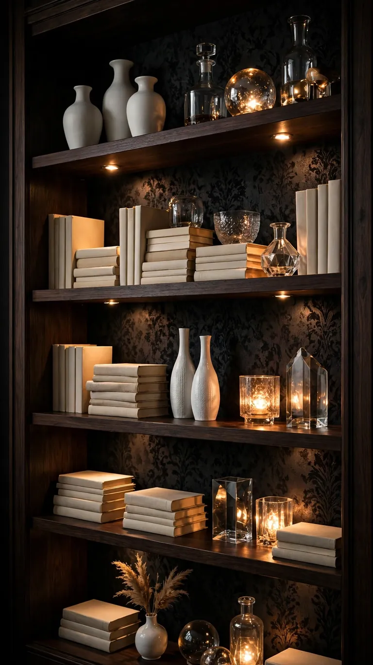
A dark, moody shelf back is the simplest way to make light colored objects pop. Charcoal, espresso, or deep navy wallpaper behind white vases, cream books, and glass objects creates a striking contrast that looks intentional and gallery like. This works brilliantly on living room bookcases and built in shelves where the rest of the room is light and airy. The dark inset adds visual weight and makes the whole wall feel more designed. It is also very forgiving of dust, which is a genuine bonus on high shelves.
Lighting makes or breaks a dark shelf back. If the shelf sits in a dim corner, the dark paper can swallow your objects instead of showcasing them, so add a small battery powered LED puck light or a stick on strip light to the underside of each shelf. The light grazing down the dark paper looks fantastic and makes the objects glow. When installing, work in bright light even if the shelf lives in a dark spot, because bubbles are harder to see on dark paper. A felt squeegee is your best friend here for a bubble free finish.
19. Scenic Mural Panel for a Storybook Backdrop
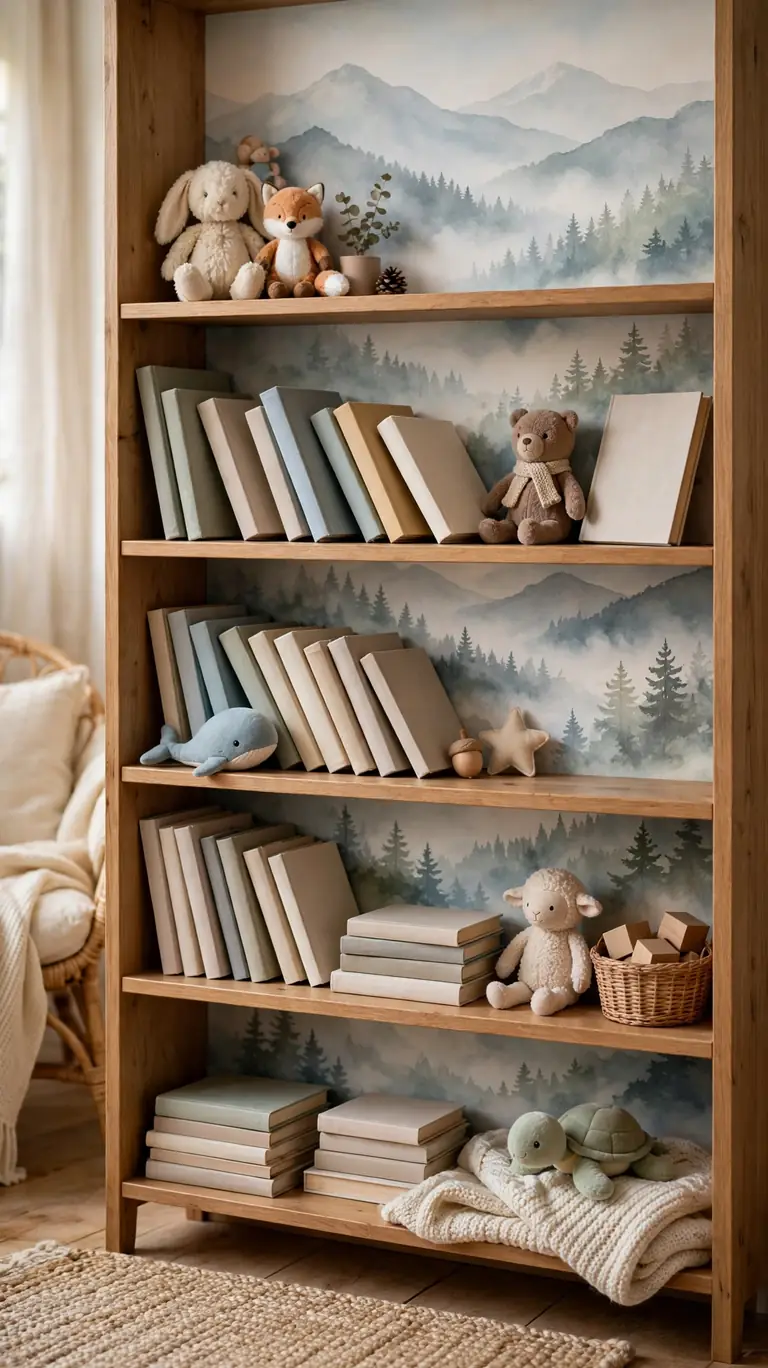
A scenic mural panel, like misty mountains, a forest, or a soft landscape, turns a bookshelf into a storybook scene. This is a magical choice for a child’s reading corner or a nursery bookcase, but it works in adult spaces too when the palette is muted. Use it on the back of one bookcase, keep the shelves styled loosely with books leaning and a few small figures, and let the landscape peek through. The depth of the scene makes shallow shelves feel much deeper than they are.
Mural panels are usually sold as a single large piece rather than a repeating roll, so measure your shelf back carefully and order the right size. If the mural is wider than your shelf, decide which part of the scene you want to keep and center it on the most visible shelf section. Unlike repeating patterns, you cannot hide a bad cut, so use a fresh blade for every trim. Apply the panel with a helper if it is large, because murals are unforgiving of wrinkles. Smooth from the center outward in slow strokes, and give it a full day before restocking the shelf.
20. Wallpaper the Sides, Paint the Back
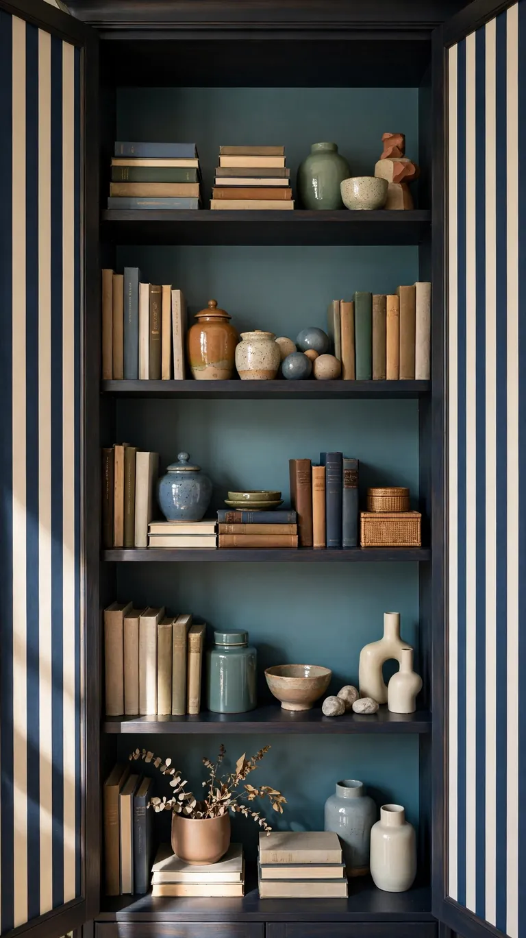
Here is a combination most people never think of: wallpaper the inside sides of the shelf and paint the back panel a coordinating solid color. The pattern on the sides frames each shelf like a border, while the painted back keeps the look calm and lets your objects shine. This works especially well on deep bookcases where the sides are very visible from an angle. Try a bold pattern on the sides, like a stripe or a small floral, with the back painted in a color pulled from the paper.
This project takes a little more planning but the payoff is a truly custom look. Paint the back panel first and let it cure fully, at least 24 hours, before you apply any wallpaper. The side panels of a shelf are narrower than the back, so measure each side separately because shelf depths can vary slightly. Cut the wallpaper for the sides with the pattern running in the same direction on both sides for symmetry. Press the paper firmly into the corner where the side meets the back, and trim the edge cleanly with a craft knife. The crisp line between paint and paper is what makes this look professional.
21. Seasonal Swap Wallpaper for Easy Holiday Refresh
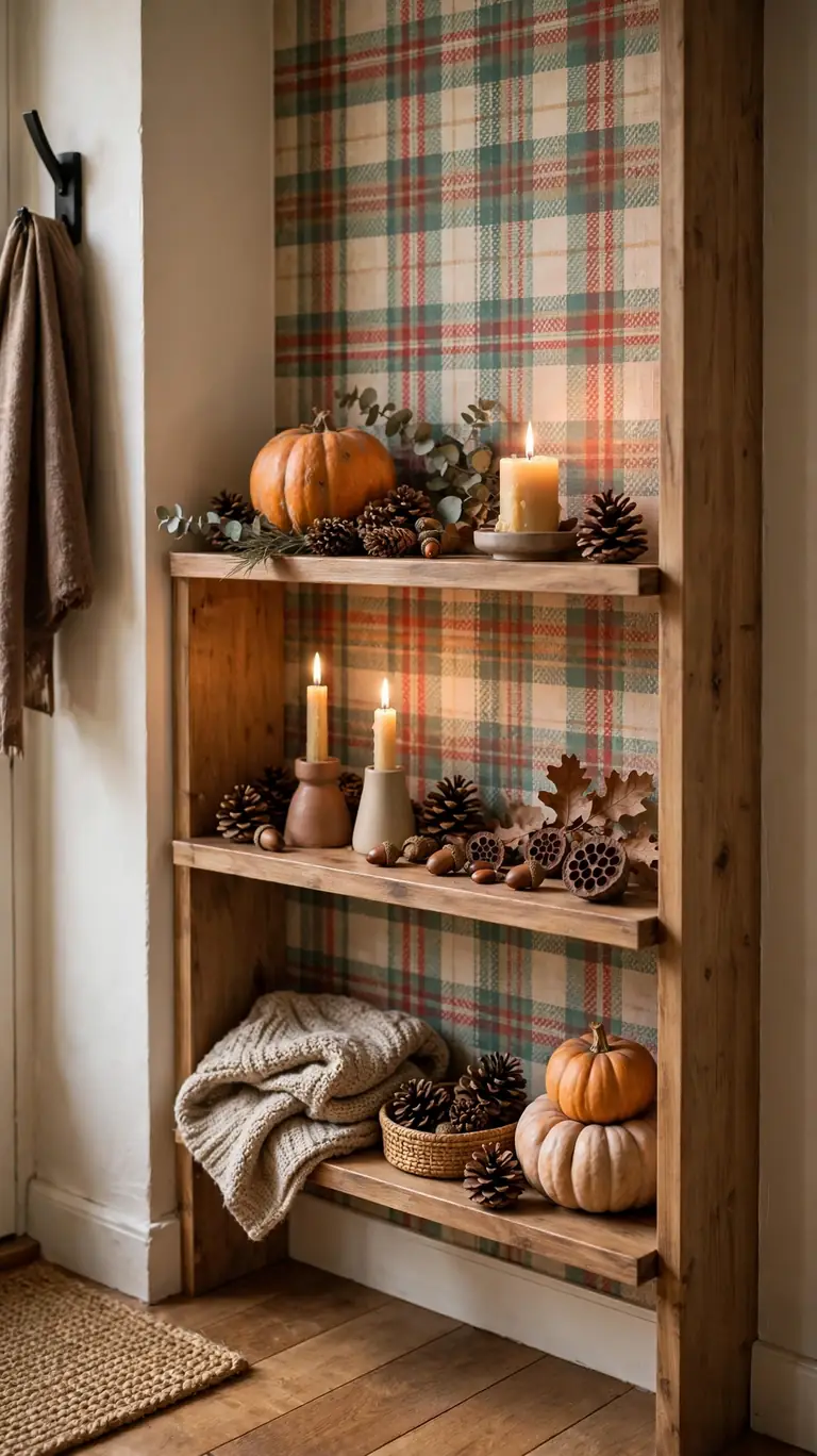
The beauty of peel-and-stick wallpaper is that it peels off, so why not treat your shelves to a seasonal wardrobe? A festive pattern, like subtle plaid for fall, tiny stars for winter, or a fresh floral for spring, on the back of a living room or entryway shelf gives you a whole new seasonal look in under an hour. Style the shelves with a few seasonal touches, a pumpkin, some pinecones, a string of fairy lights, and the room feels decorated without a full overhaul. When the season ends, peel it off and go back to your everyday paper.
To make seasonal swaps painless, keep your everyday wallpaper panels intact and stored flat between sheets of parchment paper when you swap them out. Label the back of each panel with its shelf position so reinstalling takes minutes. For the seasonal paper, buy one extra roll beyond what you measure, because holiday patterns in the exact colorway sell out and get discontinued fast. Install the seasonal paper the same careful way as always, and store it flat too. After a couple of seasons you will have a little library of shelf backs to rotate, which is a fun and cheap way to keep your home feeling fresh.
Frequently Asked Questions
Will peel-and-stick wallpaper damage my shelves when I remove it?
In most cases, no. Quality peel-and-stick wallpaper is designed to remove cleanly from smooth, sealed surfaces like painted wood, laminate, and finished MDF. The key is to pull it off slowly at a low angle rather than yanking it straight back. If the shelf is raw, unfinished wood or old flaking paint, the adhesive can pull fibers or paint chips with it, so seal those surfaces with a coat of primer or paint first. Always test a small hidden corner before committing to a full shelf.
Do I need to prep the shelf surface before applying wallpaper?
A little prep goes a long way. Wipe the shelf back with a damp cloth to remove dust, and use a degreasing cleaner on kitchen shelves or rubbing alcohol on bathroom shelves to remove any residue. Let the surface dry completely, because moisture under the paper causes bubbles and poor adhesion. If the shelf back is glossy laminate, a quick scuff with fine sandpaper followed by a wipe gives the adhesive more to grip. Most failed installations trace back to a dusty or greasy surface, not a bad product.
What tools do I actually need to install wallpaper on shelf backs?
You need less than you think: a tape measure, a pencil, scissors or a craft knife, a metal ruler for straight cuts, and something to smooth the paper like a felt squeegee, a dry cloth, or a credit card. A small level or a level app on your phone helps keep patterns straight. Painter’s tape is useful for dry fitting panels before you commit. That is genuinely the whole kit, and most of it is already in a junk drawer somewhere.
Which patterns work best on small or dark shelves?
On small shelves, lean toward small to medium scale patterns, because large motifs get chopped up and look random. Light backgrounds with airy prints keep small shelves feeling open, while dark papers on small shelves can feel heavy unless you add a light source. On dark shelves, which usually means a dark stained back panel you cannot easily paint, patterns with light or metallic details show up best. When in doubt, order a sample, tape it up, and live with it for a day before buying the full roll.
How do I measure and cut wallpaper for a shelf back?
Measure the inside width and height of each shelf back section separately, because shelves are rarely perfectly square. Subtract about an eighth of an inch from each dimension so the panel sits flat without bunching into the corners. Transfer the measurements to the back of the wallpaper, cut with a sharp blade and a straight edge, and dry fit each panel with painter’s tape before peeling the backing. Cut panels one section at a time rather than batch cutting, since tiny size differences add up.
Conclusion
Shelf wallpaper is one of those rare decorating projects that delivers a big visual payoff for very little money, time, or commitment. Whether you choose a soft linen weave, a bold botanical, or a moody emerald, the back of your shelf becomes a backdrop that makes everything in front of it look more intentional. Start with one bookcase or a single set of open shelves, take your time measuring and smoothing, and do not stress about perfection. Small imperfections hide behind books and baskets anyway. The renter friendly nature of peel-and-stick paper means you can experiment boldly, swap seasonally, and change your mind without consequences. Pick the idea that made you smile, order a sample first, and give your shelves the refresh they deserve this weekend. Keep a few leftover scraps in a drawer for quick repairs, share your favorite before and after with a friend, and remember that the best shelf is one that reflects the way you actually live. Happy wallpapering.