24 Best Bathroom Color Schemes for a Beautiful Refresh
Last spring I finally repainted my tiny hall bathroom, and I swear it felt like getting a whole new room for the price of one gallon of paint. The old walls were a dull beige that made everything look tired, and I had been putting the project off for two years because I could not decide on a color. Standing in the paint aisle with thirty shades of white was honestly overwhelming. But once I picked a warm, soft white and rolled it on, the whole space lit up. The tile looked cleaner, the mirror looked bigger, and I started actually enjoying my morning routine again. That is the thing about bathroom color schemes. This room is small, so color does more work here than almost anywhere else in your home. Whether you love calm neutrals, moody darks, or something a little bold, the right palette can turn an ordinary bathroom into your favorite spot in the house. These 24 bathroom color schemes cover every mood and style, with the exact wall, tile, fixture, and accent combinations that make each one work.
1. Classic White and Chrome
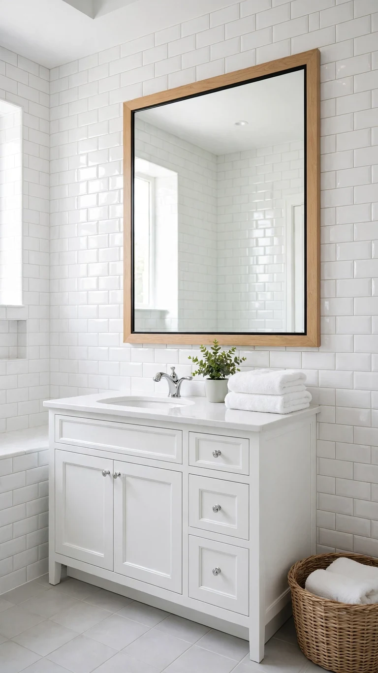
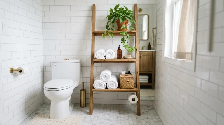
You cannot go wrong with an all white bathroom done right. Start with crisp white subway tile on the walls, a soft white paint on the ceiling, and light gray or white floor tile to ground the space. Chrome fixtures keep everything bright and reflective. The secret to making white feel designed instead of plain is texture. Mix glossy tile with a matte painted wall, add a woven basket, a fluffy white rug, and maybe a small green plant. Those layers keep the room from feeling cold or clinical. White also bounces light around, so it is the best choice for a windowless bathroom or a tiny powder room. When you want a change, just swap the towels and art.
Try this before you commit. Paint a big poster board white and tape it to the wall for a few days, checking it in morning and evening light. White paint can lean blue, yellow, or gray depending on your lighting, and you want a clean neutral white that does not fight your tile. A warm leaning white works best in most bathrooms because it keeps the space feeling welcoming rather than stark.
2. Warm White and Brass
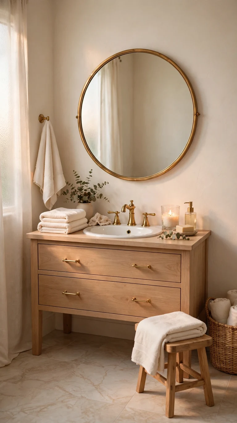
If all white feels a little cold to you, warm white with brass is the cozy upgrade. Paint the walls a creamy warm white, choose a marble look floor tile with soft beige veining, and let brass faucets, mirror frames, and cabinet pulls bring in the warmth. Brass glows against cream tones in a way chrome never does, and it makes the whole room feel like a boutique hotel. Keep the vanity simple, maybe a soft white or light wood, so the brass stays the star. Add ivory towels, a small wooden stool, and a candle in a glass holder, and the room feels calm and a little bit luxurious. This palette works beautifully in bathrooms with warm natural light, and it flatters skin tones in the mirror.
One tip that saves money. You do not have to replace every fixture to get this look. Swap just the faucet, the mirror, and the cabinet hardware for brass, and keep your existing white toilet and tub. Mixed whites read as intentional when the metals match, and those three swaps deliver most of the visual impact for a fraction of a full remodel.
3. Soft Gray and White
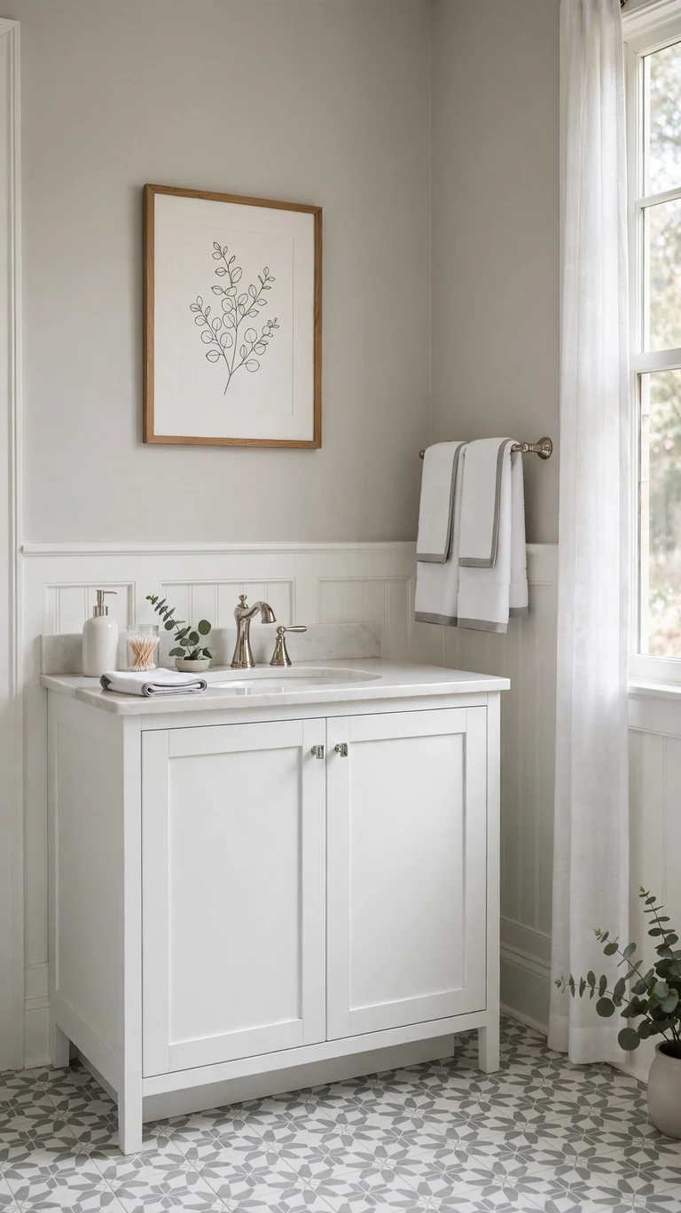
Soft gray and white is the calm, modern neutral that never goes out of style. Paint the walls a light warm gray, add white wainscoting or white subway tile on the lower half, and finish with polished nickel or chrome fixtures. The gray keeps the room from feeling stark while the white trim keeps it fresh and bright. For the floor, a gray and white patterned tile or a simple light gray porcelain works beautifully. This scheme is perfect if you want a bathroom that feels clean and current without any risk. Layer in white towels with a gray border and a simple framed print to finish the look.
Before you buy paint, test your gray in the actual bathroom light. Grays can shift purple or blue under cool bulbs, so try a few sample boards and look at them morning and night. A gray with warm undertones stays cozy, while a cool gray feels more crisp and modern. Pick the undertone that matches the mood you want, and keep it consistent across paint, tile, and textiles.
4. Navy and White
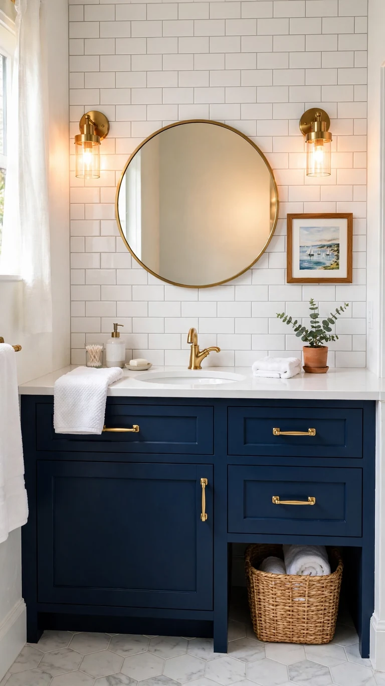
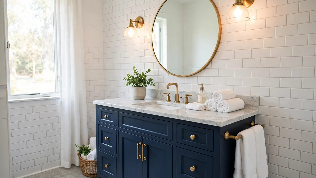
Navy and white is bold without being scary, and it works in bathrooms of every size. The classic move is a navy vanity against white walls and white tile, with brass or gold hardware to warm it up. Navy reads as almost neutral once it is in place, which surprises most people. It hides water spots and wear better than white cabinets, and it makes white tile and fixtures pop. If a full navy vanity feels like too much, paint just one accent wall navy and keep everything else white. Either way, add warm metal accents, because navy plus brass is one of those combinations that always looks expensive. Finish with white towels, a round mirror, and maybe a small piece of coastal art.
Here is the trick for small bathrooms. Keep the navy low in the room, on the vanity or the wainscoting, and keep the upper walls white. Dark color at eye level and below grounds the space without closing it in, while white above keeps the ceiling feeling high. This balance gives you the drama of navy with none of the cave feeling.
5. Sage Green and Cream
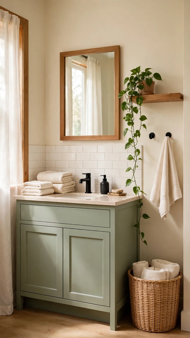
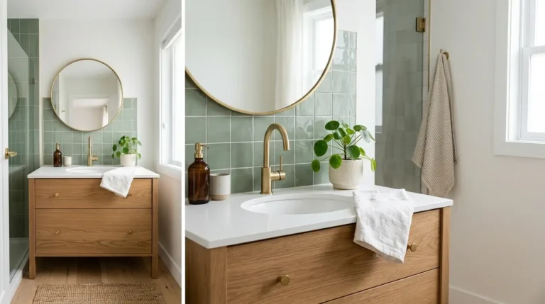
Sage green is the color of calm, and it is having a well deserved moment in bathrooms. Paint the vanity or the walls a soft sage, pair it with creamy white tile and warm cream walls, and finish with matte black or aged bronze fixtures. Sage sits beautifully between warm and cool, so it plays well with almost any existing tile you cannot change. It feels fresh and natural, like bringing a little bit of the garden indoors, and it is soft enough to live with for years without tiring of it. Add natural wood accents, a woven hamper, cream towels, and a trailing plant on a shelf. The whole room will feel like a quiet retreat.
A practical tip. If you are nervous about green paint, start with the vanity instead of the walls. A sage vanity is a smaller commitment, it is easier to repaint later, and it gives you that pop of color right where your eye lands when you walk in. You can always paint the walls later once you see how much you love it.
6. Charcoal and Oak
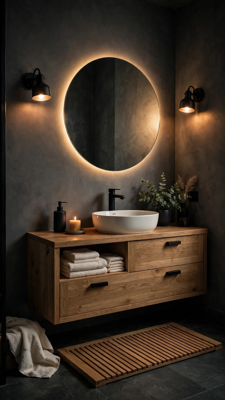
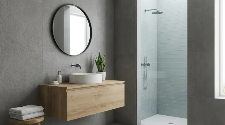
Charcoal and oak is the moody modern scheme that still feels warm. Use charcoal gray on the walls or as a large format wall tile, then warm everything up with a natural oak vanity and oak shelving. Matte black fixtures tie the dark tones together, while the wood keeps the room from feeling cold or industrial. A white vessel sink or white countertop gives the eye a bright resting spot, and good lighting is essential here. Add a backlit mirror or warm sconces on either side of the mirror so the dark walls glow instead of looming. This palette suits larger bathrooms and primary suites best, where the drama has room to breathe. Finish with charcoal or cream towels and a simple oak bath mat.
Lighting makes or breaks this scheme, so plan it before you paint. Dark walls absorb light, which means you need more of it. Two warm sconces plus a bright overhead on a dimmer will keep the room functional in the morning and moody at night. Test your charcoal sample with the lights you plan to use, since dark paint looks very different under warm versus cool bulbs.
7. Blush Pink and White
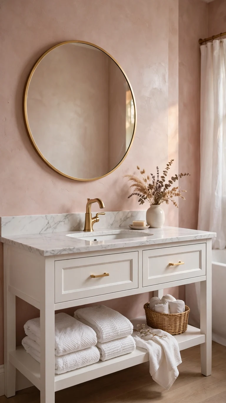
Blush pink brings a soft, romantic warmth to a bathroom without feeling childish. The grown up way to do it is blush on the walls or as a blush subway tile in the shower, paired with crisp white fixtures and brushed gold or brass accents. Keep the pink muted and dusty rather than bright, and it reads as a warm neutral instead of a statement. White marble look counters and a white vanity keep the palette light, while the gold hardware adds just enough glamour. Add white towels with a subtle texture, a small vase with dried flowers, and a round gold framed mirror to complete the soft, pretty feeling.
The key is restraint with the pink. Use it on the walls or the tile, but not both, and let white and gold do the rest of the talking. Too much pink can feel sweet, but pink as the supporting color with white as the lead feels sophisticated. If you want to test it first, paint one wall and live with it for a week. You will know quickly whether you love it or want to go softer.
8. Black and White
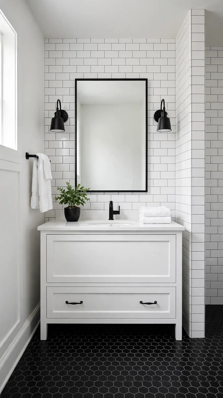
Black and white is the timeless high contrast scheme that always looks intentional. Try black floor tile, either classic hex or a bold patterned cement look, with white subway tile walls and a white vanity. Matte black faucets and hardware tie it together, or mix in a little brass for warmth. This palette works in any size bathroom, and it hides dirt on the floor better than an all white scheme. The trick is balance. Too much black feels heavy, too much white feels plain, so aim for roughly two thirds white and one third black. A black framed mirror, black sconces, and black cabinet pulls distribute the dark color evenly around the room. Finish with white towels and one green plant for a touch of life.
Grout choice matters more here than in any other scheme. White grout on white wall tile keeps things bright, but on the black floor, a dark gray grout hides stains and keeps the pattern crisp. Sealed grout in a wet area is always worth it, and in a black and white bathroom the grout lines are part of the design, so choose them on purpose instead of as an afterthought.
9. Seafoam and Sand
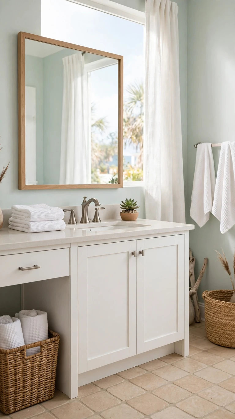
Seafoam green and sandy beige is the beach house palette that feels like a deep breath. Paint the walls a pale seafoam, choose a sandy beige floor tile, and keep fixtures and the vanity white. Brushed nickel or chrome hardware keeps things cool and fresh. This scheme is made for bathrooms with good natural light, where the colors glow softly through the day. It feels clean and relaxed without trying too hard, and it is a wonderful choice for a guest bathroom that should feel like a mini vacation. Add white waffle towels, a piece of driftwood style decor or a woven basket, and a small succulent. The whole room will feel like a calm morning at the shore.
If your bathroom has no window, you can still pull this off with the right lighting. Swap cool daylight bulbs for a balanced neutral white so the seafoam does not turn minty or gray. A large mirror helps bounce what light you have around the room. Paint a sample board and check it under your actual bathroom bulbs before committing, because pale greens shift more than almost any other color under artificial light.
10. Terracotta and Cream
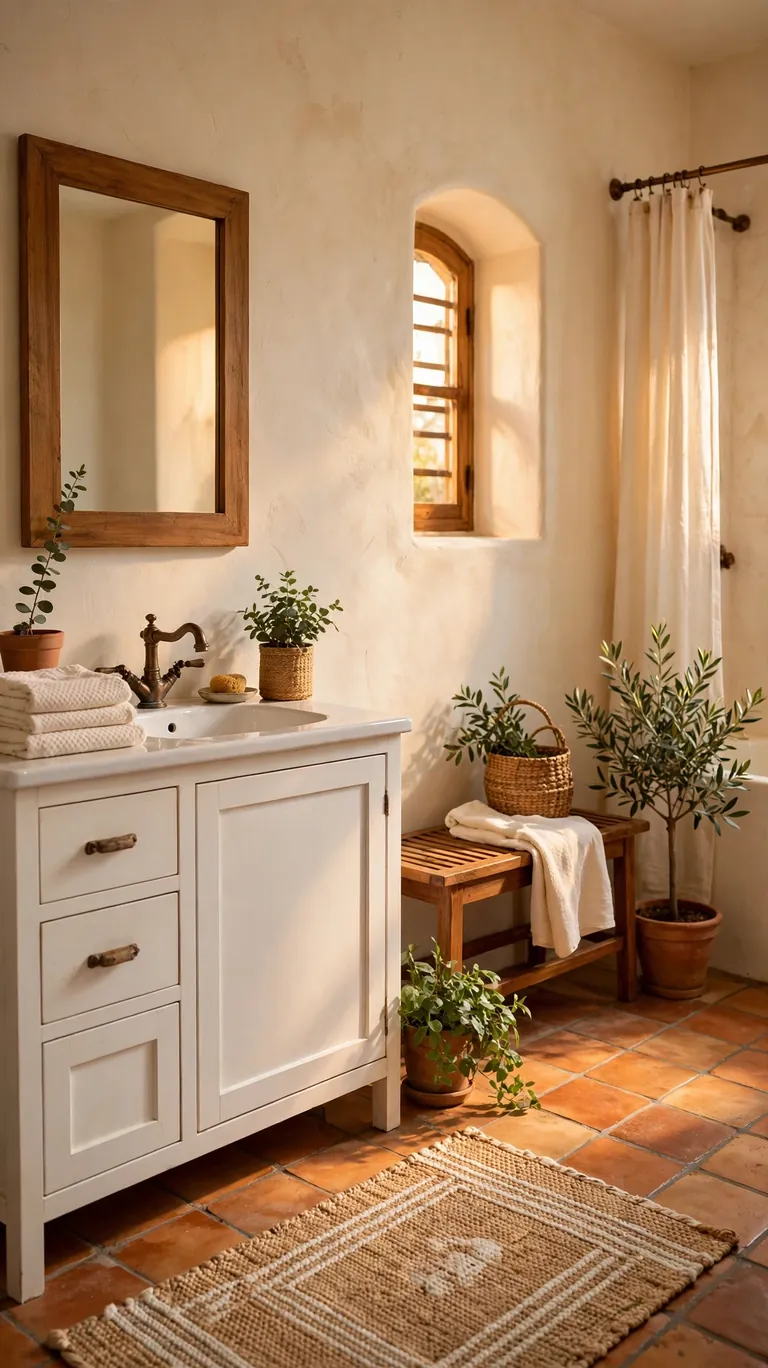
Terracotta brings earthy Mediterranean warmth that makes a bathroom feel sun baked and inviting. The easiest way in is terracotta floor tile paired with warm cream walls and a simple white vanity. Aged bronze or matte black fixtures ground the warm tones, and natural wood accents like a teak bench or wooden mirror frame complete the look. Terracotta has enough color to be interesting but enough brown to act like a neutral, so it pairs with almost anything. This scheme shines in bathrooms with warm light and works beautifully with plants, since green pops against the orange tones. Finish with cream towels, a woven rug, and maybe a patterned hand towel for a little extra character.
Because terracotta tile varies a lot from box to box, open several boxes and mix the tiles before your installer starts. This blends the natural variation evenly across the floor instead of leaving one patch darker than the rest. It is a five minute step that makes a professional looking floor, and your future self will thank you every time you walk in barefoot.
11. Powder Blue and White
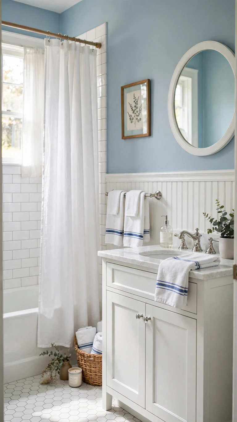
Powder blue and white is fresh, cheerful, and a little bit nostalgic in the best way. Paint the walls a soft powder blue, add white beadboard or white subway tile on the lower walls, and keep the fixtures chrome and the vanity white. This is the palette of a classic cottage bathroom, and it makes mornings feel brighter. It works especially well in small bathrooms because the light blue recedes like the sky, making walls feel farther away. Add white towels with a blue stripe, a simple white shower curtain, and a small framed botanical print. Keep everything else simple and let the pretty wall color do the work.
The trick is picking a blue with staying power. Avoid anything too icy or too baby blue, which can feel dated fast. Look for a powder blue with a whisper of gray in it. That gray undertone is what keeps it sophisticated instead of nursery like. Test it next to your white trim, because the contrast between the blue and a clean white is what makes this scheme sing.
12. Forest Green and Brass
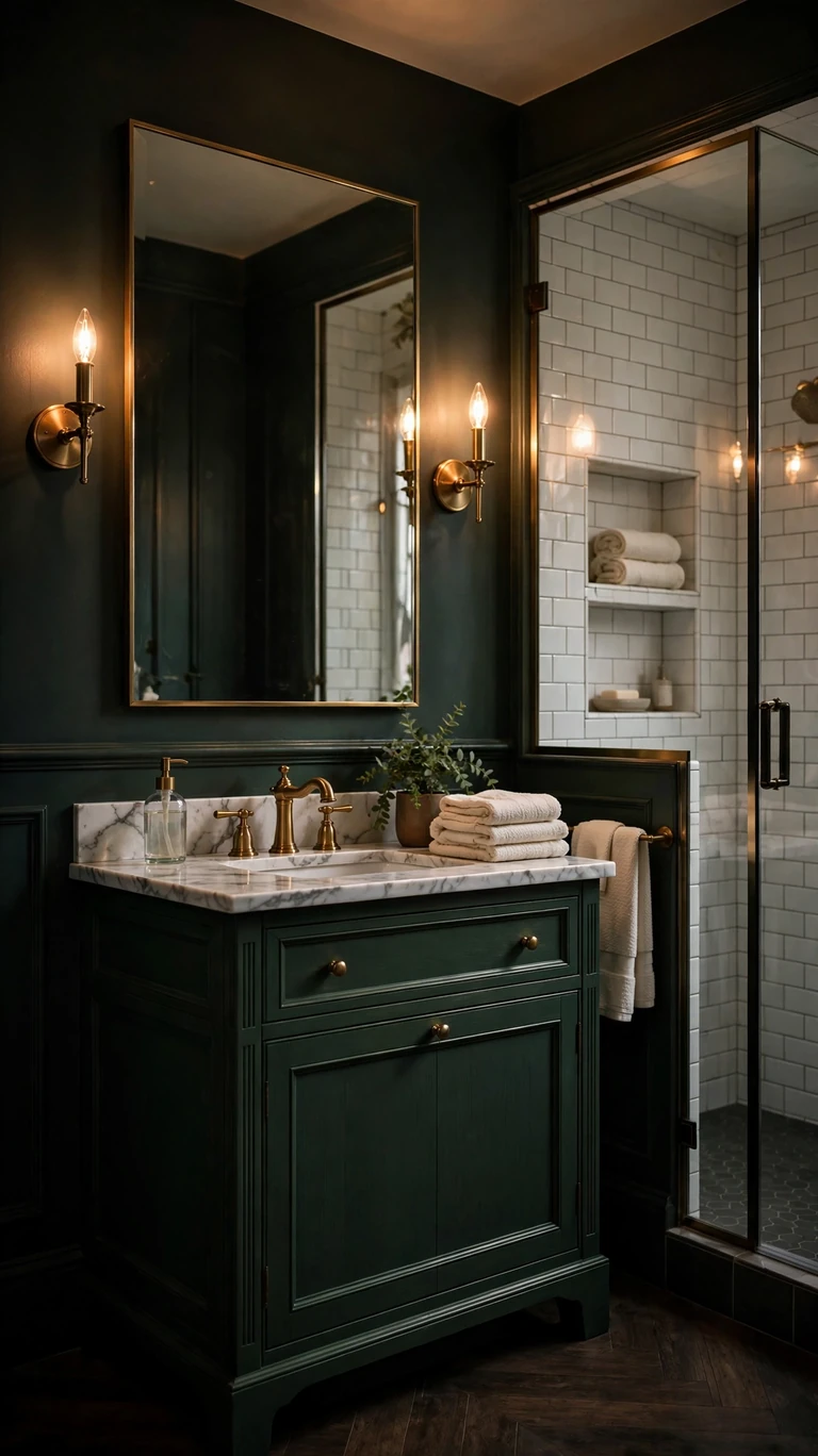
Forest green and brass is rich, moody, and unapologetically elegant. Paint the vanity or the walls a deep forest green, add a white marble look countertop, and let brass faucets, sconces, and hardware glow against the dark green. White tile in the shower keeps things bright where it counts, and a large mirror doubles the light. This is a wonderful scheme for a primary bathroom, where the drama feels indulgent instead of overwhelming. The green feels like a library or a gentleman’s club, but the brass keeps it warm and welcoming. Finish with cream or ivory towels, which look stunning against the green, and a small plant for contrast.
Dark green needs great lighting to look its best, so layer it. A bright overhead for getting ready, warm sconces at the mirror for flattering light, and maybe a small nightlight style glow for evening baths. Dimmer switches are your friend here, letting the room shift from functional to atmospheric. Paint your sample and check it at night with the lights on, because that is when this scheme really earns its keep.
13. Greige and Stone
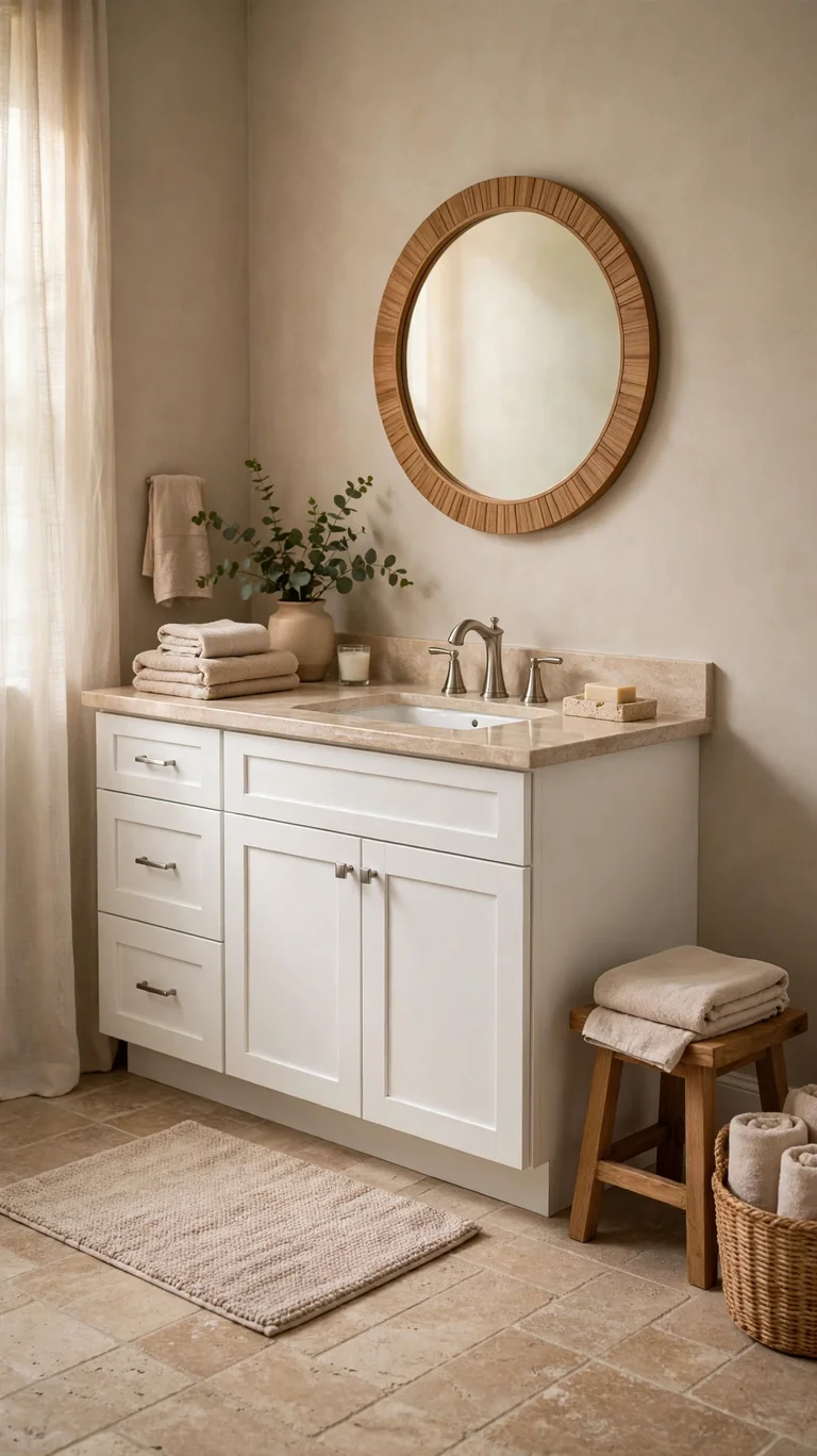
Greige, that perfect mix of gray and beige, paired with stone tones is the ultimate easy neutral. Paint the walls a warm greige, choose a stone look floor tile in a similar tone, and finish with brushed nickel fixtures. Everything blends in the most calming way, and the room feels pulled together with almost no effort. This is the scheme for people who want a bathroom that feels serene and expensive without any bold moves. The magic is in the undertones. Keep every greige and stone in the same warm family so nothing clashes. Add texture instead of color for interest, a nubby bath mat, folded beige towels, a travertine soap dish, and a wooden stool. The room will feel like a quiet spa.
Because this palette is so tonal, lighting temperature matters a lot. Cool white bulbs can turn warm greige an unflattering gray, so choose warm white bulbs around 2700 to 3000 Kelvin. The warm light keeps every beige and stone tone glowing. Check your paint sample under the bulbs you actually use, not just in the store, and you will get the cozy result you are picturing.
14. Pale Yellow and White
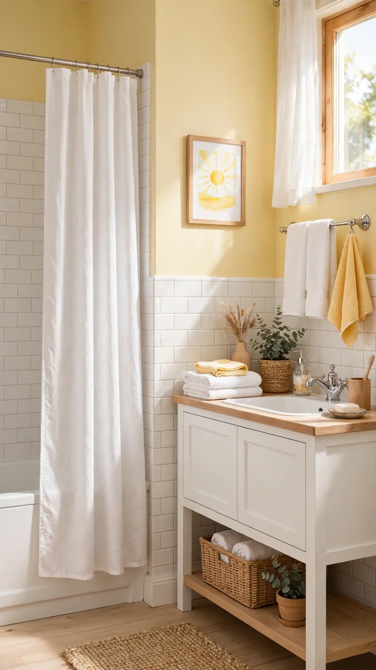
Pale yellow brings sunshine into a bathroom even on gray mornings. The trick is keeping it very pale, think buttercream or soft lemonade, on the walls, with white tile, white fixtures, and chrome hardware. Done right, it feels cheerful and warm rather than loud. This scheme is wonderful for a small bathroom with no window, because the yellow bounces a golden glow that fakes daylight beautifully. Keep the vanity white or light wood, and add white towels. A simple white shower curtain and a small sunny art print complete the happy feeling. If full yellow walls feel like too much, try it on the ceiling instead, a classic designer trick that lifts the whole room.
Yellow is one of those colors that looks very different in the can than on the wall, so always test a large sample. Paint tends to dry a little darker and more saturated than the chip suggests. Go one shade lighter than you think you want, and you will land in that perfect pale zone. Live with the sample for a few days and check it in morning light, since that is when you will see it most.
15. Slate Blue and Marble
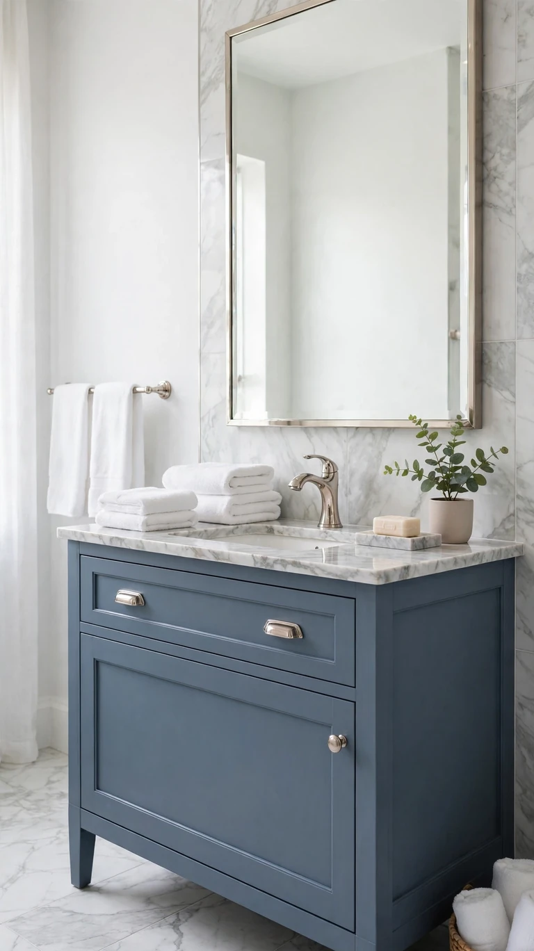
Slate blue is the sophisticated middle ground between gray and navy, and it pairs gorgeously with marble. Paint the walls or the vanity a dusty slate blue, add marble look tile with soft gray veining, and finish with polished nickel fixtures. The blue has enough color to be interesting but enough gray to stay calm and grown up. This scheme feels tailored and a little bit luxurious, like a nice hotel bathroom. It works in both small powder rooms and large primary baths. Add white towels, a marble soap dispenser or tray, and a simple green plant. The cool palette feels crisp and clean, which is exactly what most people want from a bathroom.
Slate blue changes a lot between daylight and lamplight, so test your sample in both. In the day it reads fresh and airy, at night it deepens into something moodier. Make sure you love both versions before you commit. If you are painting the vanity instead of the walls, use a durable cabinet paint or enamel, because bathroom vanities take a beating from water and cleaning products.
16. Chocolate Brown and Cream
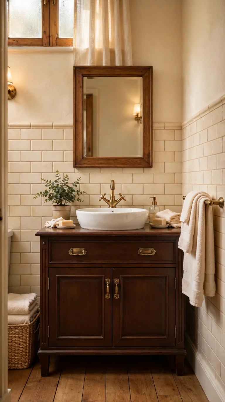
Chocolate brown is the cozy, unexpected neutral that makes a bathroom feel like a warm hug. Use it on the vanity or as wainscoting below a chair rail, with warm cream walls above, cream tile, and brass fixtures. Brown grounds a room the way black does but with much more warmth, and it hides wear beautifully. A white countertop or vessel sink gives contrast, and good lighting keeps the brown rich instead of muddy. This scheme feels traditional in the best way, like a classic library translated into a bathroom. Add cream towels, a wooden framed mirror, and a small plant. The result is warm, inviting, and a little bit surprising, which makes guests remember it.
If brown feels risky, start with the vanity, which is the easiest brown element to change later. A chocolate vanity against cream walls is a classic combination that has looked good for decades, so it is a safe bet that still feels distinctive. Keep the walls a true warm cream rather than stark white, because white next to chocolate can look harsh while cream lets the brown glow.
17. Mint and White
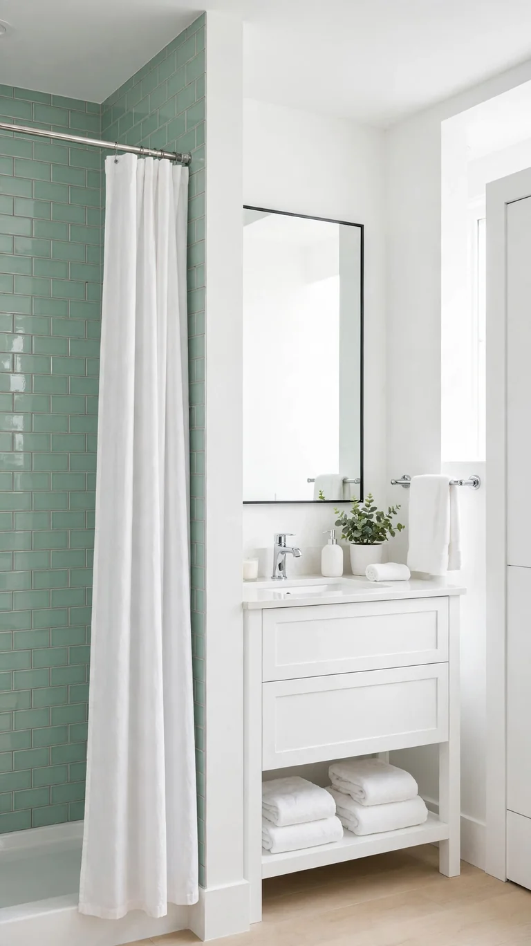
Mint green and white is fresh, clean, and quietly cheerful. The modern way to wear it is mint as an accent, maybe mint subway tile in the shower or a mint painted vanity, with white walls, white fixtures, and chrome hardware everywhere else. Mint feels crisp and a little retro without tipping into vintage kitsch, as long as you keep the rest of the room simple and current. It is a lovely choice for a kids bathroom or a cheerful guest bath. Add white towels, a simple white shower curtain, and one small plant. The room will feel like a breath of fresh air every time you walk in.
Mint can go wrong fast if the undertone is off, so choose carefully. A mint with too much yellow looks dated, while one with a whisper of blue or gray looks fresh and modern. Hold your sample next to a pure white tile, because that contrast will reveal the undertone instantly. When the mint looks clean and cool against the white, you have found the right one.
18. Burgundy and Gold
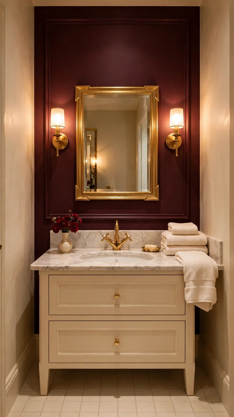
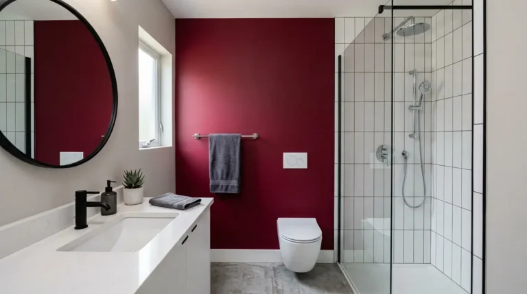
Burgundy and gold is for the bathroom that wants to feel like a jewel box. Paint one accent wall or the vanity a deep burgundy, keep the other walls a warm cream, and let gold or brass fixtures, mirror frames, and hardware bring the glamour. Cream or marble look tile keeps the palette grounded, and the burgundy gives the room a richness that surprises everyone who walks in. This scheme works best in a powder room or a small bathroom, where the drama feels intentional and enveloping rather than overwhelming. Candlelight or warm sconces make the burgundy glow beautifully. Finish with cream towels, a gold framed mirror, and maybe a small bud vase with deep red flowers.
Because burgundy is such a strong color, keep everything else quiet. Cream walls, simple tile, minimal decor. The burgundy is the star and it does not need competition. If you are nervous, try it in the powder room first, which is the perfect low risk place for a bold color since it is small and guests only see it briefly. You will probably love it so much you will want it everywhere.
19. Warm Taupe and White
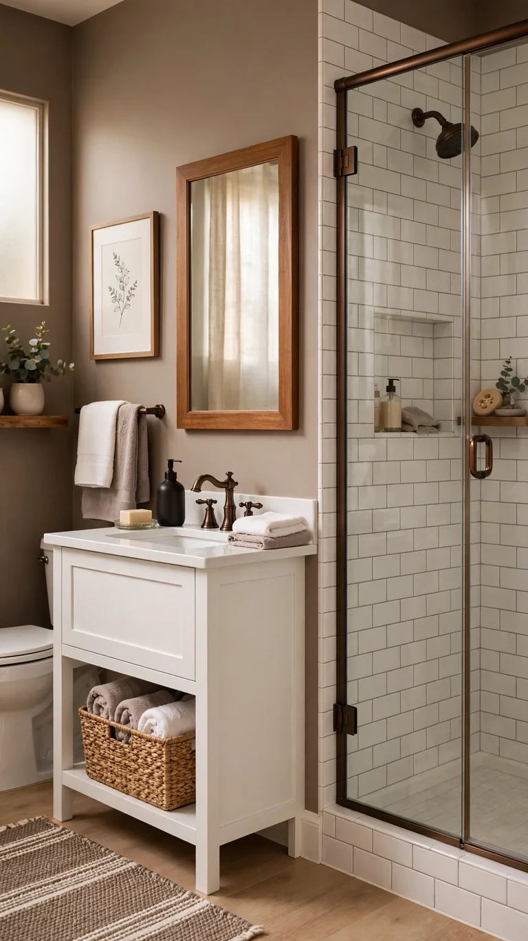
Warm taupe is the cozy neutral that sits between brown and gray, and it makes a bathroom feel soft and enveloping. Paint the walls a warm taupe, add white subway tile in the shower, and finish with oil rubbed bronze or matte black fixtures for contrast. A white vanity keeps things bright, or a medium wood vanity adds even more warmth. Taupe is forgiving in a way white is not. It hides water spots, looks good in any light, and never feels stark. This is a wonderful scheme for a busy family bathroom that needs to look good with minimal effort. Add white and taupe towels, a woven basket for storage, and a simple framed print. The room will feel calm and put together every single day.
Taupe lives or dies by its undertone, so test carefully. A taupe with pink undertones can look muddy next to white tile, while one with warm golden undertones glows. Paint a large sample board and move it around the bathroom at different times of day. The right taupe will look like a warm hug in every light, and that is the one to buy.
20. Deep Teal and Copper
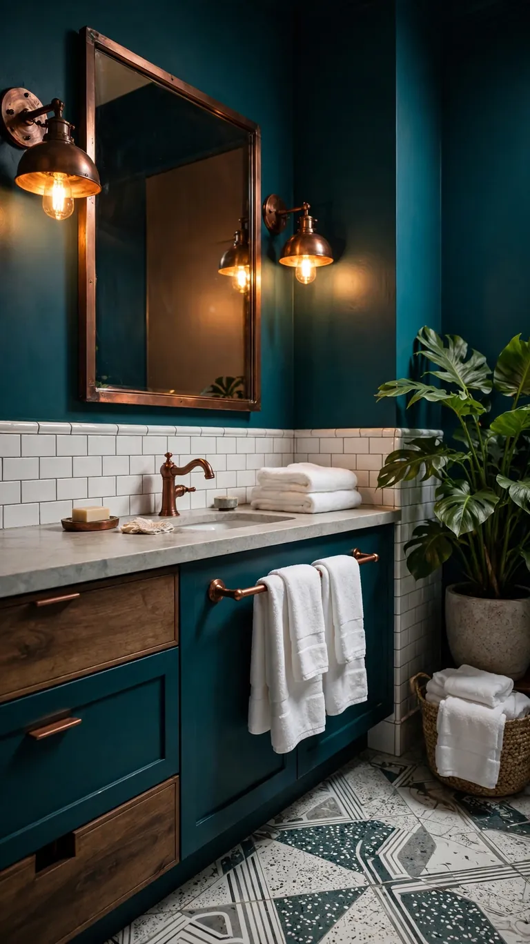
Deep teal with copper accents is the bold, artistic scheme that looks like it belongs in a design magazine. Paint the walls or tile the shower in a rich teal, and let copper faucets, light fixtures, and hardware shine against it. White or light gray counters keep the palette from getting too dark, and a large mirror is essential to bounce light around. Teal is a chameleon color, reading blue in some lights and green in others, which keeps the room interesting all day. This scheme suits a primary bathroom or a dramatic powder room. Finish with white towels, which pop beautifully against teal, and a plant with big green leaves to echo the wall color.
Copper fixtures need a little more care than chrome, since they can spot and patina over time. Wipe them dry after use and clean with a soft cloth, and they will keep their warm glow for years. If you love the look but want less maintenance, brushed copper finishes hide water spots better than polished ones. Either way, the teal and copper combination is worth the small extra effort.
21. Lavender Gray and White
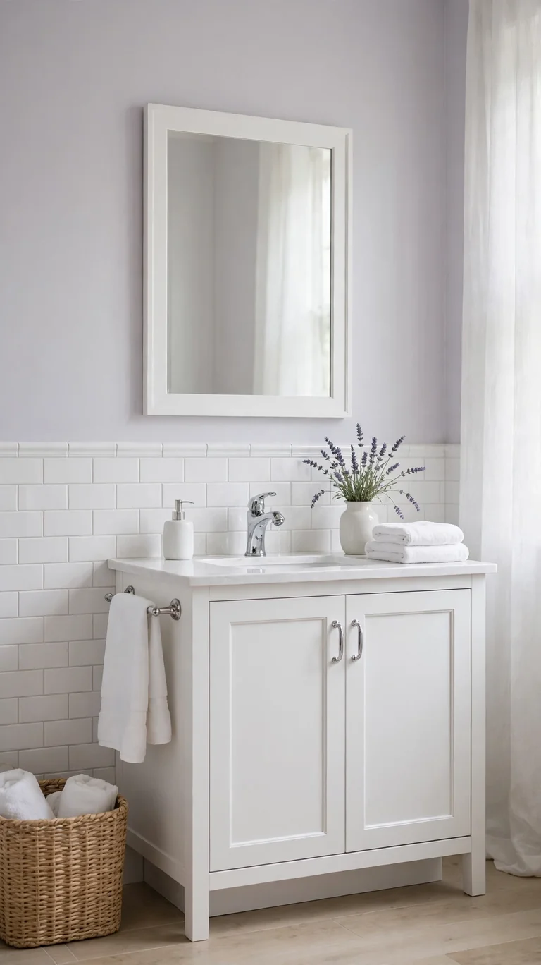
Lavender gray is the softest, dreamiest neutral on this list. It is essentially a gray with a whisper of purple, and in a bathroom it feels calm, clean, and a little bit romantic. Paint the walls a pale lavender gray, add white tile and white fixtures, and finish with chrome or polished nickel hardware. The purple undertone is subtle enough that the room still reads as neutral, but it adds a softness that plain gray lacks. This scheme is lovely in a primary bathroom where you want to unwind, and it looks beautiful in both natural and artificial light. Add white towels, a small vase with lavender sprigs or eucalyptus, and a simple white framed mirror.
The danger with lavender gray is going too purple, which can feel dated. Stick to the palest, grayest version you can find, one that looks almost gray until you hold it next to a true gray. That whisper of color is all you need. Test your sample next to your white tile, because the contrast will show you exactly how much purple is really in there.
22. Olive Green and Black
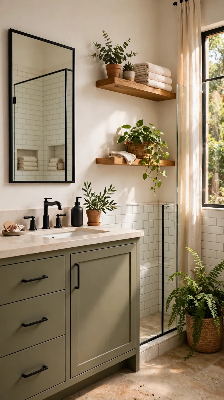
Olive green and black is earthy, modern, and a little bit edgy. Paint the vanity or an accent wall a muted olive, pair it with matte black fixtures and hardware, and keep the walls a warm white with simple white tile. Natural wood accents like an oak shelf or a wooden stool warm up the combination beautifully. Olive is a grounded, natural color that feels calm without being boring, and black gives it a crisp modern edge. This scheme works well in a primary bathroom with good light, and it looks fantastic with plants, since green on green is always harmonious. Finish with cream towels and a black framed mirror.
Balance is everything here. Olive and black can feel heavy if they dominate, so let warm white do most of the work on the walls and ceiling. Use the olive on the vanity or one wall, and the black on fixtures and small accents only. That way you get the earthy modern feeling without the room feeling dark. Good lighting, especially warm sconces at the mirror, keeps the olive rich and the black crisp.
23. Cream and Natural Wood
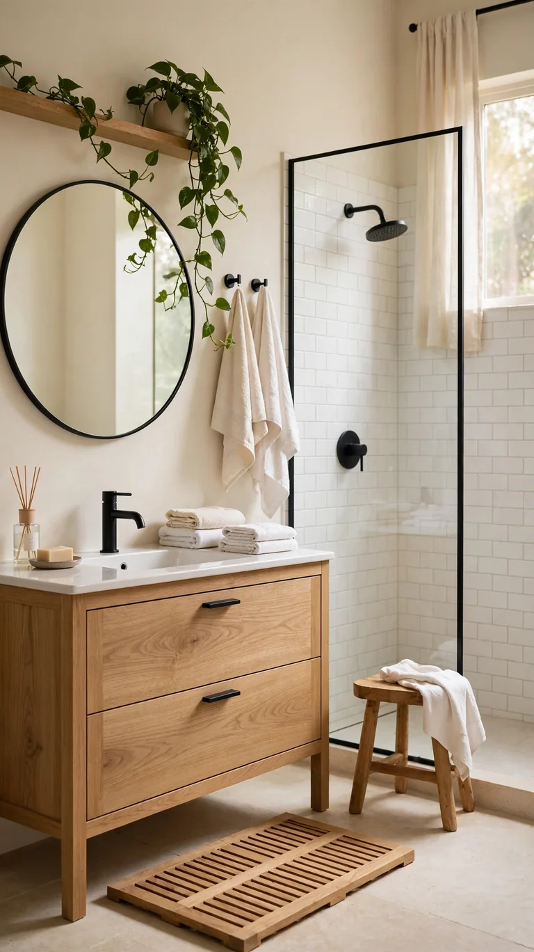
Cream walls with natural wood is the warm minimalist scheme that never feels cold. Paint the walls a soft cream, choose a natural wood vanity in oak or teak, and add white tile in the shower with matte black or bronze accents for definition. This palette is all about natural materials and soft light, and it makes a bathroom feel like a calm retreat. It works in any size space and suits every style from Scandinavian to rustic to modern organic. The cream keeps things bright while the wood adds warmth and texture. Add cream and white towels, a wooden bath mat or stool, and a trailing plant. The room will feel like a deep breath.
Wood in a bathroom needs protection from moisture, so choose wisely. Teak and properly sealed oak handle humidity well, and a good water resistant finish on the vanity is essential. Keep the wood away from direct shower spray, and wipe up standing water. With those simple precautions, natural wood brings a warmth to a bathroom that no painted cabinet can match.
24. Moody Black and Brass
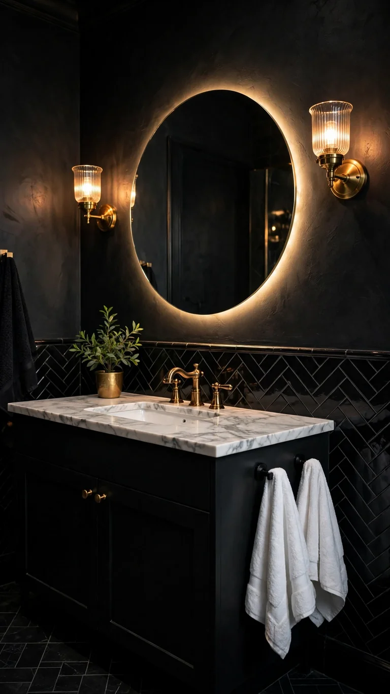
Moody black with brass is the most dramatic scheme on this list, and it is absolutely stunning when done right. Use black on the walls or as dramatic black tile, add brass faucets, sconces, and hardware that glow against the dark, and break it up with white marble look counters or a white vanity top. Black makes a small powder room feel like a chic cocktail lounge, and in a larger bathroom it feels bold and luxurious. The brass is essential, because it is the warmth that keeps black from feeling flat or cold. Good lighting is non negotiable here. Layer a bright overhead, warm sconces, and a backlit mirror so the room glows. Finish with white or cream towels for contrast and a small plant for life.
The secret to black walls is the finish. A matte or eggshell black looks rich and velvety, while glossy black can look harsh and show every imperfection. If full black walls feel like too much, try black wainscoting with a lighter wall above, or a black vanity against lighter walls. You still get the drama with half the commitment.
Frequently Asked Questions
What is the best color for a small bathroom?
Light colors are the safest bet for a small bathroom because they reflect light and make walls feel farther away. Soft white, pale gray, powder blue, and warm cream all open up a tight space. That said, you can absolutely use a dark color in a small bathroom if you do it strategically. A navy or forest green vanity with white walls above gives you richness without closing the room in. The real rule is contrast and light. Keep the ceiling white, use a large mirror, and make sure your lighting is bright and warm. A small bathroom with great light can handle almost any color.
Should bathroom walls and tile be the same color?
They do not have to match, but they should coordinate. The easiest approach is to keep walls and tile in the same color family with slightly different tones, like a soft gray wall with white tile, or cream walls with beige tile. This creates depth without busy contrast. If you want more drama, let one be the star. A bold tile with quiet walls, or a bold wall color with simple white tile. What you want to avoid is two strong patterns or colors fighting each other. When in doubt, make the tile simple and let the paint do the talking, since paint is cheaper and easier to change later.
What color fixtures go with everything?
Chrome and polished nickel go with literally everything, which is why they are the default in most bathrooms. They are bright, affordable, and never look dated. Brushed nickel is a close second and hides water spots better. If you want warmth, brass and gold work with whites, creams, greens, navies, and most earth tones. Matte black is the modern neutral that pairs with almost any palette but shows water spots more. The safest advice is to pick one metal and use it consistently on faucets, hardware, and light fixtures. Mixed metals can work, but matching metals always look intentional.
How do I choose a bathroom color that will not feel dated in five years?
Stick to colors with a track record. White, soft gray, warm greige, sage green, and navy have all looked good for decades and show no sign of fading. Put your trendier colors in places that are easy to change, like paint, towels, and art, and keep the expensive permanent stuff like tile and vanities in timeless neutrals. That way you can refresh the whole feeling of the room with a weekend paint job instead of a remodel. Also, choose muted versions of colors rather than the brightest, boldest shade. A dusty sage will outlast a neon green every time.
Can I use dark colors in a bathroom with no window?
Yes, but lighting becomes the whole game. A windowless bathroom with dark walls needs generous, warm artificial light to feel inviting instead of cave like. Use a bright overhead on a dimmer, add sconces at the mirror, and consider a backlit mirror for extra glow. Light colored floors and counters help bounce light around, and a large mirror doubles whatever light you have. Many designers actually love dark colors in windowless powder rooms because the small space makes the drama feel intentional and cozy. Just do not skimp on the lighting plan, and test your paint under your actual bulbs before committing.
Conclusion
Choosing a bathroom color scheme is one of those decisions that feels bigger than it is, because the room is small and every choice shows. But that is also what makes it fun. A single gallon of paint, a new shower curtain, or a swapped faucet can completely change how the room feels, and most of these ideas cost far less than a full remodel. Start with the feeling you want. Calm and clean, warm and cozy, bold and dramatic. Then pick the scheme on this list that matches it and adapt it to your space, your light, and your budget. Test your colors in the actual room before you commit, because bathroom lighting changes everything. And remember that the best bathroom color scheme is the one that makes you happy every single morning. Whether that is a crisp white, a moody black, or a soft sage green, trust your gut. Paint it, live with it, and enjoy the little daily luxury of a bathroom that finally feels like yours.