19 Best Bathroom Color Schemes for Every Style
Picking paint for a bathroom is harder than it looks. The room is small, the light changes fast, and one wrong shade can make the whole space feel flat. I have put together 19 bathroom color schemes that work in real homes, not just in photos. Some lean warm and cozy, some feel airy and open, and a few are bold enough for a small powder room where you want guests to notice. Each pairing includes the wall color, the trim or tile partner, and a quick note on where it works best. Whether you have a tiny half bath or a full family bathroom, you will find a combination here that fits your light, your fixtures, and the mood you want when you walk in.
1. Warm Ivory And Brass
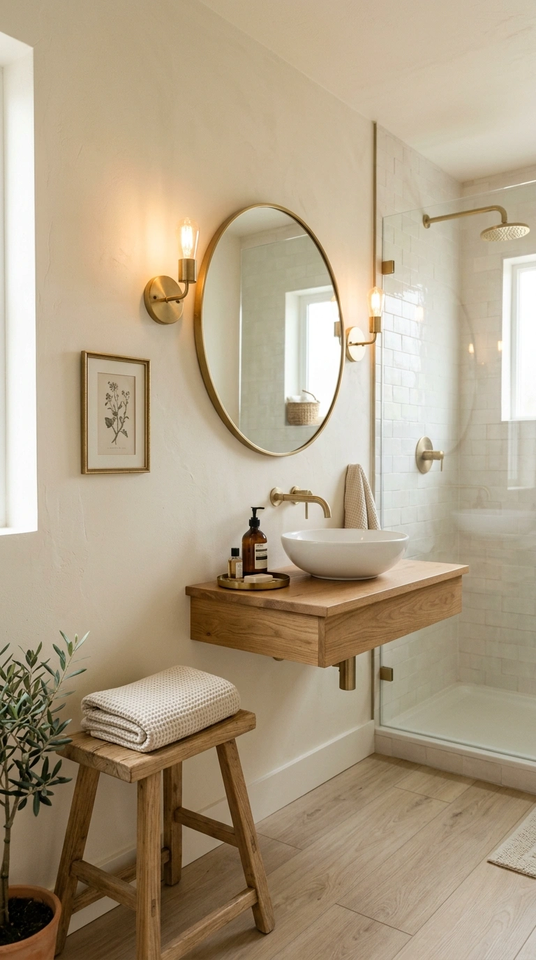
Warm ivory walls give a bathroom a soft, hotel like glow without feeling cold the way pure white can. Pair it with brushed brass faucets and cabinet pulls to add warmth and a small hit of shine. This combination works well in bathrooms with limited natural light because ivory bounces light around the room instead of absorbing it. Keep the floor tile in a warm white or light stone tone so nothing competes with the walls. Add a wood stool or a rattan hamper to bring in texture, since a flat color scheme without any material contrast can start to feel plain after a while.
Lighting changes how ivory reads on the wall, so test a sample patch near your mirror at different times of day before committing to a full gallon. Brass wall sconces placed on either side of the mirror add a warm glow that flatters skin tones and pulls the brass hardware together into one cohesive look.
2. Sage Green And White
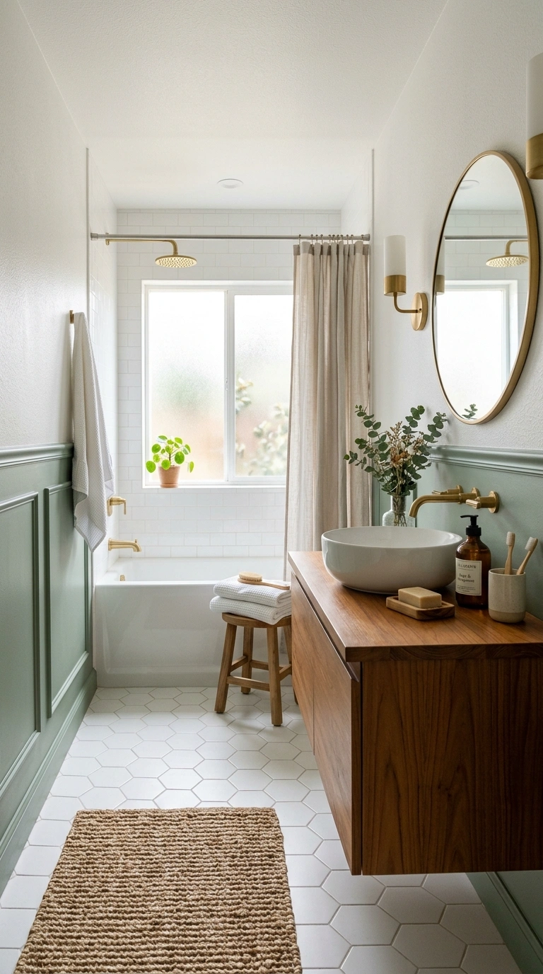
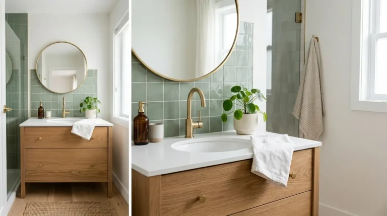
Sage green is soft enough to feel calm but has enough color to keep a bathroom from looking sterile. Paint the lower half of the wall in sage and keep the upper half or the ceiling in a clean white to stop the room from feeling boxed in. This works especially well with white subway tile or white hexagon floor tile, since the cool undertone in sage plays nicely against crisp white grout lines. Natural wood accents, like a teak bath mat or a wood framed mirror, warm the pairing up so it does not read too clinical.
A woven bath mat placed at the base of the tub or shower adds texture underfoot and softens the transition between the green wall and the white tile. Woven bath mat options in a natural fiber tone tie the earthy feel of sage green together without introducing another competing color into the room.
3. Soft Blush And Charcoal
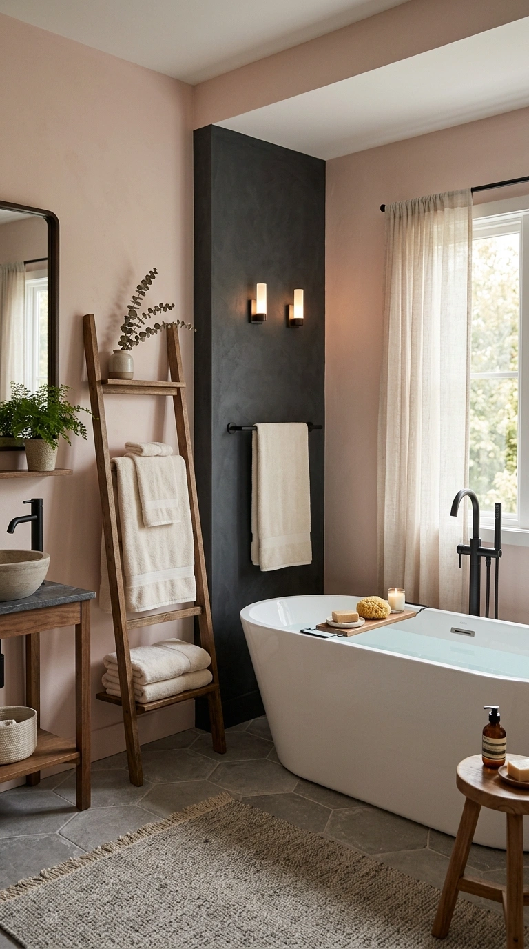
Blush pink has a warm, gentle quality that works surprisingly well next to a deep charcoal accent. Use blush on the main walls and bring in charcoal through the vanity, floor tile, or a single accent wall behind the toilet or tub. This scheme feels more grown up than a typical pastel bathroom because the dark charcoal grounds the softness of the pink. Chrome or matte black fixtures both work here, though matte black tends to match the charcoal tone more closely and creates a cleaner overall look. Keep towels and small textiles in cream or ivory so the room does not end up with too many competing pastels.
4. Navy And Warm Oak
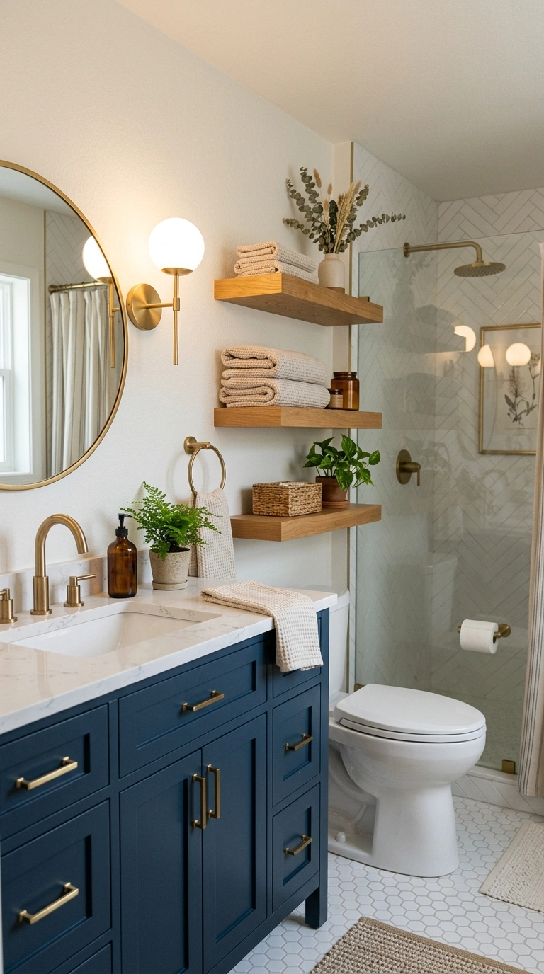
Navy blue is one of the most reliable dark colors for a bathroom because it reads as calming rather than heavy, especially in a room with good lighting. Pair navy walls or navy cabinetry with warm oak floating shelves or a wood vanity top to keep the space from feeling too cool or formal. Brass or unlacquered brass hardware adds a warm metallic note that bridges the navy and the oak together. This scheme works particularly well in a powder room or guest bathroom where you want a bold, memorable look since guests only spend a short time in the space.
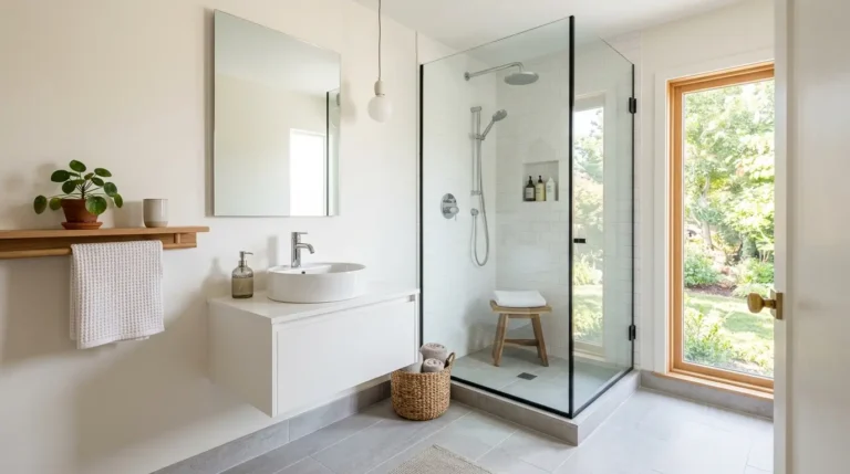
A small open shelf gives the navy walls somewhere to breathe with a few styled objects. A wood floating shelf mounted above the toilet or beside the vanity holds folded towels or a small plant while keeping the warm oak tone visible against the dark wall.
5. Greige And Matte Black
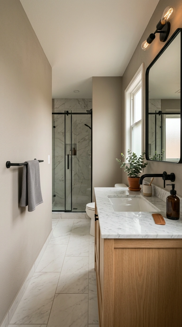
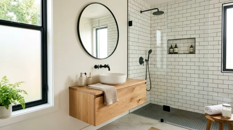
Greige, the soft blend between gray and beige, is one of the easiest bathroom colors to live with long term because it shifts slightly depending on the light and never feels dated. Pair it with matte black fixtures, black framed mirrors, and black cabinet hardware for a scheme that feels current without being trendy in a way that will look old in five years. Keep the floor tile in a light stone or marble look so the black accents stand out clearly against the walls instead of blending into a busy floor pattern.
6. Terracotta And Cream
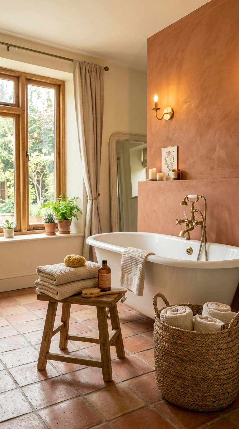
Terracotta brings warmth and a slightly earthy, sun baked feeling into a bathroom, especially when paired with a soft cream on the trim, ceiling, or lower wall panel. This combination works well in bathrooms with south facing windows where natural light already leans warm, since the terracotta will glow rather than look muddy. Cream colored towels, a woven basket for extra toilet paper storage, and a simple wood stool round out the earthy palette without adding too many patterns or textures at once.
7. Dusty Blue And White
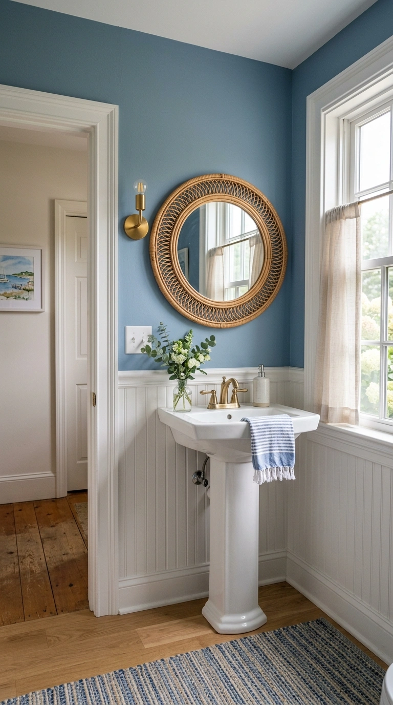
Dusty blue sits between a true blue and a soft gray, which makes it easy to pair with almost any white trim or tile. It works well as a full wall color in a small powder room, or as a lower half wall paired with white beadboard on top. This scheme feels fresh and a little coastal without leaning into a full nautical theme. A round rattan mirror on the dusty blue wall adds a warm, textured focal point that keeps the cool blue tone from feeling flat or one dimensional.
The mirror shape matters here since a round frame softens the straight lines of the tile and vanity. Round rattan mirror styles bring in a woven texture that pairs naturally with the soft blue backdrop and works well above a pedestal sink or a simple floating vanity.
8. All White Marble Look
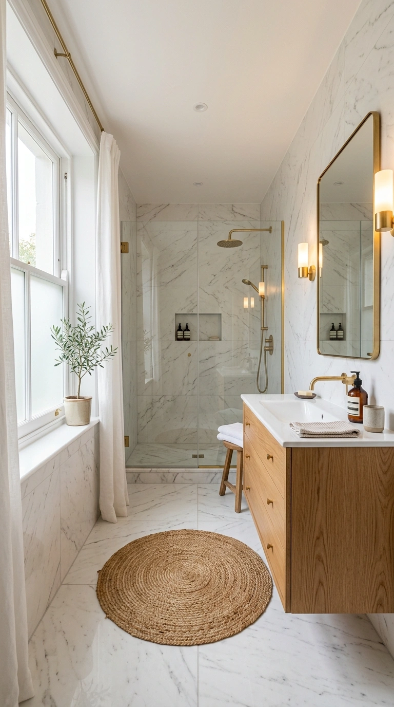
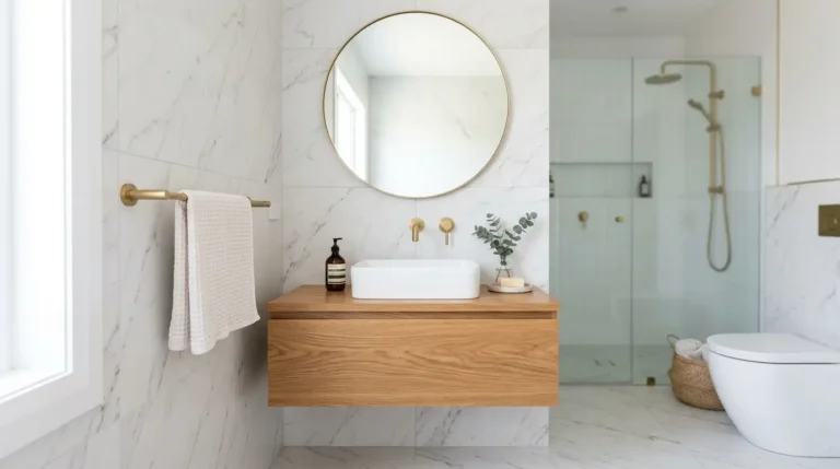
An all white scheme built around marble look tile is still one of the most reliable choices for resale value and long term style. The trick to keeping it from feeling cold is layering in warm textures, like a wood vanity, a jute bath mat, or brass fixtures. Vary the whites slightly, using a warm white on the walls and a cooler white marble look on the floor, so the eye can tell the difference between surfaces instead of everything blending into one flat white box.
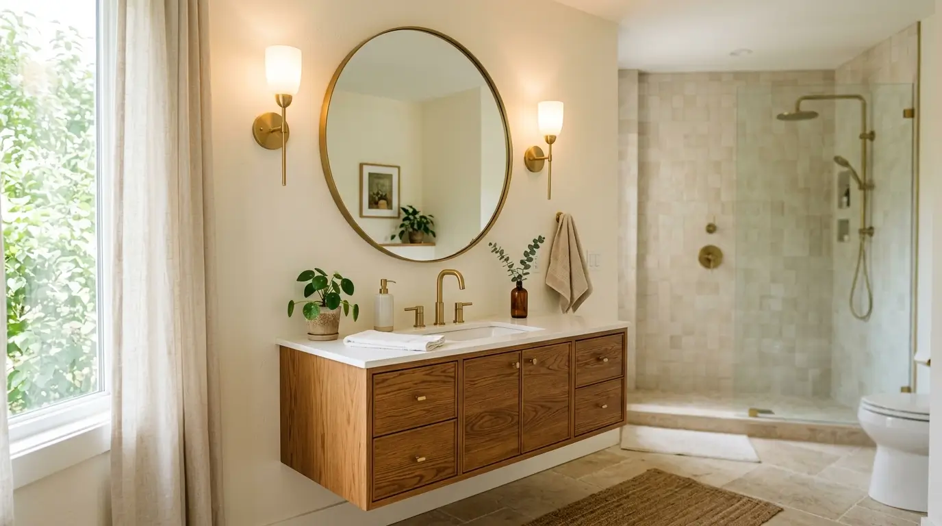
9. Warm Taupe And Brass
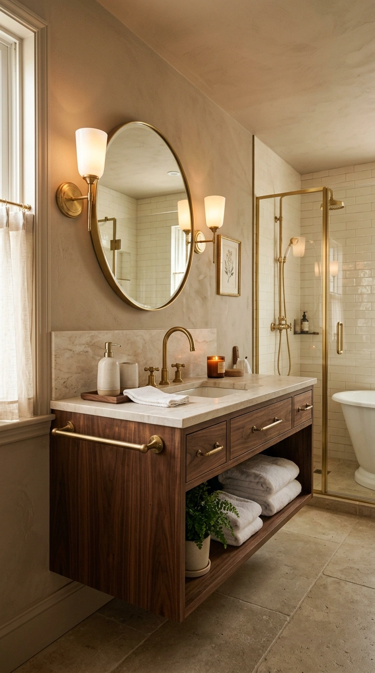
Warm taupe is a gentle, livable neutral that reads more sophisticated than a plain beige. Pair it with brass fixtures and warm wood accents for a bathroom that feels like a boutique hotel. This scheme is especially forgiving in bathrooms with mixed metal fixtures already in place, since taupe does not clash with silver, chrome, or brass the way some bolder colors can.
Small styling details finish the look, and a ceramic soap dispenser set on the counter keeps the vanity tidy while adding a soft, matte texture that matches the warmth of the taupe walls. Ceramic soap dispenser set options in a neutral glaze fit naturally into this kind of warm, quiet color story.
10. Olive Green And Ivory
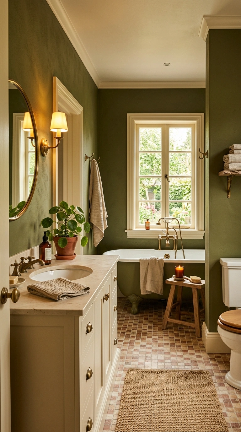
Olive green has more depth than sage, making it a good choice for a bathroom that gets plenty of natural light and can handle a slightly darker, moodier color. Pair olive with ivory trim and cabinetry to keep the room from feeling too heavy. Brass or aged brass hardware continues the earthy, warm feeling, while a few dried branches or a small potted plant on the counter tie the green wall color back into something living and natural.
11. Black And White Classic
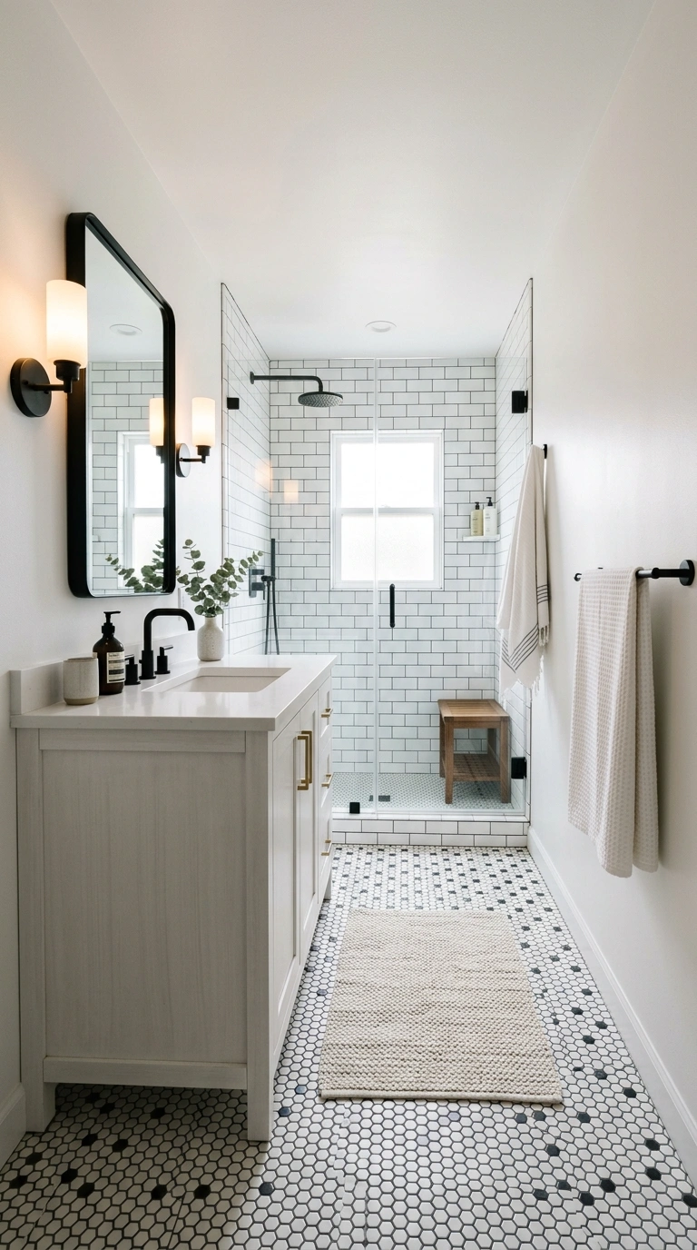
A black and white bathroom never really goes out of style because the contrast is timeless and works with almost any fixture finish. Use black on the floor tile in a classic hexagon or checkerboard pattern and keep the walls a crisp white. Matte black hardware, a black framed mirror, and a black towel bar pull the scheme together without needing any other color in the room. This combination is especially good for a smaller bathroom, since the strong contrast draws the eye around the space instead of making it feel cramped.
12. Soft Pink And Sage
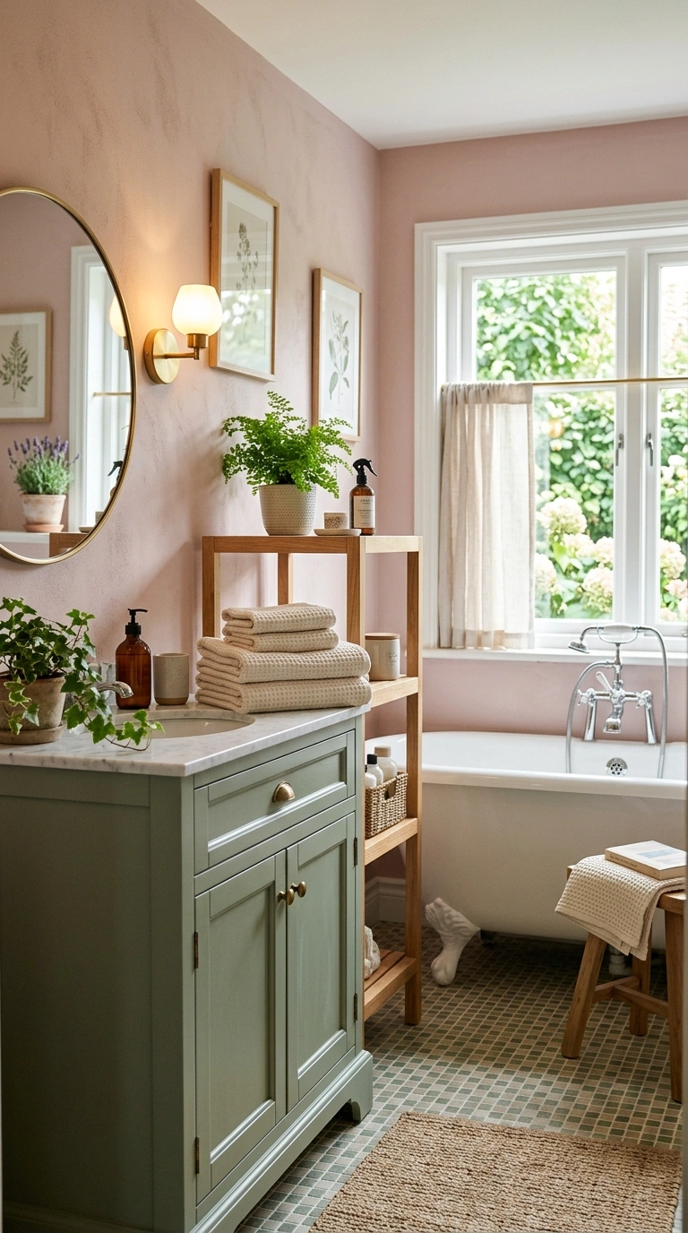
Pairing a soft, dusty pink with sage green creates a garden inspired palette that feels fresh without being overly sweet. Use pink on the main walls and bring sage in through tile, towels, or a painted vanity. This combination works especially well in a bathroom with a window, since natural light lets both colors breathe instead of competing with each other.
Soft textiles finish this look nicely, and waffle weave towels in a cream or soft green shade add texture without introducing a third competing color into the room. Waffle weave towels in a neutral tone let the pink and sage walls stay the visual focus while still adding a cozy, hotel style feel to the space.
13. Warm Gray And Wood
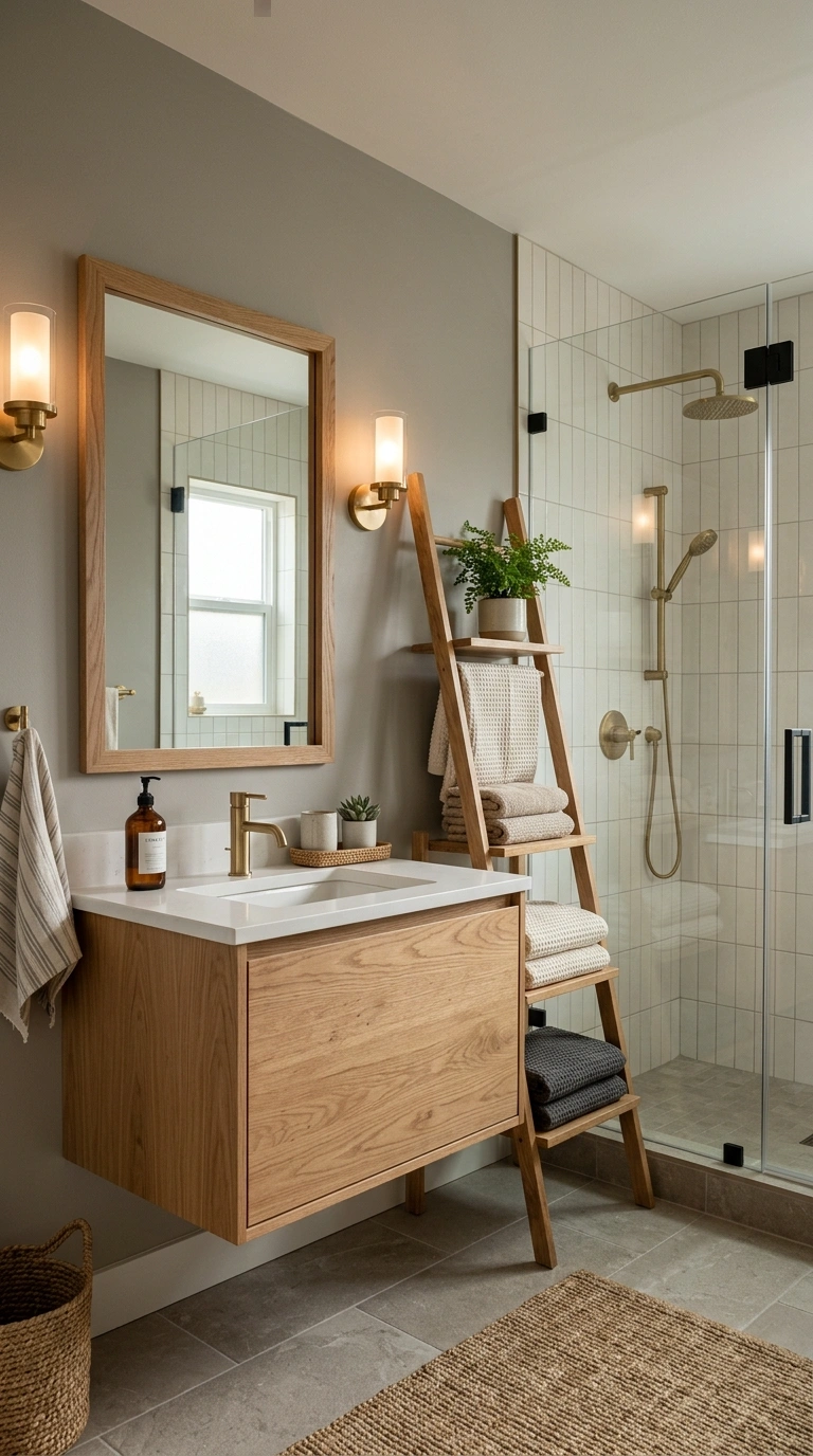
Warm gray is one of the safest bathroom colors because it works in almost any lighting condition without turning blue or purple the way some cooler grays can. Pair it with warm wood tones, like a floating oak vanity or a wood framed mirror, to keep the room from feeling too cold or sterile. This scheme is a good middle ground for households that want a modern look but still want the bathroom to feel warm and inviting rather than clinical.
A simple wood ladder shelf leaning against the wall adds storage for towels while continuing the warm wood tones from the vanity. Wood ladder shelf styles work especially well in a bathroom with limited cabinet space, since they hold towels within easy reach without taking up floor room.
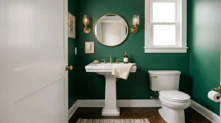
14. Deep Forest Green
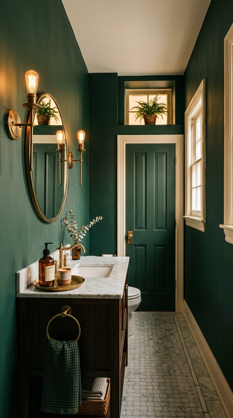
Deep forest green is a bold choice, but it works beautifully in a powder room or a bathroom with good ventilation and either natural light or strong artificial lighting. Pair it with brass fixtures and warm white trim to keep the dark color from feeling like it is closing in on the space. This scheme photographs especially well and tends to be a favorite for guest bathrooms where you want people to remember the room after they leave.
15. Muted Yellow And White
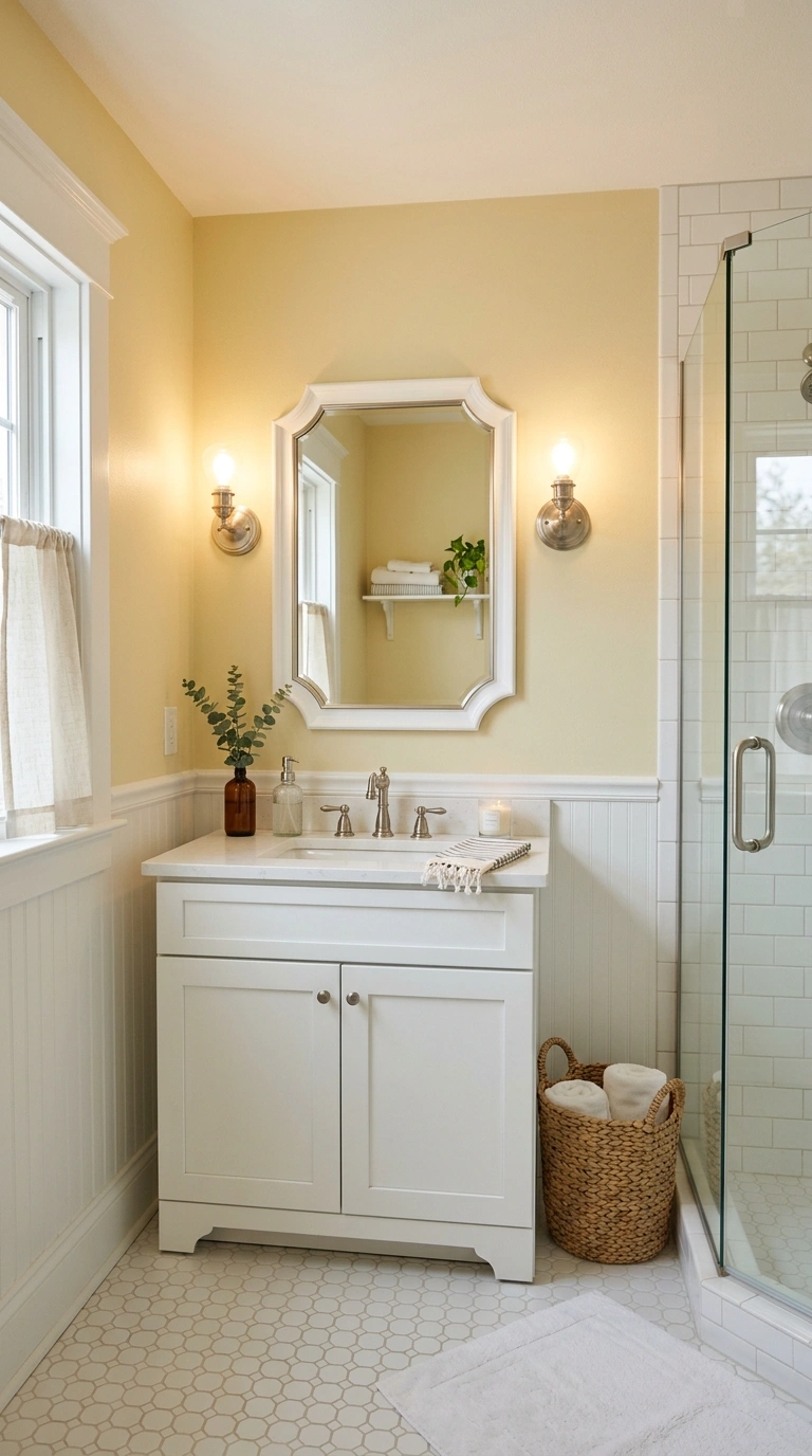
A soft, muted yellow, closer to a butter tone than a bright lemon, brings a cheerful but grown up feeling into a bathroom. Pair it with clean white trim, white tile, and simple chrome or nickel fixtures. This combination works especially well in a bathroom without much natural light, since the yellow undertone helps the room feel sunny even under standard bulbs.
16. Clay Red And Cream
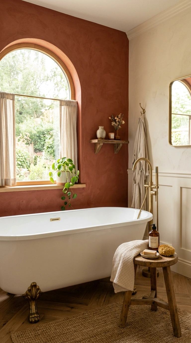
Clay red, sometimes called brick or terracotta red, is warmer and more livable than a true red and works well as an accent wall behind a freestanding tub or vanity. Pair it with a soft cream on the remaining walls and trim so the red does not overwhelm a small space. Wood and brass accents continue the warm, earthy feeling of this scheme.
17. Light Blue And Gold
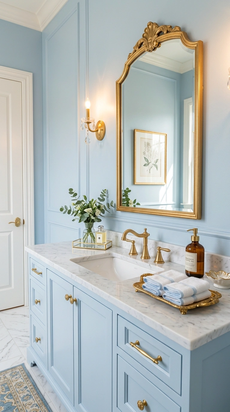
Light, powdery blue paired with gold or brass fixtures creates a bathroom that feels a little glamorous without being overly formal. Use the blue on the walls and let gold hardware, a gold framed mirror, and a small gold tray on the counter carry the shine. This scheme works especially well in a powder room where a bit of sparkle feels appropriate.
18. Warm Beige And Chrome
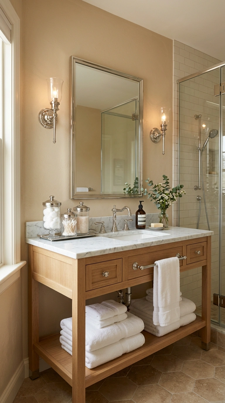
Warm beige is a quiet, flexible neutral that works in almost any bathroom style, from traditional to modern. Pair it with chrome fixtures for a cleaner, slightly more classic look than brass would give. Keep textiles in white or ivory so the beige walls stay the main focus of the room.
Small glass storage pieces add function without visual clutter, and a set of glass apothecary jars on the counter can hold cotton balls or bath salts while matching the clean, simple feeling of the beige and chrome pairing. Glass apothecary jars in a clear or lightly frosted finish keep counter storage visible and tidy in this kind of neutral scheme.
19. Two Tone Gray Scheme
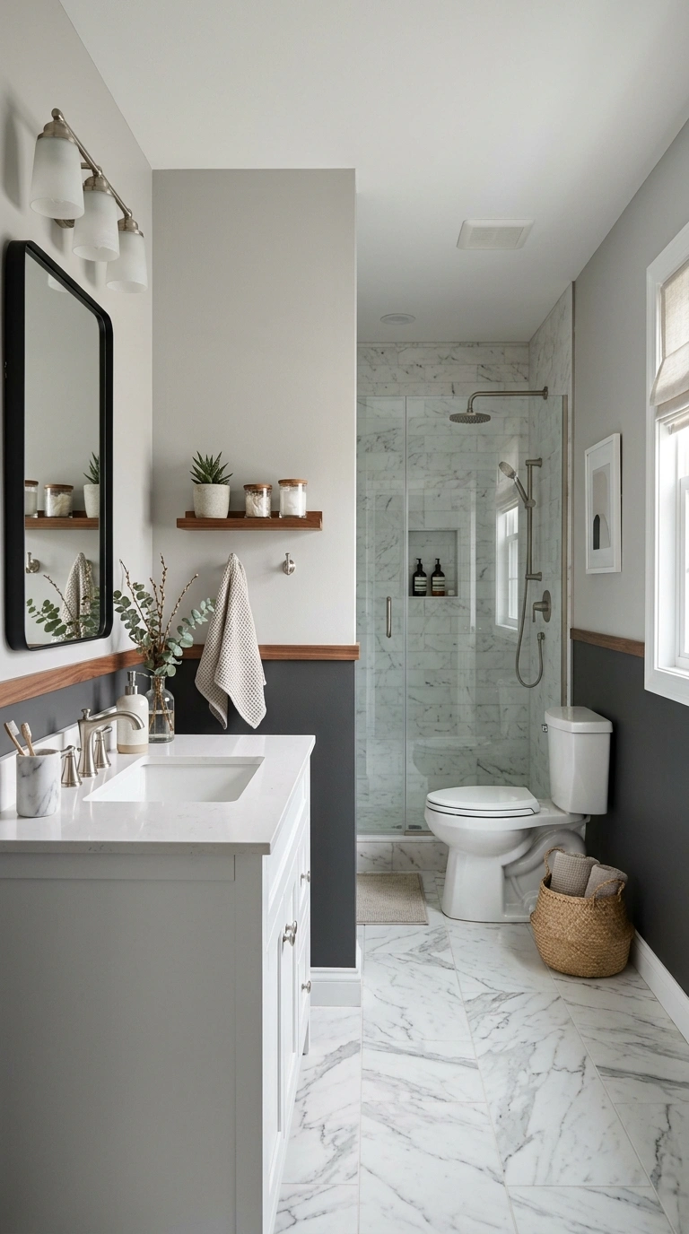
Using two shades of gray, a lighter one on top and a slightly darker one on the bottom half of the wall, adds depth to a bathroom without introducing a whole new color. Separate the two tones with a simple wood chair rail or a thin trim strip. This scheme feels modern and calm, and it works well in bathrooms of almost any size since the two tones keep the eye moving instead of flattening the whole room into one block of color.