21 Relaxing Bedroom Paint Colors for a Calm, Cozy Space
Picking a “calming green” or “soft blue” off a mood board is where most bedroom repaints go wrong, because the actual can of paint you buy has a specific name, a specific undertone, and a specific Light Reflectance Value (LRV) that a vague color description can’t tell you. Below are 21 relaxing bedroom paint colors, all real, named colors from major brands, with the undertone and LRV details that actually predict how they’ll look on your walls.
Quick primer: LRV measures how much light a color reflects, on a scale of 0 (absolute black) to 100 (pure white). Colors in the 50s and 60s read as soft, livable neutrals in most light. Anything under 25 is a genuinely dark, moody color that needs strong ambient lighting at night to avoid feeling like a cave.
1. Sherwin-Williams Sea Salt (SW 6204)
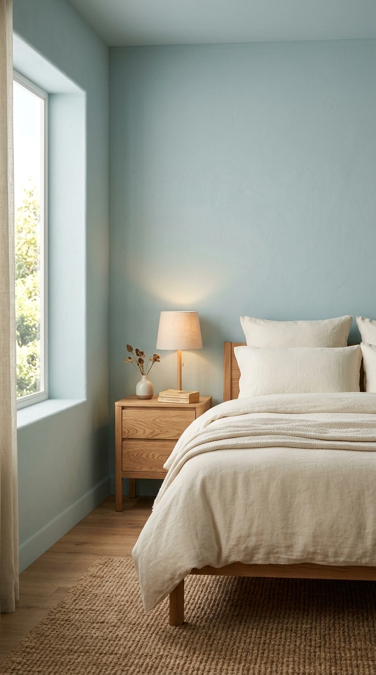
Sea Salt is one of the most recommended calming colors in the Sherwin-Williams range, a soft blue-green with an LRV of 63, so it stays light and airy rather than moody. The undertone shifts between blue, green, and gray depending on the light, which is part of why designers reach for it so often. Pair it with warm white trim and natural wood tones so the room doesn’t tip too cool.
Because its LRV sits in the low 60s, Sea Salt holds onto its color even in rooms with limited direct sun, unlike lower-LRV blue-greens that can read almost gray in a north-facing bedroom. That makes it one of the safer green picks if your window doesn’t get much afternoon light.
Quick tip: Sea Salt reads greener in warm, south-facing light and bluer in cooler, north-facing light. Test a sample on your actual wall, not just a chip, before buying a full gallon.
2. Sherwin-Williams Upward (SW 6239)
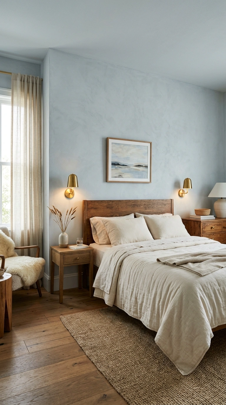
Upward is a light, airy blue-gray that Sherwin-Williams specifically markets as one of its calming shades, meant to feel spacious and serene rather than cold. It works especially well in bedrooms that get decent natural light, since low light can push it toward flat and gray.
Upward carries very little green in its undertone compared to other Sherwin-Williams blue-grays, which means it coordinates more cleanly with true grays already in your home, like a gray-tiled bathroom or a gray hallway runner, than a greener blue-gray typically would.
Quick tip: Balance Upward with warm brass fixtures and cream bedding, since its cool undertone can feel sterile without a warm counterpoint somewhere in the room.
3. Benjamin Moore Quiet Moments (1563)
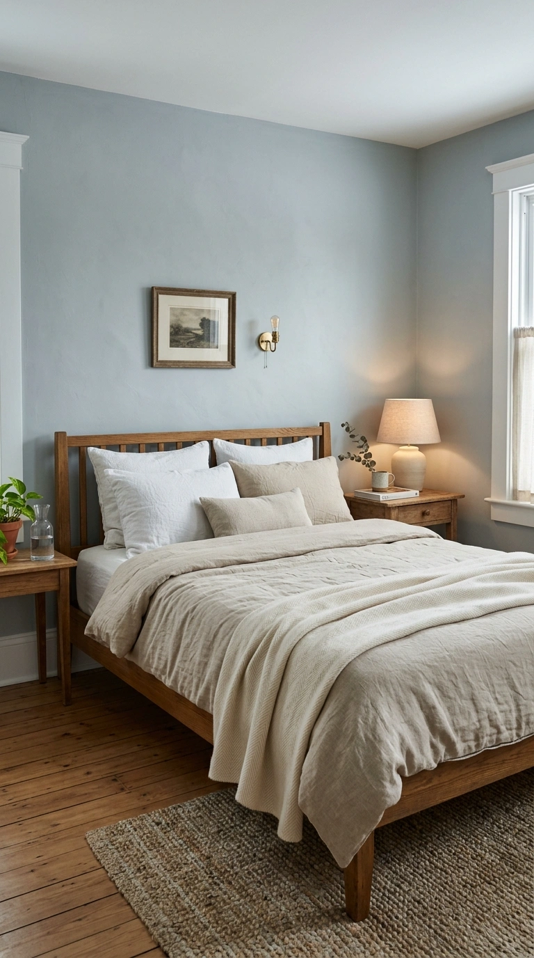
Quiet Moments is a soft, barely-there blue-gray that reads almost as a neutral in most light, giving it a quiet, still quality that’s genuinely restful rather than decorative. It pairs well with white trim, warm wood furniture, and natural linen bedding, letting the color recede into the background of the room. Because the color sits so close to neutral, it works especially well in a shared or multi-use bedroom, like a guest room that doubles as an office, since it won’t clash with whatever accent colors rotate through the space over time.
Quick tip: Because it reads so close to neutral, Quiet Moments is a safer choice than a true blue if you’re not sure how committed you are to a colored bedroom.
4. Sherwin-Williams Naval (SW 6244)
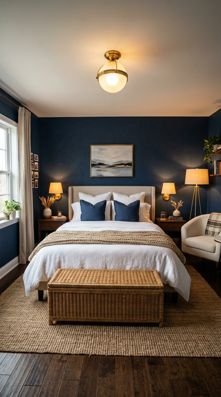
Naval is a deep, confident navy with an LRV in the single digits, meaning it absorbs most of the light that hits it. In daylight it reads as a true navy; at night it deepens into something closer to ink. Because it’s this dark, plan on at least two coats and a tinted primer, and layer in a floor lamp, a bedside table lamp, and an overhead fixture so the room doesn’t go flat and dim at night.
Naval is also a common exterior door and shutter color, so if your home already uses it outside, repeating it on your bedroom’s headboard wall creates a deliberate connection instead of introducing an unrelated dark color to the palette.
What to avoid: Don’t paint a small, low-light bedroom in Naval on all four walls without adding real supplemental lighting. Dark, low-LRV colors need more artificial light to stay cozy instead of cave-like.
5. Farrow & Ball Elephant’s Breath (No. 229)
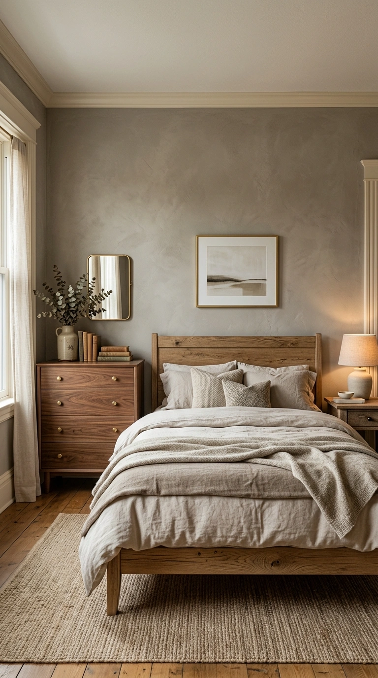
Elephant’s Breath is a warm greige that shifts between gray, brown, and a faint pink depending on the light in the room, which is exactly why it’s been one of the most talked-about neutrals of the past few years. It pairs naturally with warm ivory trim, brass hardware, and natural wood furniture.
Because Elephant’s Breath leans warm gray rather than warm brown, it can clash with cool white marble or blue-gray stone accents. If your bedroom has a cool-toned fireplace surround or stone feature, test a sample against it before committing to the whole room.
Quick tip: Farrow & Ball colors are formulated differently than most mass-market brands and often read slightly darker on the wall than the chip suggests, so order a sample pot before committing to a full room.
6. Behr Hidden Gem (N430-6A)
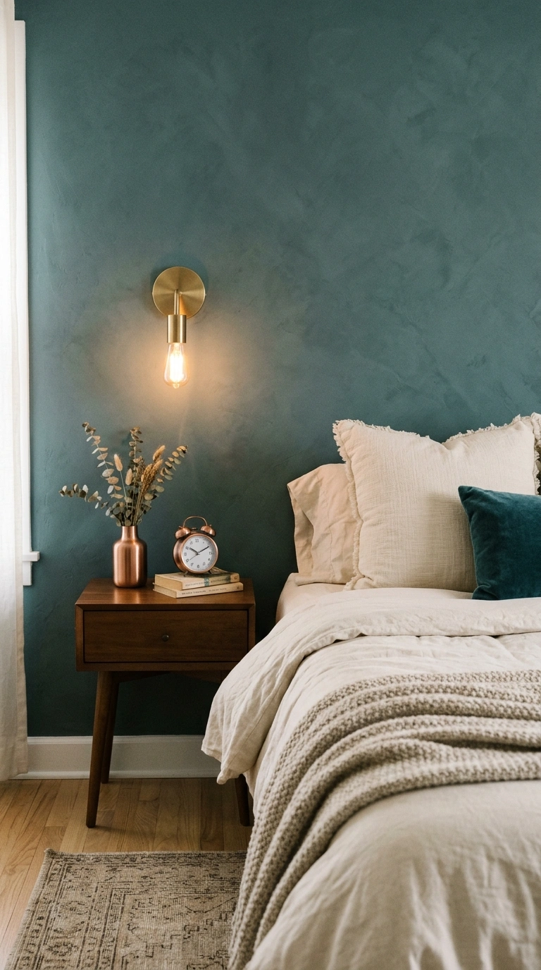
Hidden Gem is Behr’s 2026 Color of the Year, described by the brand as a “smoky jade,” a blue-green blend with more depth and sophistication than a standard sage. It works as a moody but livable neutral rather than a bold accent, especially with warm metallics like brass or copper.
As a newly released color, it’s worth asking your paint counter to double-check current stock and formula, since brand-new Color of the Year picks occasionally see minor formula adjustments during their first year on shelves as the brand fine-tunes production.
Quick tip: Because it’s a newer color, ask your paint counter to double-check the formula against the current Behr deck, since color formulas occasionally get refreshed.
7. Sherwin-Williams Repose Gray (SW 7015)
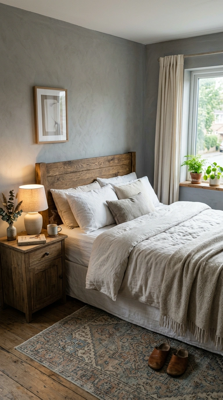
Repose Gray has an LRV of 58, and carries subtle blue and violet undertones that keep it from reading as a flat, cold gray, especially in north-facing rooms where it tends to stay soft and warm despite the cooler light. Pair it with warm wood tones to lean into its softer side, or with crisp white and black for a more modern, cooler look.
Because Repose Gray carries a slight violet undertone, some people notice a faint lavender cast in very warm, yellow-toned lamp light. If that bothers you, Agreeable Gray’s warmer, more beige-green undertone avoids it while staying in the same LRV range.
Quick tip: If Repose Gray reads too cool in your room’s light, Sherwin-Williams’ Agreeable Gray (SW 7029, LRV 60) is the warmer, more beige-leaning alternative on the same paint strip.
8. Sherwin-Williams Agreeable Gray (SW 7029)
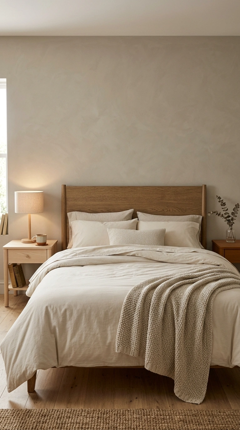
Agreeable Gray is the best-selling neutral in the Sherwin-Williams lineup, with an LRV of 60 and a warm base with a faint green-gray edge that reads warm in nearly any light. It’s an easy, low-risk choice if you want the room to feel calm without committing to a stronger color statement. Because it’s one of the most requested neutrals in the country, most local painters and paint counters have mixed it before, which can make color-matching touch-ups or trim work more consistent than starting with a less common shade.
Quick tip: Agreeable Gray pairs with almost any wood tone, which makes it a smart pick if you swap furniture or bedding often.
9. Sherwin-Williams Mindful Gray (SW 7016)
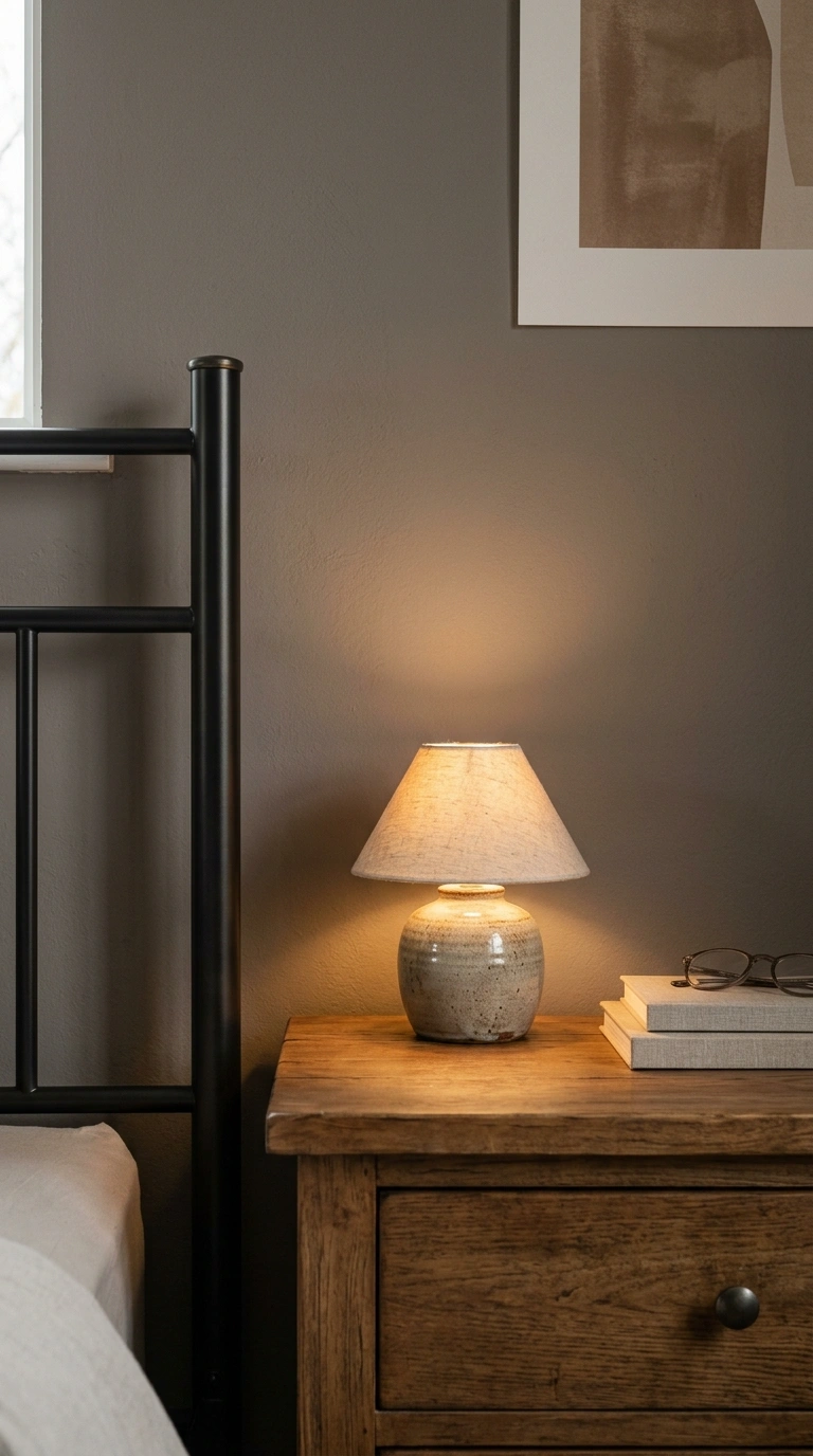
Mindful Gray sits one shade darker than Repose Gray on the same paint strip, with an LRV of 48 and stronger gray-taupe undertones, giving a deeper, more grounded neutral without going as dark as a true accent color. It works well as a full-room color for people who find Repose Gray or Agreeable Gray too light and washed out. Because its LRV of 48 sits closer to the middle of the scale, it holds up well in rooms with mixed lighting, like a bedroom with one bright window and one darker reading corner, where a lighter neutral can look inconsistent from one wall to the next.
Quick tip: Because it’s a mid-depth color, test it in your dimmest corner as well as your brightest one, since mid-tone grays shift the most across a room.
10. Sherwin-Williams Urbane Bronze (SW 7048)
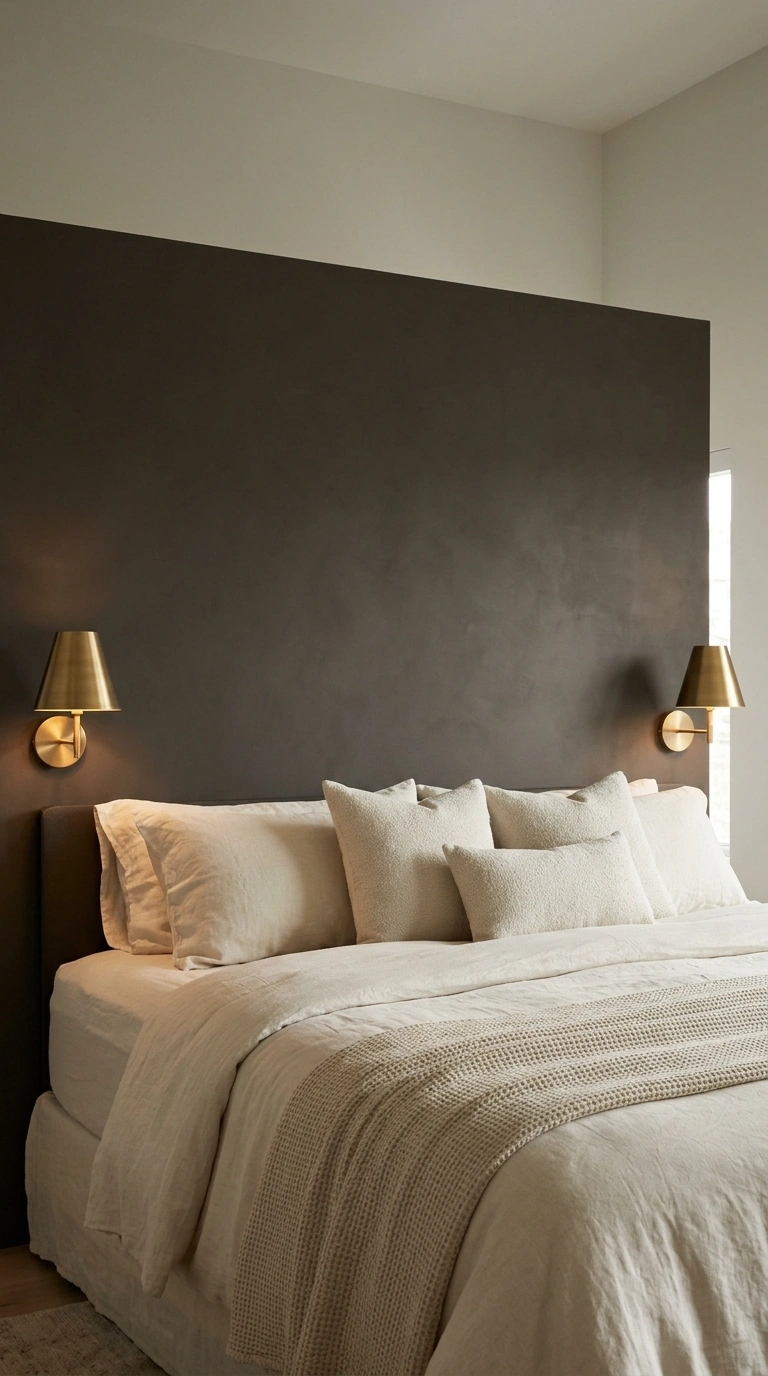
Urbane Bronze is a dark, sophisticated brown-gray with an LRV under 25, making it a genuinely moody, dramatic choice rather than a soft neutral.
It works best in bedrooms with good natural light or high ceilings, where the depth can read as luxurious rather than closing the room in, and pairs beautifully with warm brass or bronze fixtures.
It’s also a popular exterior door and shutter color, so pairing it on just the headboard wall echoes the same dark tone already used outside your home, rather than introducing a brand-new dark color to the palette.
Quick tip: Use Urbane Bronze on just the headboard wall in a smaller or darker bedroom to get the cocooning effect without losing all the light in the room.
11. Sherwin-Williams Accessible Beige (SW 7036)
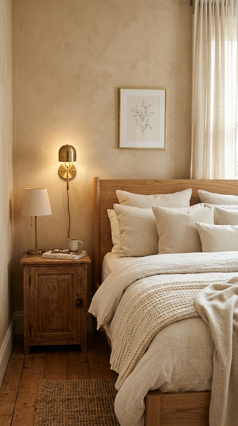
Accessible Beige is a warm, adaptable beige that regularly ranks as one of Sherwin-Williams’ most popular colors, and it leans warmer than Agreeable Gray without tipping into a dated, yellow-heavy beige. It pairs well with warm wood, brass, and cream textiles for a soft, cozy bedroom base. It’s one of the few warm beiges that plays well with both black and brass hardware at once, since its undertone sits neutral enough that it doesn’t clash with either warm or cool-toned metal finishes the way a more strongly yellow beige can.
Quick tip: If your room has pink or peach-toned flooring, Accessible Beige can amplify that warmth; Repose Gray is the cooler alternative in that situation.
12. Sherwin-Williams Alabaster (SW 7008)
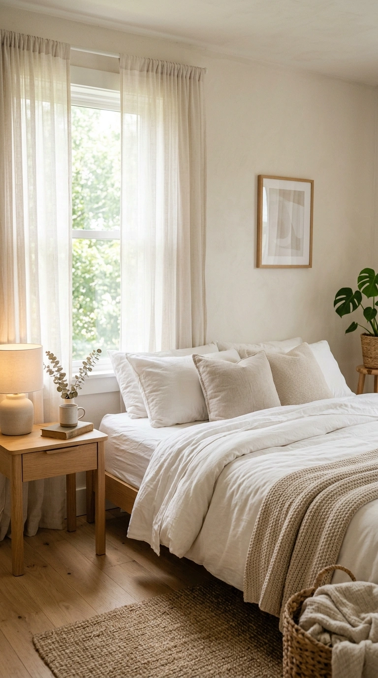
Alabaster is a warm off-white, not a stark white, which makes it a genuinely calming trim or wall color instead of the slightly clinical feel a true white can bring to a bedroom. Use it as a full wall color for a soft, bright, airy bedroom, or as the trim color against any of the bolder shades on this list. Alabaster works as a dependable trim color specifically because it isn’t a stark white. It won’t read yellow or dingy next to bright white appliances or fixtures the way a true white sometimes does once mixed lighting hits it.
Quick tip: Alabaster can look slightly warm-yellow next to cool gray furniture, so check your existing pieces before committing to a full room.
13. Sherwin-Williams Rosemary
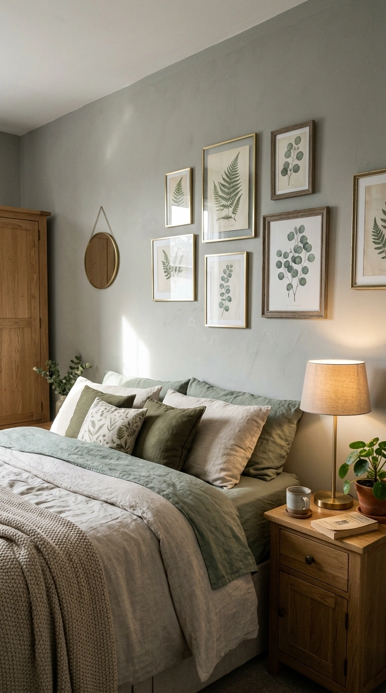
Rosemary is a soft, gray-toned green with an herbal depth that reads more sophisticated than a bright or true sage, sitting closer to the muted, botanical greens leading bedroom color trends this year. Pair it with warm wood furniture, linen bedding, and brass accents for a grounded, natural bedroom. Because it’s a newer addition to the botanical-green trend compared to long-running colors like Agreeable Gray, some retailers may have a smaller pool of pre-mixed sample sizes on hand, so it can be worth ordering a custom sample pot a few days ahead of when you plan to test it.
Quick tip: Rosemary reads grayer in cooler, north-facing light, so if you want more visible green, prioritize a room with warmer afternoon sun.
14. Benjamin Moore Edgecomb Gray (HC-173)
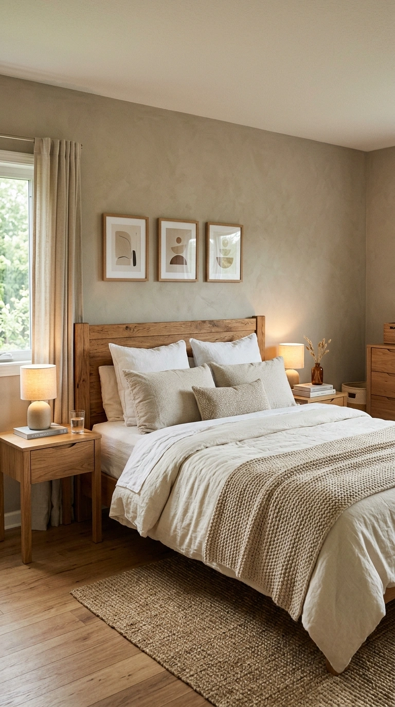
Edgecomb Gray sits in the genuinely useful territory between a true gray and a warm beige, and it’s one of the most reliable warm neutrals in the entire Benjamin Moore catalog because it adapts to whatever light and furniture surround it. It works with virtually any wood tone and bedding palette, which is exactly why designers reach for it when they want the walls to recede. Because Edgecomb Gray shifts noticeably between morning and afternoon light, it’s worth painting a full sample board and moving it around the room over the course of a day, rather than judging it from one fixed spot on a single wall.
Quick tip: Edgecomb Gray can lean more beige in warm afternoon light and more gray in the morning, so view your sample at both times of day.
15. Benjamin Moore Gray Owl (OC-52)
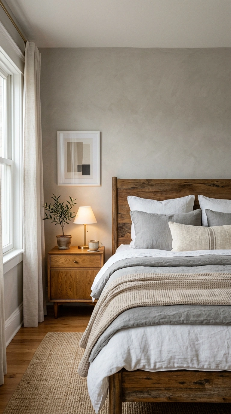
Gray Owl is a soft, warm-leaning gray that’s become one of Benjamin Moore’s most requested neutrals, quietly dynamic rather than flat or static across different lighting conditions. It pairs especially well with white trim and warm wood tones for a calm, adaptable bedroom.
Gray Owl pairs particularly well with warm brass and mixed wood tones, since its undertone sits closer to a true gray than most Benjamin Moore greiges, which keeps it from competing with warmer accent colors already in the room.
Quick tip: In very low-light rooms, Gray Owl can read slightly cooler than expected; pairing it with warm lamp light in the evening keeps it feeling soft rather than cold.
16. Benjamin Moore First Light (OC-53)
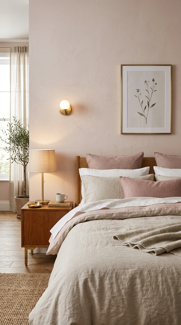
First Light is a soft, barely-there pink with warm undertones, kept pale enough that it reads as a gentle neutral rather than a true pastel, so it doesn’t skew the room sweet or juvenile. Pair it with warm brass accents and natural linen for a bedroom that feels soft without being fussy.
Because First Light is formulated as a genuine near-neutral rather than a true pastel, it tends to age better over time than brighter pinks, which can start to feel dated or overly trend-driven within just a few years of painting.
Quick tip: Choose a warm white trim rather than a stark white alongside First Light, since a cool trim can make the pink read chalkier than intended.
17. Benjamin Moore November Rain
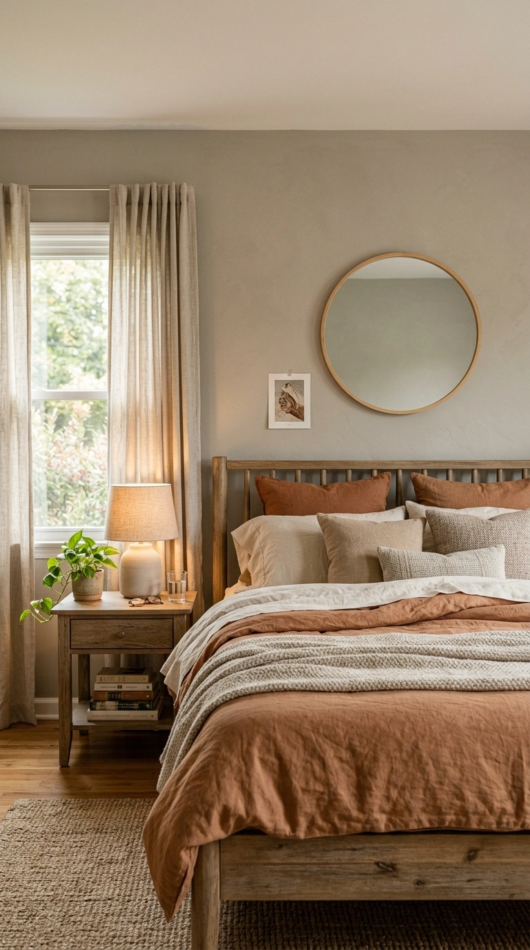
November Rain is a soft greige that walks the line between warm and cool without settling firmly into either, which makes it flexible across rooms with different light exposures. It works as a full-room neutral for bedrooms where you want the walls to support the furniture and bedding rather than compete with it.
Because it doesn’t commit firmly to warm or cool, November Rain is a lower-risk choice if you’re repainting ahead of selling your home, since it tends to read as broadly appealing to more buyers than a color with a stronger, more clearly defined undertone.
Quick tip: Because it sits right on the warm-cool line, test November Rain next to your actual bedding and curtains, since nearby colors will pull its undertone one direction or the other.
18. Behr Copper Moon
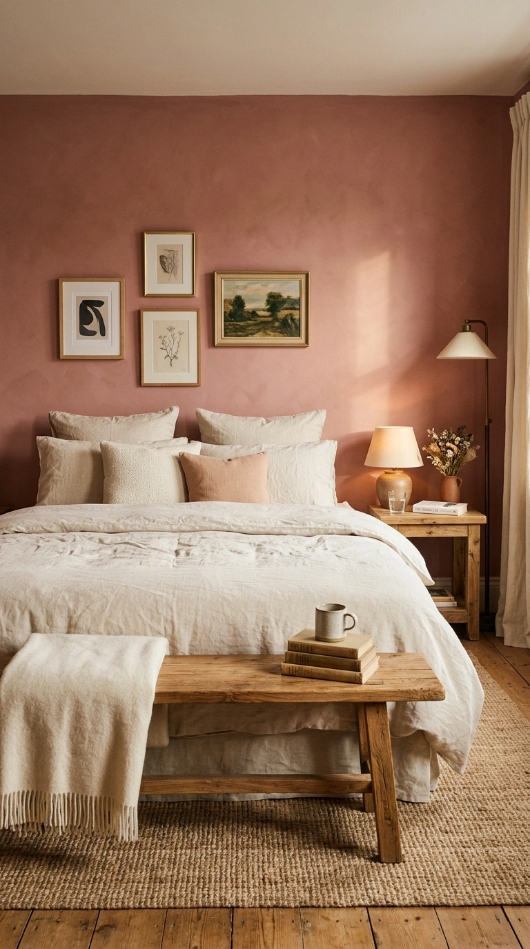
Copper Moon is a warm, dusky rose that leans sophisticated rather than sweet, giving a cozy, grounded version of pink that works well as either a full wall color or a single accent wall. Pair it with warm wood tones and cream linens for a bedroom that feels sun-warmed even in lower light.
Because dusky rose tones like this can shift toward orange under warm incandescent bulbs, use warm LED bulbs closer to 2700K rather than older incandescent bulbs, which keeps the color reading rose rather than drifting toward tan.
Quick tip: Copper Moon looks richest with warm afternoon light, so it’s a strong pick for west-facing bedrooms.
19. Valspar Warm Eucalyptus
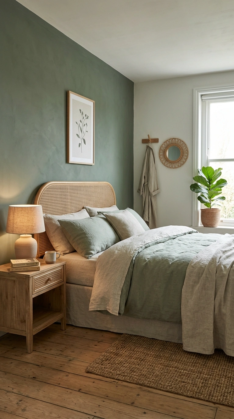
Warm Eucalyptus is a cool, nature-inspired green that reads as restful and inviting rather than sharp or minty, closer to the muted botanical greens trending across most paint brands this year. It pairs naturally with natural wood, rattan, and linen textures for an organic, calming bedroom.
Because it’s a cooler green than sage or olive, it pairs better with cool-toned wood like ash or white oak than with orange-toned wood like traditional oak, which can visually fight the color’s cool undertone instead of complementing it.
Quick tip: Because it’s a cooler green, balance it with warm-toned wood furniture rather than cool gray pieces to avoid the room feeling chilly.
20. Little Greene Adventurer
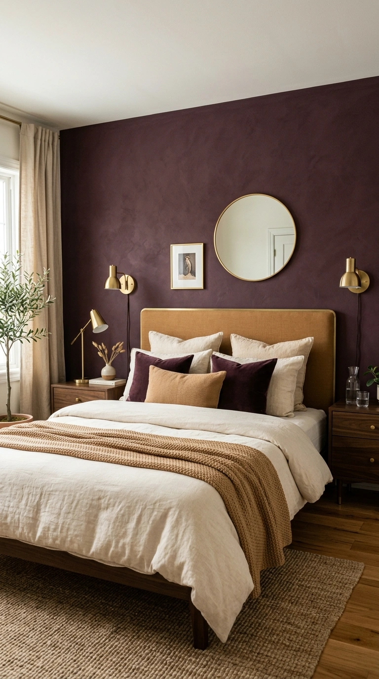
Adventurer is a deep, rich plum from the Little Greene range, a genuinely bold jewel tone rather than a muted neutral, best used with intention rather than as a safe default.
Use it on a single accent wall behind the headboard, paired with warm brass lighting and cream or camel textiles, so the depth reads as cocooning rather than overwhelming.
Because Little Greene is a specialty British brand, expect to order through a dedicated retailer or online rather than picking it up at a typical big-box hardware store, and budget for a longer lead time on a full order than you would with a mass-market brand.
Quick tip: Jewel tones like Adventurer show brush and roller texture more than lighter colors, so a smooth, high-quality roller finish matters more here than on a pale neutral.
21. Sherwin-Williams Universal Khaki
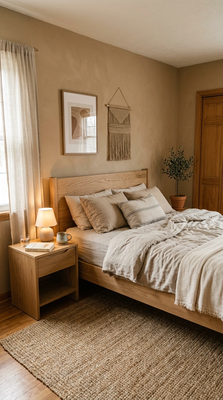
Universal Khaki, Sherwin-Williams’ recent Color of the Year pick, is a warm, mid-tone tan built to pair with natural materials like wood and stone, landing as a practical, livable neutral rather than a trend color that dates quickly.
It works especially well in bedrooms styled around natural textures, like a jute rug, linen bedding, and unfinished or lightly stained wood furniture.
Because it’s Sherwin-Williams’ current Color of the Year, expect strong stock availability at most stores along with easy access to coordinating trim and accent color suggestions directly from the brand’s own color visualizer tools.
Quick tip: Because it’s a mid-depth warm neutral, it can read slightly dull under cool LED bulbs; warm 2700K bulbs bring out its full warmth at night.
How Much Paint You Actually Need
A gallon of paint covers roughly 350–400 square feet per coat on a smooth, previously painted wall. Most standard bedrooms (10×12 to 12×14 feet with 8-foot ceilings) need one gallon for two coats on the walls alone; darker colors like Naval or Urbane Bronze often need a third coat or a tinted gray primer to get full, even coverage.
What to avoid: Skip high-gloss or semi-gloss finishes on bedroom walls. Matte and eggshell finishes hide small wall imperfections and don’t bounce lamp glare back into the room the way glossier sheens do. Save satin or semi-gloss for trim and doors, where a tougher, wipeable finish earns its keep.
Bringing It All Together
The most relaxing bedroom color is the one whose actual LRV and undertone match your room’s light, not the one that looked best on a screen. Soft blue-greens like Sea Salt and grays like Repose Gray stay flexible in most light; warm neutrals like Accessible Beige or Edgecomb Gray are the safest bet in rooms with less natural light; and deep colors like Naval or Urbane Bronze need real supplemental lighting to feel cozy instead of dim.
Order two or three physical samples, not just chips, and look at them in your room at both morning and night before you commit to a gallon.
Pick your favorite, save it to Pinterest, and start planning your new relaxing bedroom this weekend.
FAQs
What is the most relaxing paint color for a bedroom?
Sherwin-Williams Sea Salt (SW 6204) and Benjamin Moore Quiet Moments (1563) are two of the most consistently recommended calming bedroom colors, both soft blue-based neutrals with LRVs in the 50s-60s that stay light and airy in most rooms. The right pick still depends on whether your room gets warm or cool natural light.
What does LRV mean for paint colors, and why does it matter for a bedroom?
LRV, or Light Reflectance Value, measures how much light a paint color reflects on a 0 to 100 scale, with higher numbers reflecting more light. A bedroom color with an LRV above 50 will read as a soft, livable neutral, while anything under 25 is genuinely dark and needs strong supplemental lighting to avoid feeling closed-in.
What paint finish is best for a bedroom?
Matte or eggshell finishes work best in bedrooms because they hide small wall imperfections and avoid the glare that glossier finishes create under lamp light. Save satin or semi-gloss finishes for trim and doors instead.
Do warm or cool paint colors make a bedroom feel cozier?
Colors with warm undertones, or higher LRVs paired with warm lighting, generally read cozier, especially in rooms with limited natural light. A cool-toned color like Sherwin-Williams Upward can still feel calm, but it benefits from warm brass fixtures and lamp light to avoid feeling sterile.
How many coats of paint does a dark bedroom color need?
Dark, low-LRV colors like Sherwin-Williams Naval or Urbane Bronze often need three coats, or two coats over a tinted gray primer, to get full, even coverage without patchiness. Lighter neutrals in the 50-65 LRV range usually cover fully in two coats.