23 Blue and Beige Living Room Ideas That Look Effortlessly Elegant
Blue and beige work together because they sit on roughly opposite sides of the color wheel. Beige is a softened orange or yellow, so blue naturally balances it. That is also why the pairing goes wrong so easily. A cool grey-blue next to a yellow-heavy beige can look muddy, and a stark icy blue can make warm sand tones read dingy.
The 23 ideas below cover paint, upholstery, textiles, and small changes you can make in an afternoon. Where it matters, each one notes the trade-off, the condition it depends on, or the situation where a different choice makes more sense. Start with the four checks in the next section, since they shape almost every decision that follows.
Before You Commit: Four Things That Shape the Result
1. Match the undertones, not the color names. Beige ranges from pink-beige to yellow-beige to grey-beige (greige). Blue ranges from green-blue to purple-blue. Warm, yellow-based beige generally pairs more easily with a softened, slightly grey blue than with a bright primary blue. Hold your samples together in the actual room before deciding.
2. Decide which color is the base. One color usually needs to cover most of the room while the other appears in fewer, stronger doses. Rooms that use both colors in equal amounts often look unresolved. A common working split is roughly two-thirds beige, one-third blue, plus a small amount of a third accent.
3. Check your light direction. In the northern hemisphere, north-facing rooms get cooler light, which pushes blue toward grey and can make the room feel chilly. South-facing rooms get warmer light that softens blue and brings out yellow in beige. Test paint samples on two walls and look at them in the morning, afternoon, and under your lamps at night.
4. Work around what you cannot change. Orange-toned oak floors, a red-brick fireplace, or a grey tile surround will all pull the palette one way. Pick your blue after looking at those finishes, not before.
| Depth of blue | Tends to work best in | Pairs well with | Watch for |
|---|---|---|---|
| Powder or sky blue | Bright rooms with plenty of daylight | Crisp white trim, oatmeal linen | Can look washed out in low light |
| Dusty or French blue | Most rooms, including dimmer ones | Warm greige, natural oak | Can read flat without texture |
| Slate and grey-blue | North-facing rooms with warm bulbs | Mushroom beige, brass | Can read cold under cool white lighting |
| Navy | Rooms with good daylight or strong lamps | Cream, camel, walnut | Absorbs light, so balance large areas |
| Teal or petrol | Accent use | Tan leather, aged brass | Competes with other strong colors |
1. Make Beige the Base and Blue the Accent
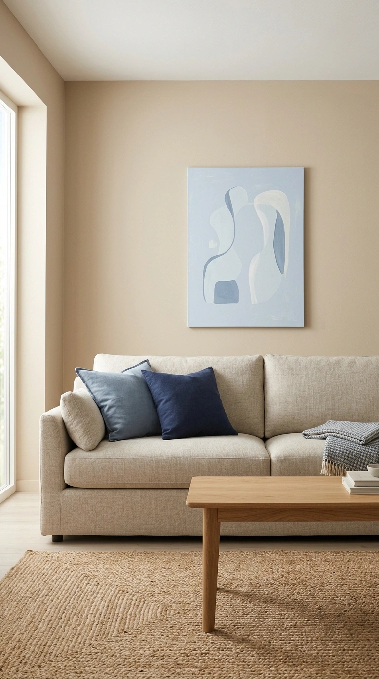
The simplest version of this palette keeps walls, large upholstery, and curtains in beige, then adds blue through pillows, a rug, art, and ceramics. It is one of the more forgiving routes, because the strong color stays in items you can swap. Neutral walls also tend to suit a wider range of furniture, which helps if you redecorate or move.
Best for: renters, first-time decorators, and anyone unsure how bold they want to go.
2. Anchor the Room With a Navy Sofa
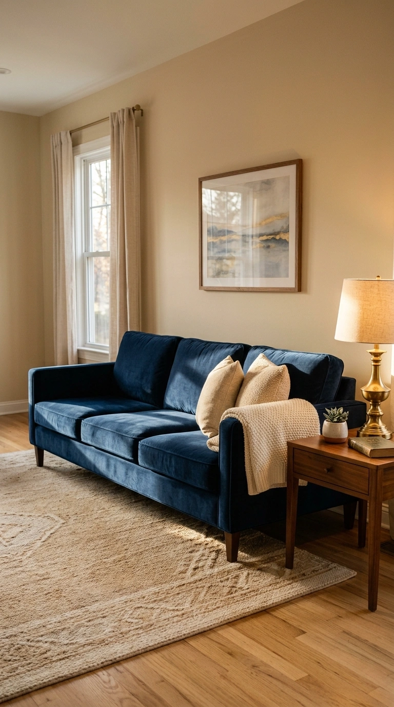
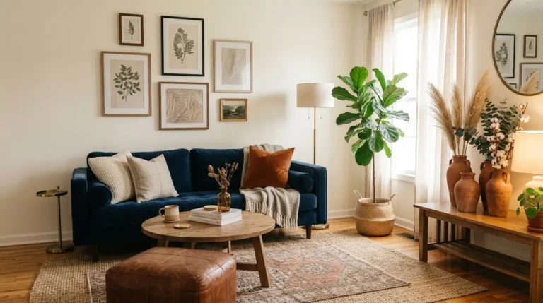
A navy sofa gives the room a clear center of gravity and tends to hide the marks that show most on pale upholstery. Against warm beige walls, the contrast reads tailored rather than harsh.
Fabric choice does a lot of work here. Navy in a flat weave can look heavy and dark, while navy in velvet, chenille, or a textured boucle catches light and shows depth. If the room has limited daylight, a textured version plus a cream or camel throw will break up the mass.
Watch out for: pet hair and lint, which show clearly on dark upholstery. A tighter weave usually helps.
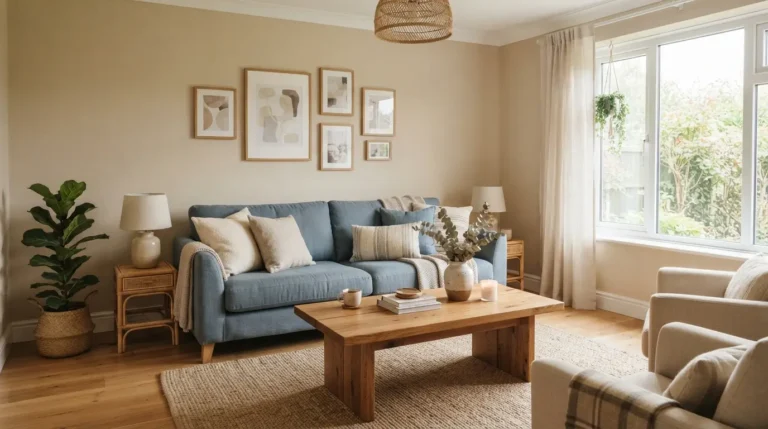
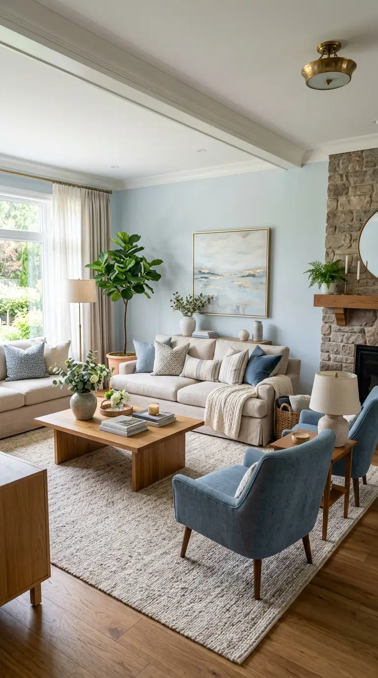
3. Flip It: Dusty Blue Walls With a Sand-Colored Sofa
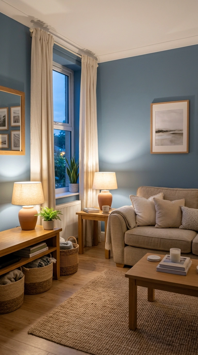
Painting the walls a soft, greyed blue and keeping furniture in oatmeal or sand gives a calmer result than a bright white room with blue accents. The color surrounds you instead of sitting in patches.
This version needs warmth added deliberately. Natural oak or walnut furniture, a jute or wool rug, and warm-toned lamp shades keep the room from tipping cold. Cool white bulbs work against that warmth, so choose warmer bulbs for lamps.
4. Use Three Depths of Blue in One Room
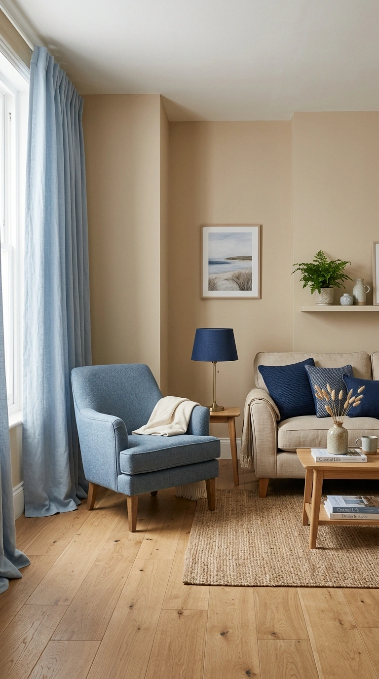
A room using a single blue can look flat. Layering a pale blue, a mid dusty blue, and a deep navy creates depth while still feeling like one palette.
One workable distribution: pale blue in curtains or a large piece of art, mid blue in an accent chair or ottoman, navy in smaller items like pillows, a lampshade, or the binding on a rug. Keep the beige consistent so the blues have a steady background to sit against.
5. Let a Patterned Rug Set the Palette
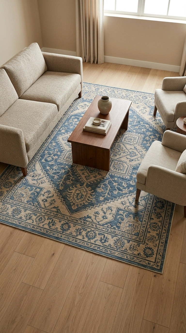
Buying a rug that already contains both colors removes most of the guesswork. Pull the beige from the rug for your walls and the blue for your pillows, and the room coordinates without much effort.
Rug size often does more work than pattern. In most seating arrangements, and if your floor plan allows it, the rug should be large enough that at least the front legs of the sofa and chairs sit on it. A small rug floating under the coffee table can make the whole room look under-scaled, no matter how good the colors are.
6. Let Warm Wood Floors Bridge the Two Colors
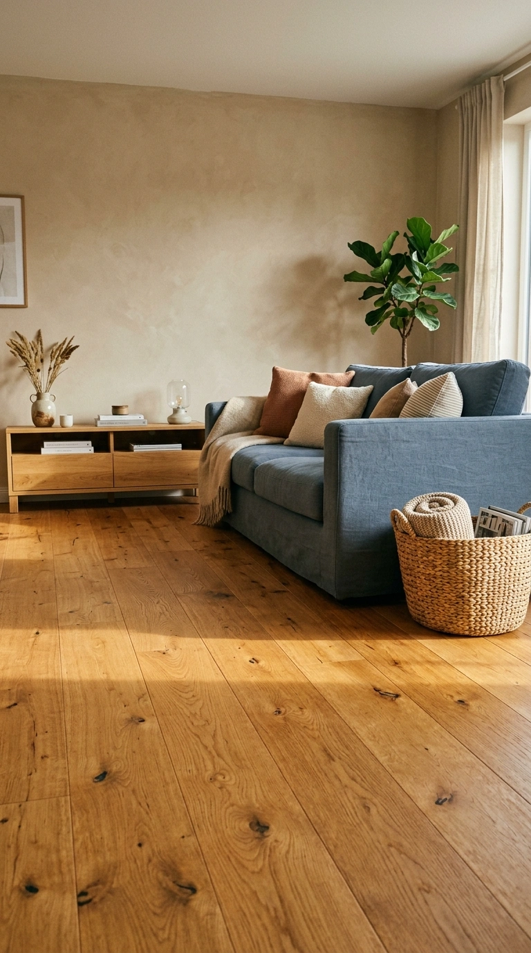
Oak, walnut, and other warm-toned wood floors act as a middle step between cool blue and warm beige, which is why this palette often looks easier over wood than over grey tile or cool laminate.
If your flooring is grey or cool-toned, add the warmth elsewhere. A jute rug, a wooden coffee table, or woven baskets can do the same job.
7. Start With Pillows and Throws Before Anything Else
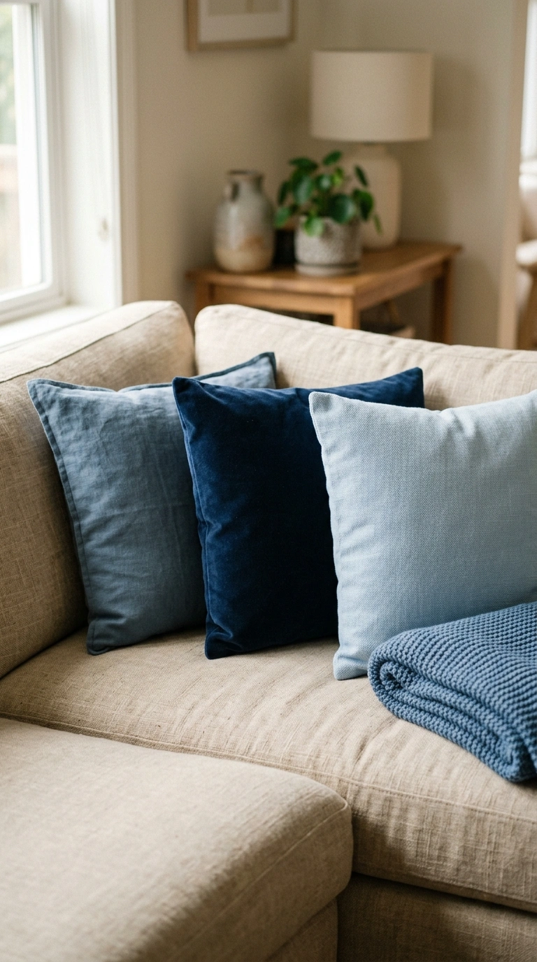
If you are unsure which blue suits your room, buy pillow covers in three different blues and live with them for a week. It costs far less than repainting and tells you more than a paint chip held against a wall.
Pay attention to how each one looks at night under lamplight. Some blues that look right at midday shift toward grey or purple under warm artificial light.
8. Paint Built-In Shelving Blue Against Beige Walls
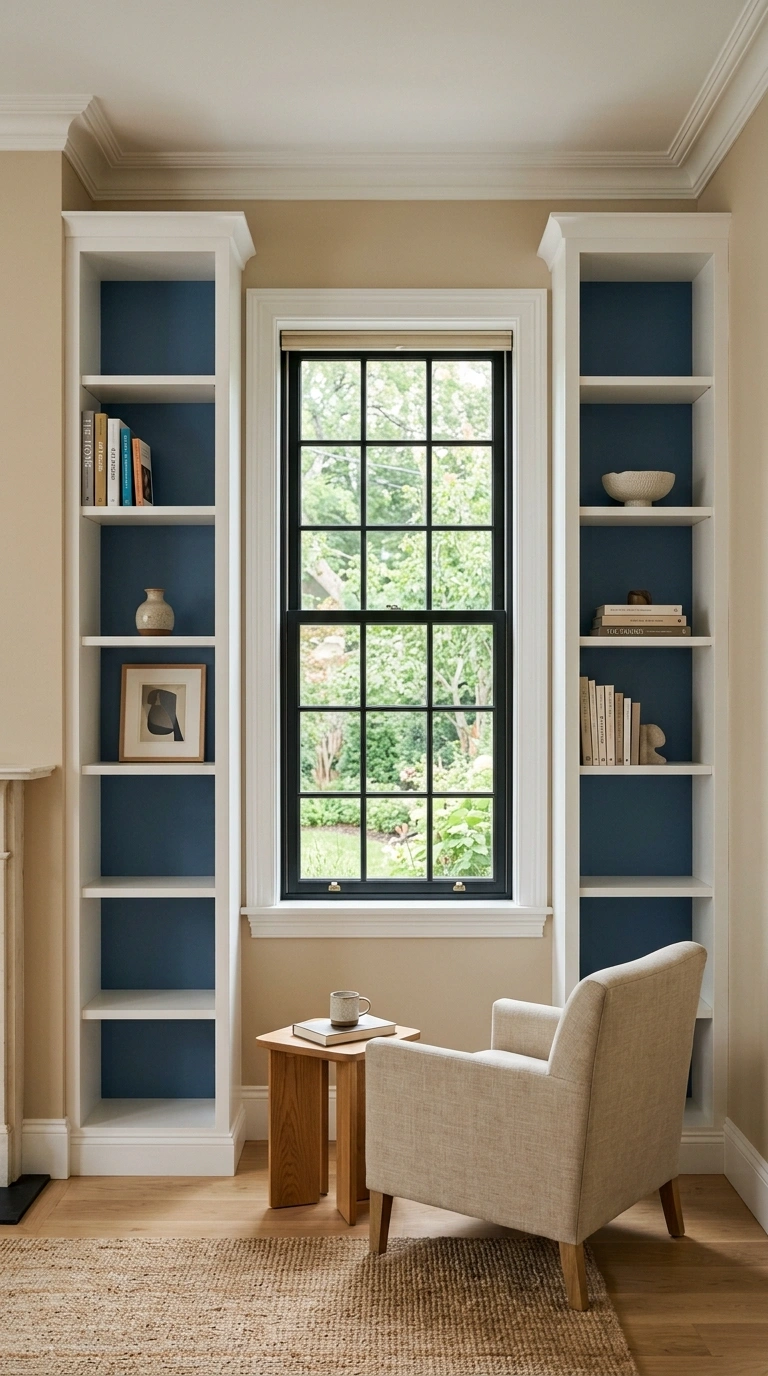
Painting the inside back panel of built-ins or a bookcase in blue while the walls stay beige creates a framed block of color without committing a full wall.
Keep the styling restrained. Blue backing already adds visual activity, so shelves crowded with mixed-color objects can look busy. Group books by color where you can, leave gaps, and repeat a few beige and natural elements across the shelves so the two colors stay connected.
9. Pair a Beige Sofa With Blue Velvet Chairs
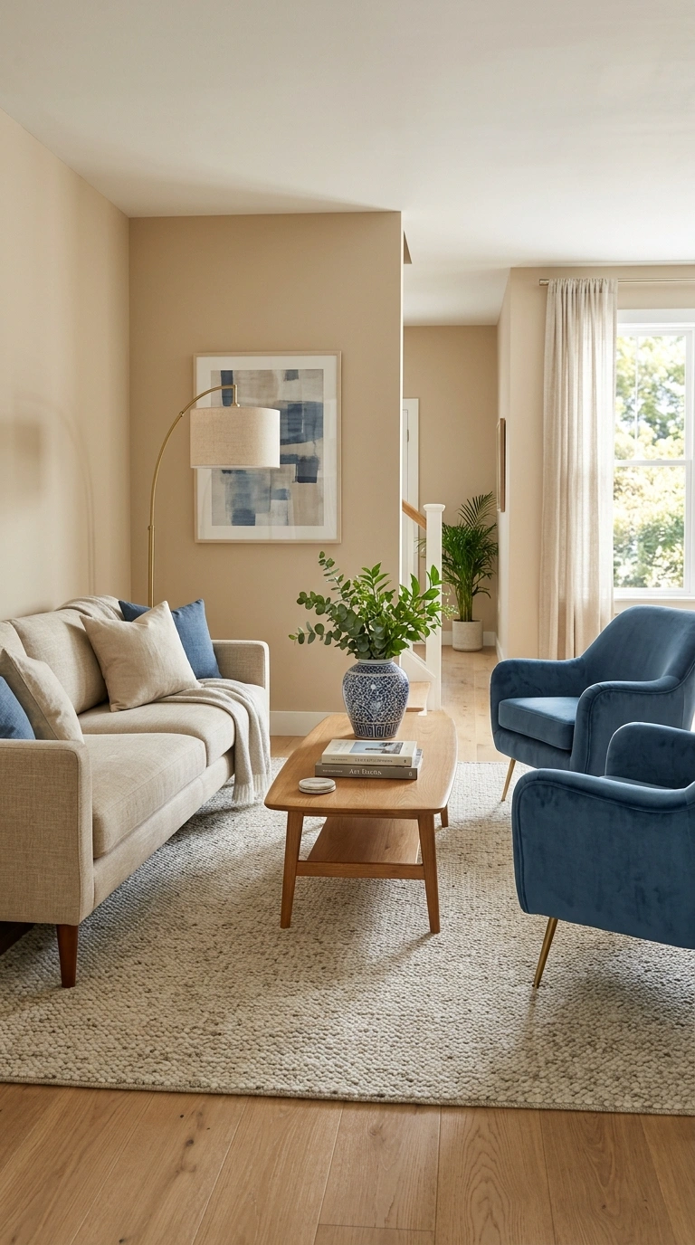
Two blue accent chairs facing a beige sofa create a balanced conversation layout and let you use a richer blue than you might risk on a large sofa.
Velvet reads more formal, linen more relaxed, and leather in a deep blue more unusual but harder to match later. Repeating the blue somewhere else in the room, even in something small, helps the chairs read as part of the scheme rather than as leftovers.
10. Split the Wall: Blue Below, Beige Above
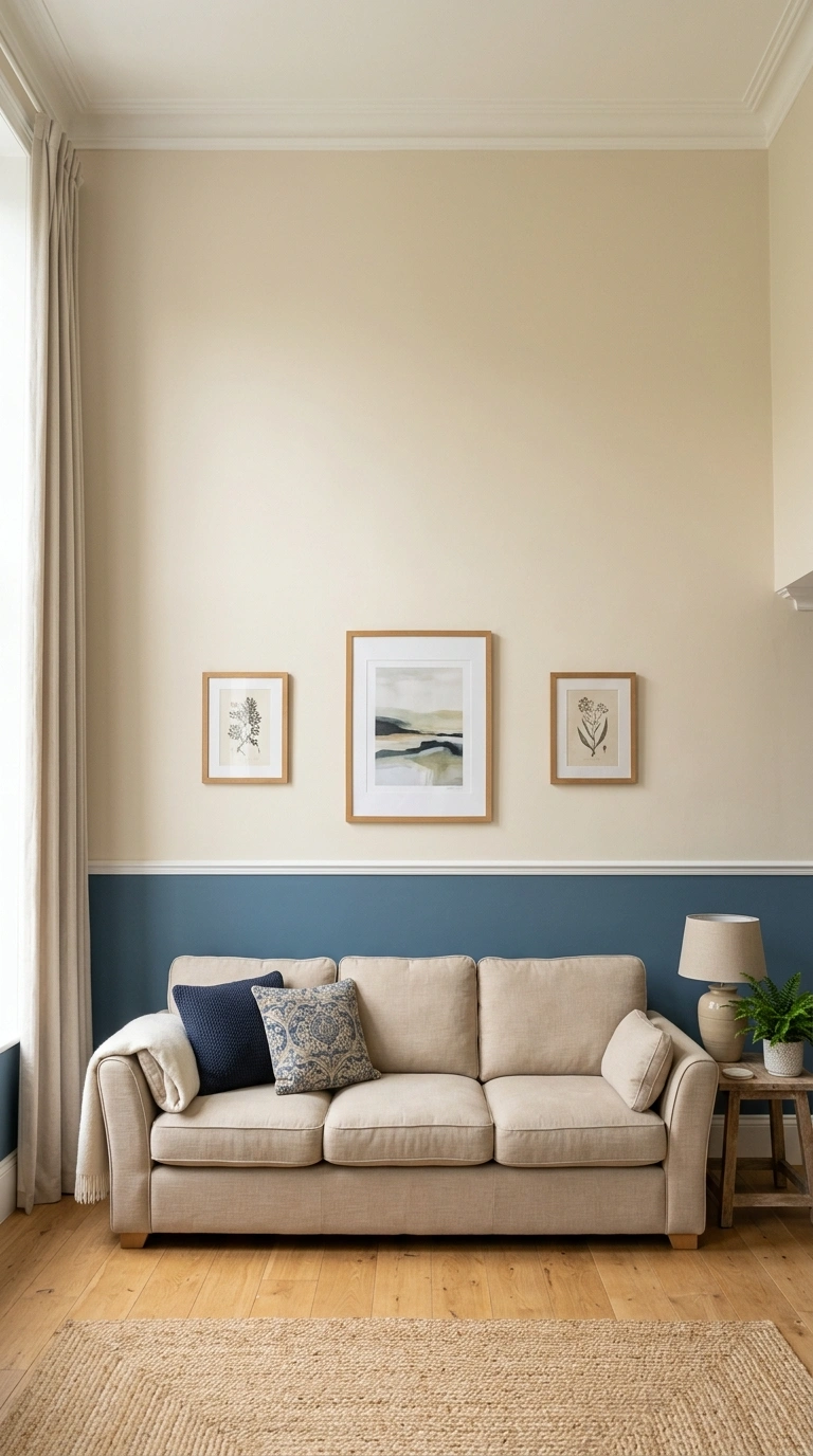
Painting the lower third of the wall in blue and the upper section in beige, with a picture rail or slim molding at the join, gives the room structure while keeping the upper wall light.
This suits rooms with tall walls and can look awkward in rooms with low ceilings, where the horizontal line cuts an already short wall in half. If your ceiling is low, the alternative in the next idea works better.
11. Beige Linen Curtains With a Blue Border
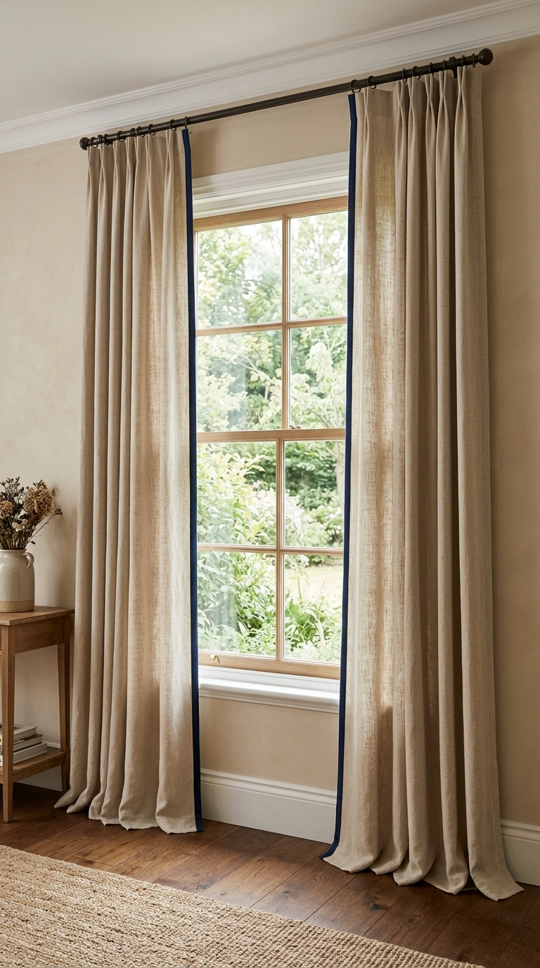
A contrast tape or border sewn along the leading edge of plain beige curtains adds the blue in a thin, tailored line. It is a small detail that makes ready-made curtains look custom.
Hang the rod close to the ceiling and extend it past the window frame on both sides so the panels stack against the wall rather than covering glass. That change often does more for a room’s proportions than the fabric itself.
12. Use Blue and White Ceramics for Small Doses of Pattern
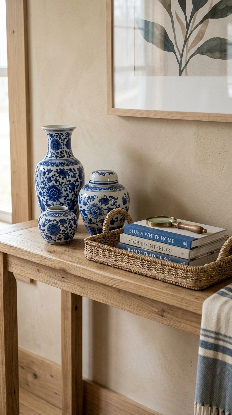
Ginger jars, blue and white vases, and patterned bowls carry the color in small, moveable amounts. They also let you add pattern without committing to patterned upholstery.
Group them in odd numbers and vary the height. Three pieces of different sizes on a beige console usually reads better than a row of matching items.
13. Paint the Ceiling a Pale Blue
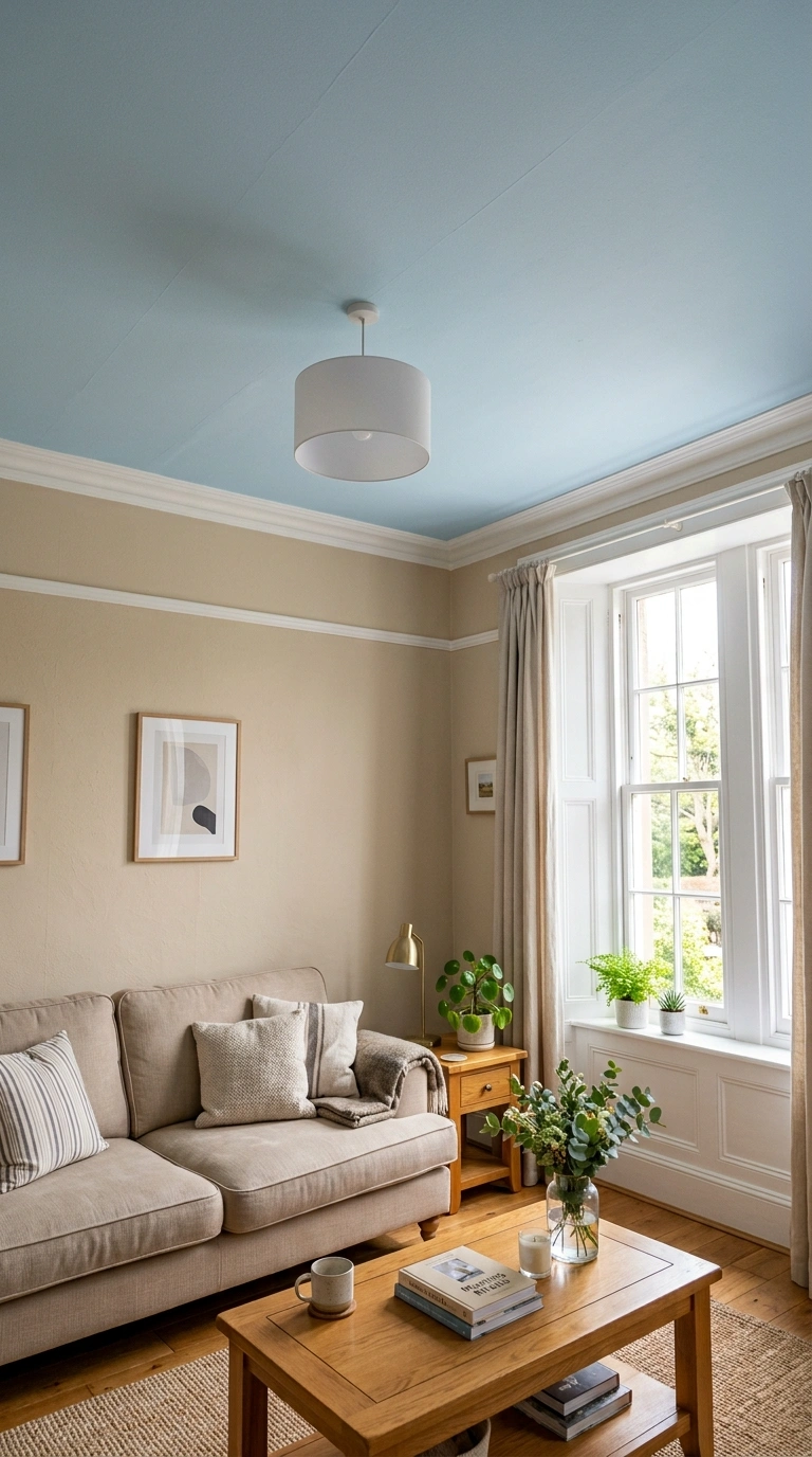
A very soft blue ceiling above beige walls gives the room a quiet lift and looks considered rather than trendy. It suits rooms with white or cream trim and reasonable daylight.
Choose a blue several shades lighter than you think you need. Ceilings sit in shadow and usually read darker than the sample. In a room with low light, this idea can make the ceiling feel heavy, so test a large sample patch first.
14. Coastal Version: Pale Blue, Oatmeal, and Rattan
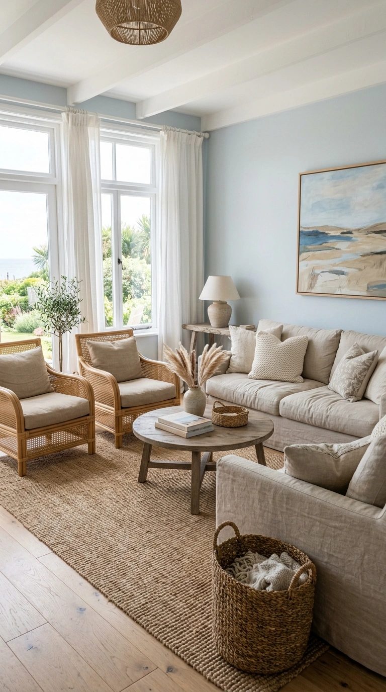
The relaxed version of this palette leans on natural fiber. Oatmeal linen upholstery, a pale blue wall or slipcover, rattan or cane chairs, and a jute rug give the room texture instead of pattern.
Literal beach decor is what dates this look fastest. Skip the anchors, rope details, and starfish. The palette and the materials already carry the idea.
15. Paint the Fireplace Wall or Millwork Navy
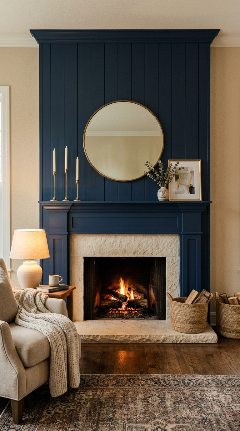
Painting the fireplace wall, paneling, or trim in navy while the rest of the room stays beige focuses attention on the architecture. It suits rooms that already have a feature worth highlighting.
Test the color against your mantel and hearth materials first. Navy generally sits well with cream limestone, white marble, and painted brick. Against orange-toned brick or a strongly veined grey stone, it often fights.
16. Use a Slate Blue Media Wall to Soften the TV
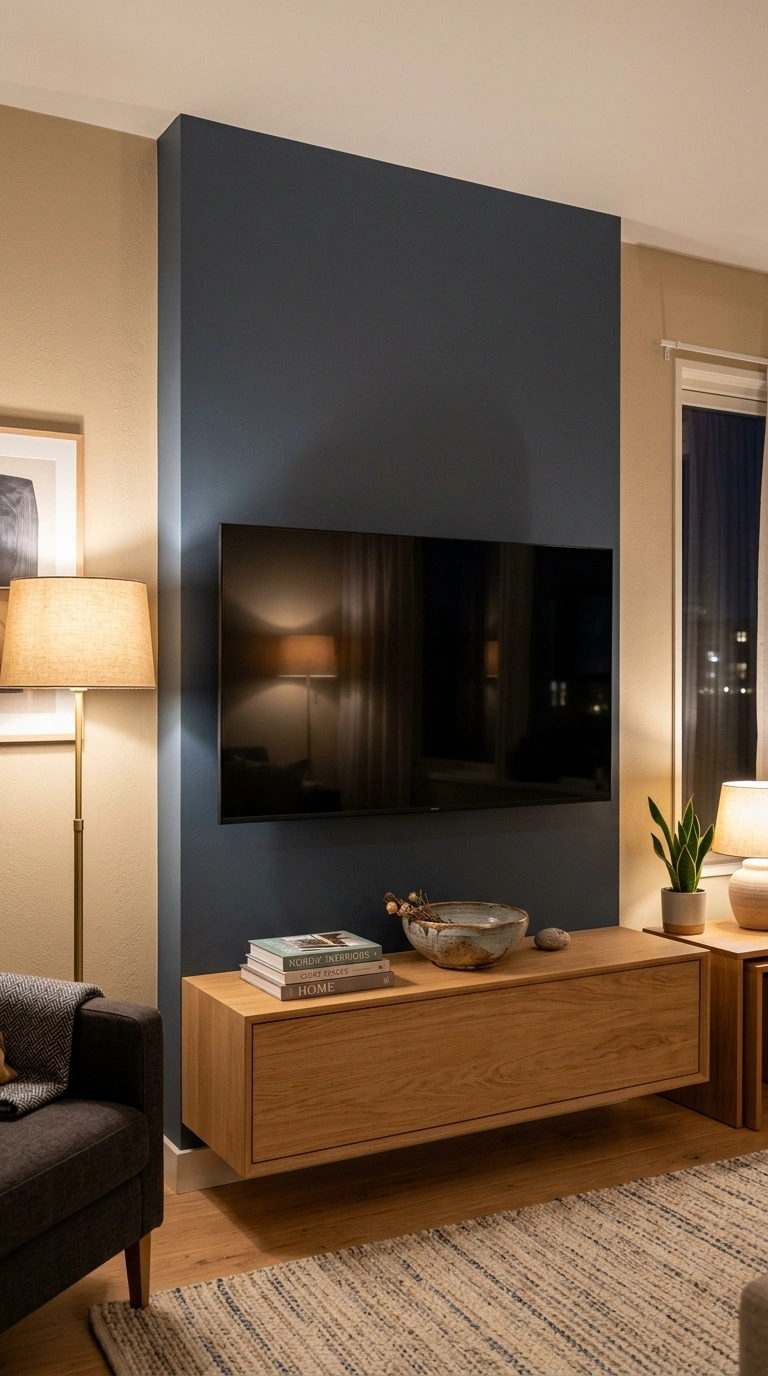
A dark, muted blue behind a wall-mounted television reduces the contrast between the black screen and the wall, so the TV is less likely to be the first thing you see. Beige walls make a black screen stand out sharply by comparison.
Slate blue often works better than navy here because it holds more grey and stays quiet at night when the room is lit by lamps. Floating shelves or low cabinetry in a beige or oak tone underneath keep the block of color from feeling like a slab.
17. Add Texture to Beige Walls Instead of More Color
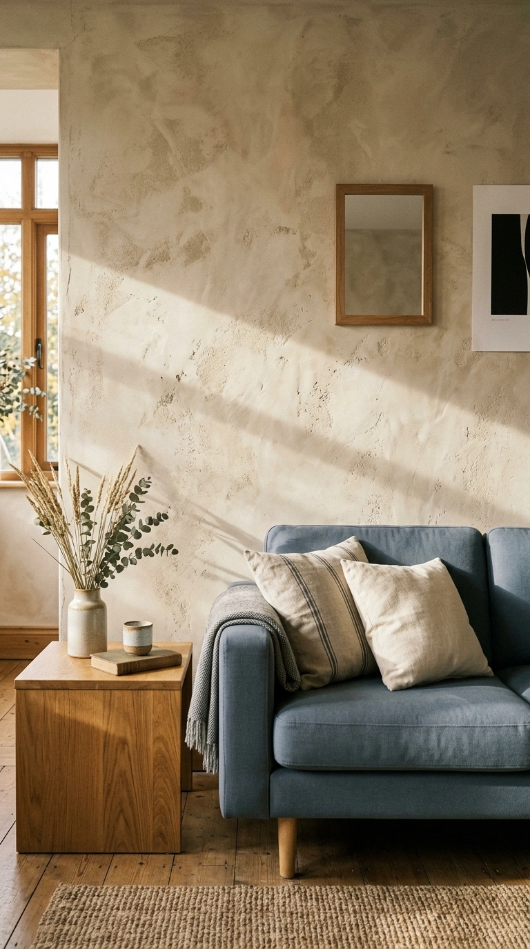
Limewash, plaster finishes, and textured wall paint give beige walls movement and shadow, which is often what stops a neutral room from looking flat. Blue upholstery then reads as the clean, smooth element against a softly varied background.
Textured finishes are harder to touch up than flat paint, and repairs rarely blend invisibly. That is worth knowing before you commit a whole room.
18. Choose Brass or Aged Bronze Over Chrome
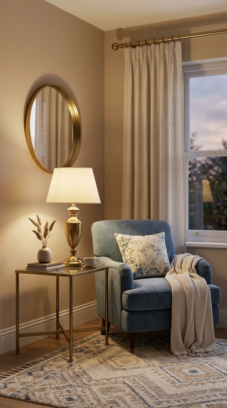
Metal finish changes the temperature of this palette more than many people expect. Brass, antique bronze, and warm nickel pull the room toward warmth. Chrome and polished steel push it cooler and sharper.
If your room already leans cold because of light direction or grey flooring, swapping to warm metals in lamps, curtain rods, and hardware is one of the simpler corrections available.
19. Bring in Stripes for Structure
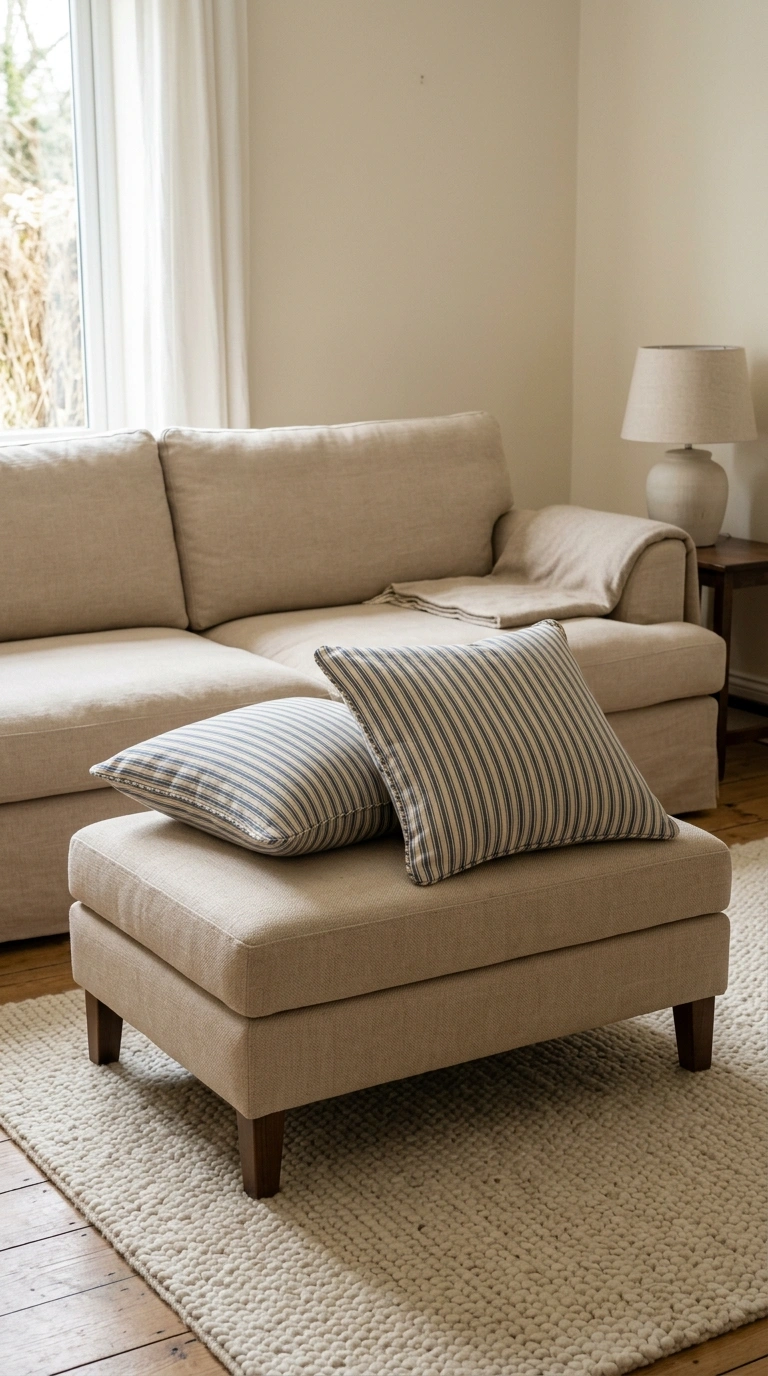
Blue and beige stripes give the palette a crisp, tailored edge that a solid pairing does not have. Use them in one or two places rather than everywhere: a pair of pillows, an ottoman, or a chair seat.
Stripe width changes the mood. Narrow stripes read classic and quiet, wide stripes read more casual and modern. Mixing several stripe widths in one room can look unsettled unless the colors stay closely related.
20. Use Denim and Washed Cotton in Family Rooms
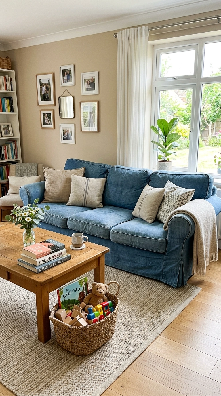
Washed denim and heavy cotton in mid blue tones tend to hide wear better than pale linen, and many are made as removable covers. For rooms with children or pets, that often matters more than the exact shade.
Before you buy: check the care label and the manufacturer’s cleaning code, and ask whether replacement covers are sold separately. A second set of slipcovers gives you a fallback while the first is being washed.
21. Hang Blue Artwork on Beige Walls
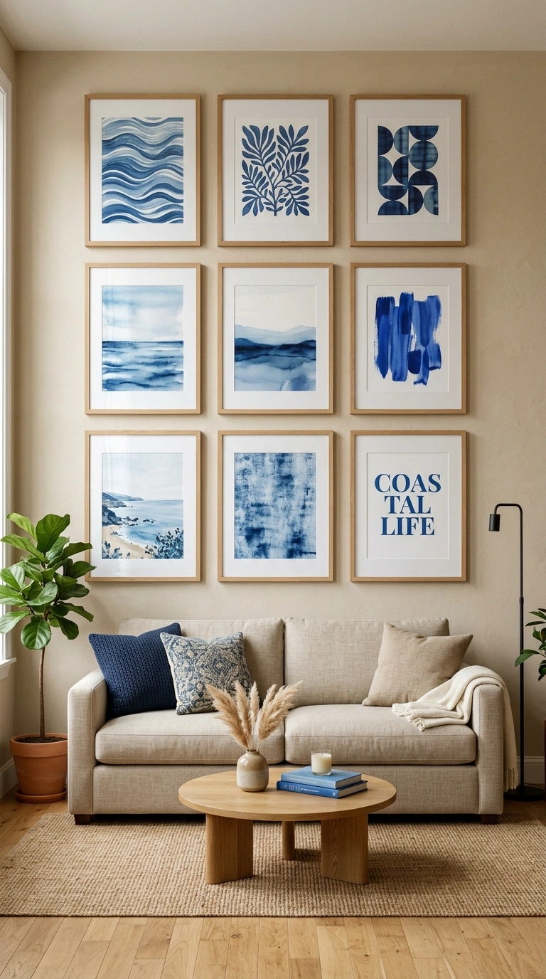
Beige walls make a quiet background for art, and blue-dominant pieces distribute the color at eye level where it registers most.
Keep the frames consistent, either all wood or all one metal, so the wall reads as a set. Hang the center of the arrangement at roughly eye level rather than high on the wall, which is a common mistake with gallery walls.
22. In Small Living Rooms, Keep Blue Low and Soft
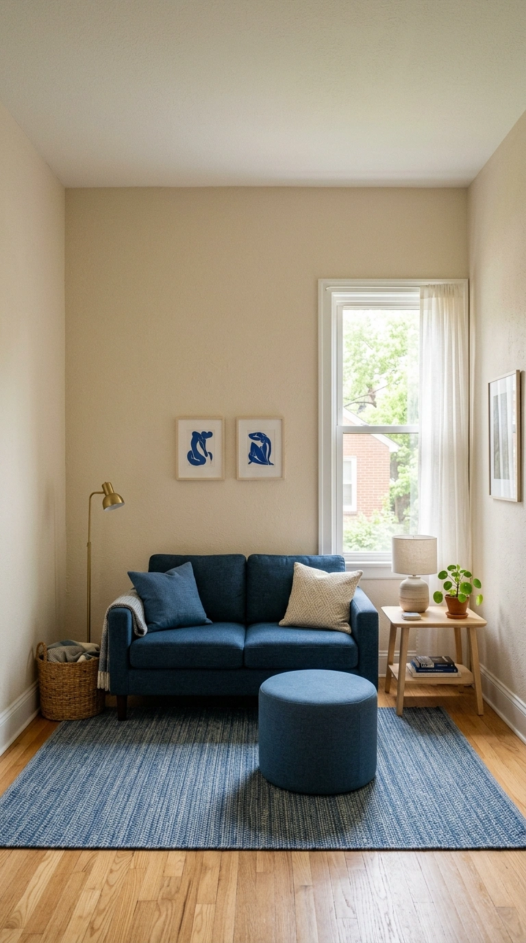
In a small room, large areas of dark blue on the walls tend to pull them visually inward. Keeping walls in a light beige and placing the blue in the rug, seating, and lower objects keeps the upper half of the room open.
A useful exception: painting one small wall in a strong blue at the far end of a narrow room can add depth, because the darker surface appears to recede. This applies to the end wall rather than the long side walls, which would narrow the room further.
23. Add One Warm Third Color
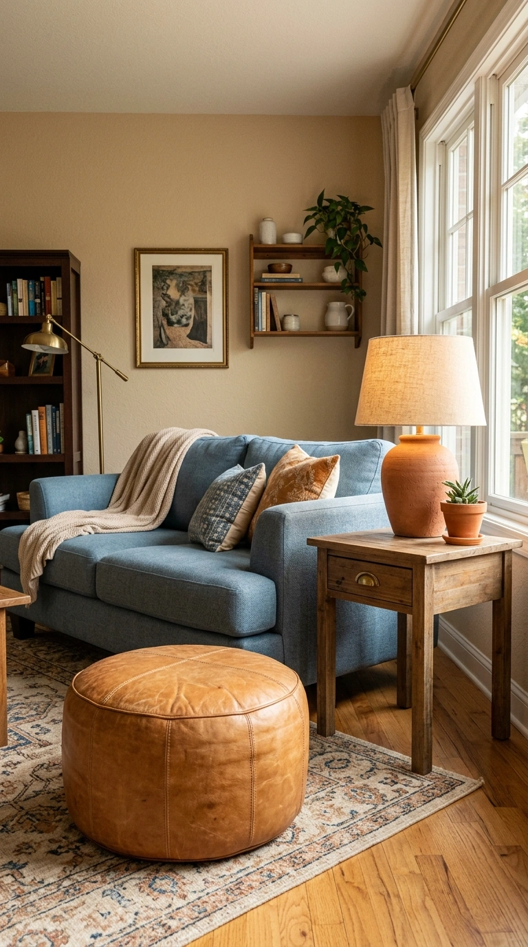
Blue and beige alone can feel slightly cool and safe. A third accent in camel, tan leather, terracotta, or aged brass gives the palette warmth and stops it from looking like a hotel room.
Keep the third color to a small share of the room. A leather ottoman, a terracotta lamp base, and a few brass details are usually enough. Once the third color spreads across most of the room, it stops reading as an accent and starts competing with the main palette.
Where to Start
The decision that does the most to make blue and beige look elegant rather than muddy is undertone. Get the warmth of your beige and the warmth of your blue reading in the same direction, and most of the ideas above become easier to pull off.
If you are starting from scratch, buy the rug or the main upholstery first and pull your paint color from it. Paint comes in far more shades than fabric does, so matching paint to a fabric is usually easier than the reverse. Save the ideas that suit your room’s light and flooring, then test samples on your own walls before ordering anything.
KEY TAKEAWAYS
- Match undertones first: warm yellow-beige generally sits better with a softened, slightly grey blue than with a bright or icy blue.
- Give one color the majority of the room. Equal amounts of blue and beige often look unresolved.
- Check your room’s light direction before choosing a blue, and view samples in daylight and under your own lamps.
- Layer two or three depths of blue instead of repeating one shade, and add texture so beige walls do not read flat.
- Brass and warm wood help correct a palette that feels cold. Chrome and grey flooring push it cooler.
- Add one warm third color, such as camel or terracotta, in small amounts to keep the scheme from feeling clinical.
FAQs
Which shade of beige goes best with navy?
Cream and warm sand beiges usually give the cleanest contrast with navy, because the warmth balances navy’s depth. Grey-leaning greige also works, but the result reads cooler and more modern, so it tends to need warm wood or brass elsewhere to stay comfortable.
Is blue and beige too cold for a north-facing living room?
It can be, but the fix is straightforward. Choose a blue with more grey or green in it rather than a clear cool blue, keep beige on the warmer side, use warmer bulbs in lamps, and add wood, brass, or a jute rug. The color pair itself is rarely the problem; unbalanced warmth usually is.
Should I paint the walls blue or buy a blue sofa?
Paint is cheaper to change and easier to undo, so if you are undecided, put the blue on the walls and keep large upholstery neutral. If you already love a specific blue sofa, buy it and keep walls beige. Doing both at full strength in a small room can feel heavy.
What flooring works best with blue and beige?
Warm-toned wood such as oak or walnut sits naturally between the two colors. Grey or cool laminate is workable but usually needs warmth added through rugs, wood furniture, and metal finishes. Strongly orange-toned flooring is the hardest to balance and often calls for a blue with more grey in it.