Neutral but Not Boring: California Coastal Interior Design
There is a version of coastal design that leans hard into anchors, rope, and navy stripes, and there is another version entirely that people in California actually live with, one built on sun bleached wood, soft sand tones, and rooms that feel open and easy without trying so hard. The trouble is that a lot of neutral rooms end up flat instead of calm, with every surface the same shade of beige and nothing for the eye to land on. Real California coastal style avoids that trap by leaning on texture instead of color to do the work, mixing rough linen against smooth plaster, woven rattan against pale oak, so a room stays interesting even when the palette barely moves. This piece walks through eight ways to build that look in a real home, focused on choices you can actually shop for and place in a room this month, not abstract mood board talk.
Sandy Neutral Palette
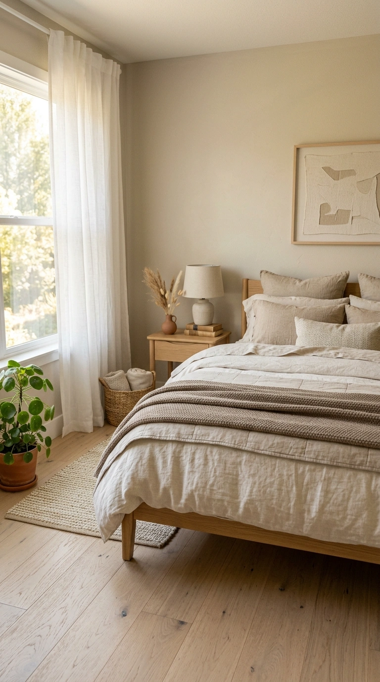
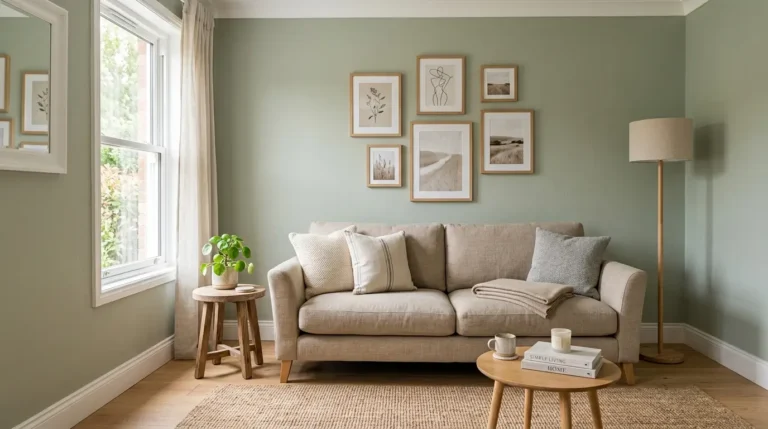
Start with wall and floor tones that sit somewhere between warm white and pale sand rather than a stark, cool white or a flat beige. Think of colors like unbleached linen, oat, or a soft greige with a hint of warmth in it, since these read as sun washed rather than sterile. Paint the walls in a flat or matte finish rather than anything glossy, which keeps the light soft and diffused the way it would look in a home a few blocks from the water. Layer in one slightly darker tone through a rug or a set of pillows, maybe a warm taupe or a soft driftwood gray, so the room has some depth instead of everything sitting at the exact same value. Furniture in natural wood tones or bleached oak continues the palette without introducing anything that reads as a hard color statement.
Textured Linen Layers
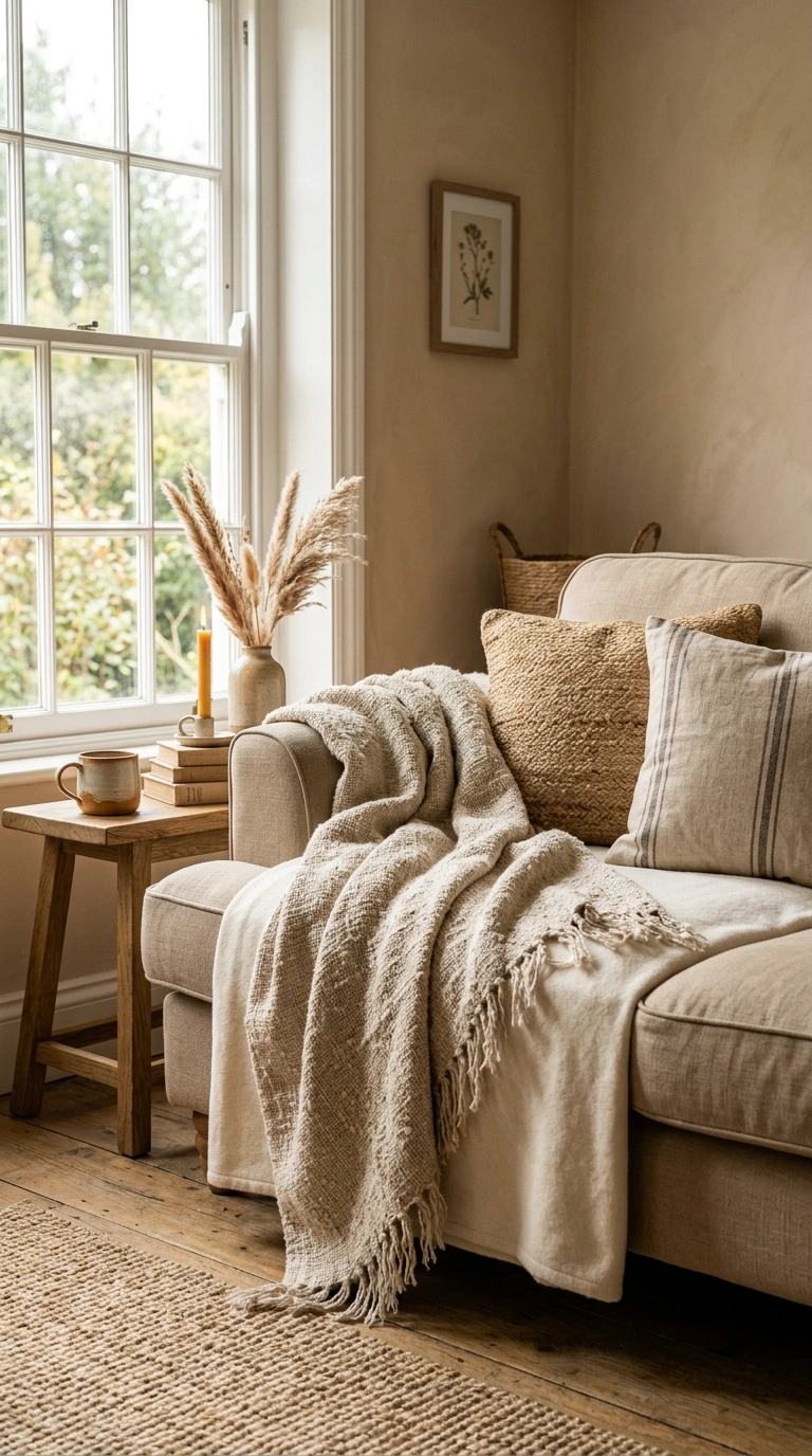
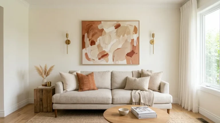
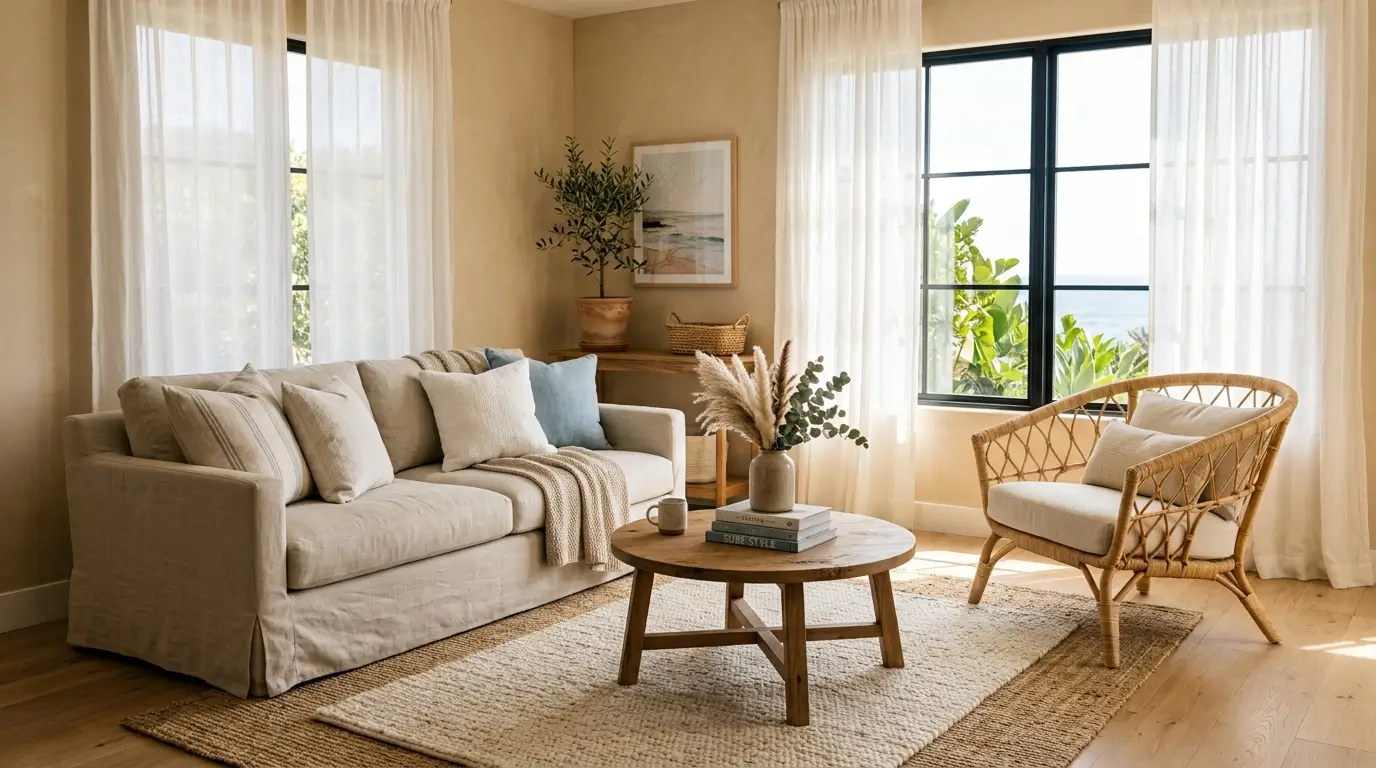
Once the base palette is set, texture becomes the main tool for keeping a neutral room from feeling flat, and linen is one of the easiest fabrics to lean on for this. Choose linen slipcovers or curtains in their natural, slightly wrinkled state rather than a stiff, pressed finish, since that relaxed texture is a big part of what makes a room feel California casual instead of formal. Layer a nubby linen throw over a smoother cotton one on a sofa, or mix a linen curtain against a woven wood blind, so the eye picks up on the contrast even though the colors are nearly identical. Avoid anything too crisp or shiny in this style, since polished satin or heavy velvet pulls the room in a much more formal direction than the relaxed, sun faded feeling this look is going for.
Natural Wood Tones
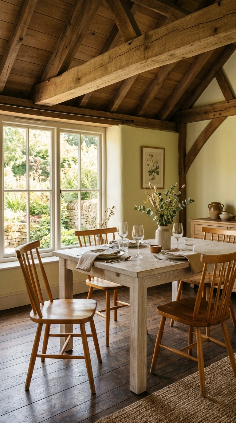
Wood furniture in this style should look sun bleached rather than dark and formal, so lean toward white oak, ash, or a whitewashed finish rather than a deep walnut or mahogany. A dining table or coffee table with visible wood grain and a matte, low sheen finish captures the look better than anything glossy or heavily lacquered. Mix in at least two different wood tones in the same room, like a pale oak floor with a slightly warmer honey toned side table, since a room built entirely from one identical wood tone can start to feel monotonous rather than layered. Exposed wood ceiling beams, if your home has them or can add them, tie the whole room together and echo the kind of relaxed, sun touched feeling that defines this style at its best.
Woven Rattan Accents
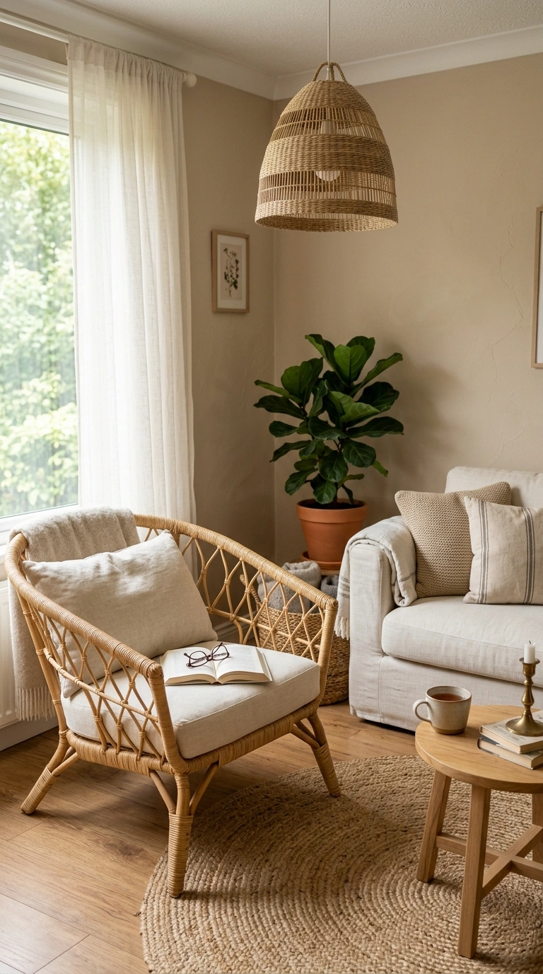
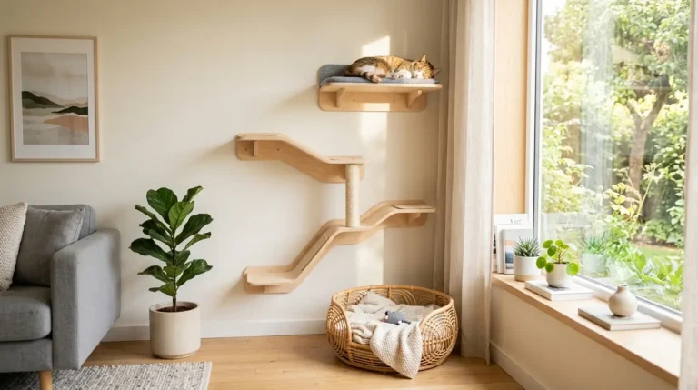
Rattan and cane furniture bring in a textural element that reads as coastal without ever needing to touch a nautical theme directly. A woven rattan dining chair, a cane fronted cabinet, or a simple rattan pendant light overhead all add warmth and visual interest without introducing new color into the room. Choose pieces with an open, airy weave rather than a tightly packed one, since the gaps in the weave let light pass through and keep furniture from feeling heavy in the space. Pair a rattan accent chair with a plain linen sofa so the two textures play off each other, rather than filling a whole room with rattan pieces that end up competing instead of complementing. This material also ages well, developing a slightly deeper honey tone over the years that only adds to the lived in feeling.
Soft Ocean Blue Touch
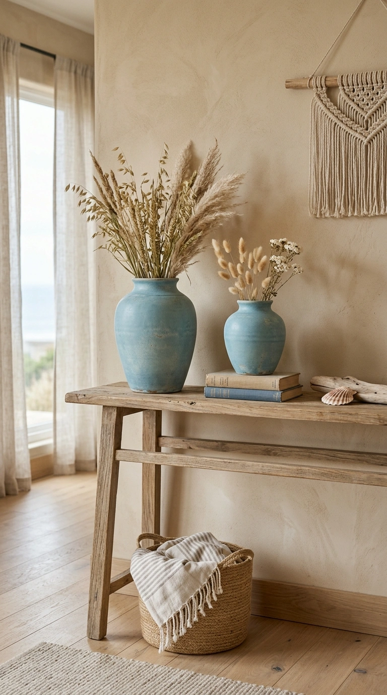
While the overall palette stays neutral, one small dose of a soft, faded blue, closer to sea glass or washed denim than a bright navy, gives the eye a gentle place to rest without breaking the calm, sandy base of the room. Use this color sparingly, maybe on a single set of ceramic vases, a stack of throw pillows, or the glaze on a piece of pottery, rather than painting an entire wall or buying a large blue sofa. The goal is a hint of color that feels like it drifted in naturally, the way a piece of sea glass might show up on a beach walk, rather than a deliberate color scheme announcement. Keep every other blue toned object in the room within the same faded, muted family so nothing reads as a bright, saturated accent that clashes with the softness of everything else.
Airy Window Treatments
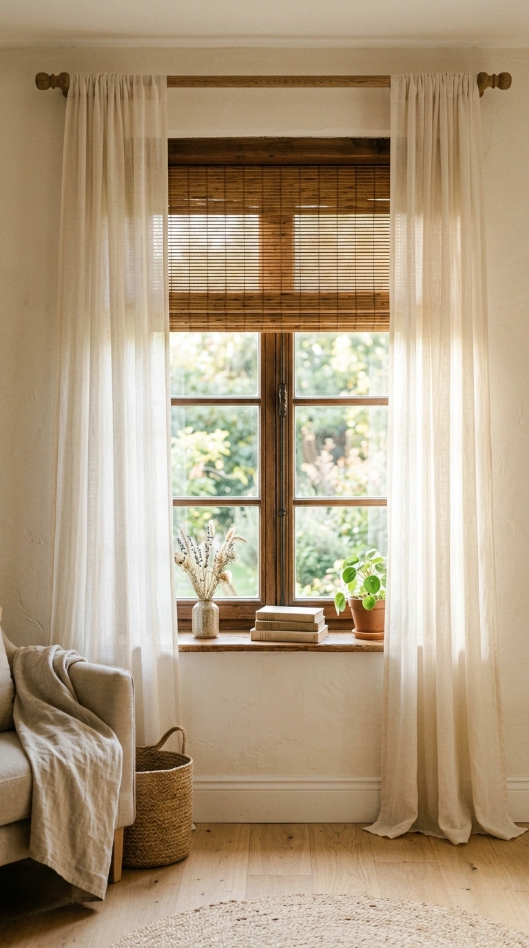
Windows in this style should feel open and let in as much natural light as possible, since diffused daylight is one of the defining features of the whole look. Sheer linen curtains, hung slightly higher than the window frame itself, let light filter through softly during the day while still offering privacy in the evening. Skip heavy blackout curtains or anything in a dark, saturated color, since they cut against the airy feeling this style depends on. If you need more privacy or light control, a simple woven wood shade in a light natural tone works well underneath a sheer curtain panel, giving you both function and the right visual texture. Keep curtain rods simple, in a matte black or natural wood finish, rather than an ornate or heavily decorative style.
Organic Ceramic Pieces
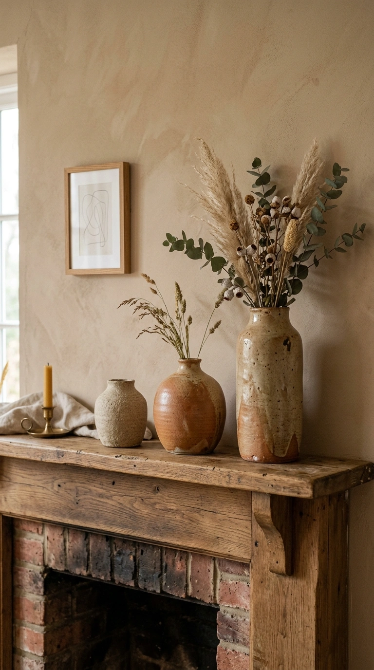
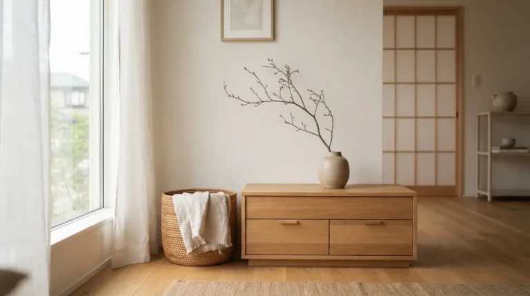
Hand thrown or hand glazed ceramic pieces, whether that is a set of table lamps, a vase, or a stack of dinnerware displayed on open shelving, bring in the kind of slight irregularity that keeps a neutral room from feeling mass produced. Choose pieces with a matte or slightly speckled glaze in tones like oatmeal, warm white, or a soft terracotta rather than a perfectly glossy, uniform finish. Group two or three ceramic vases of varying heights together on a console table or mantel rather than displaying a single piece alone, since the slight variation between handmade objects photographs and reads beautifully as a small collected moment. These pieces work especially well as the main decorative objects in a room that otherwise keeps furniture and walls very simple and unadorned.
Layered Jute Rugs
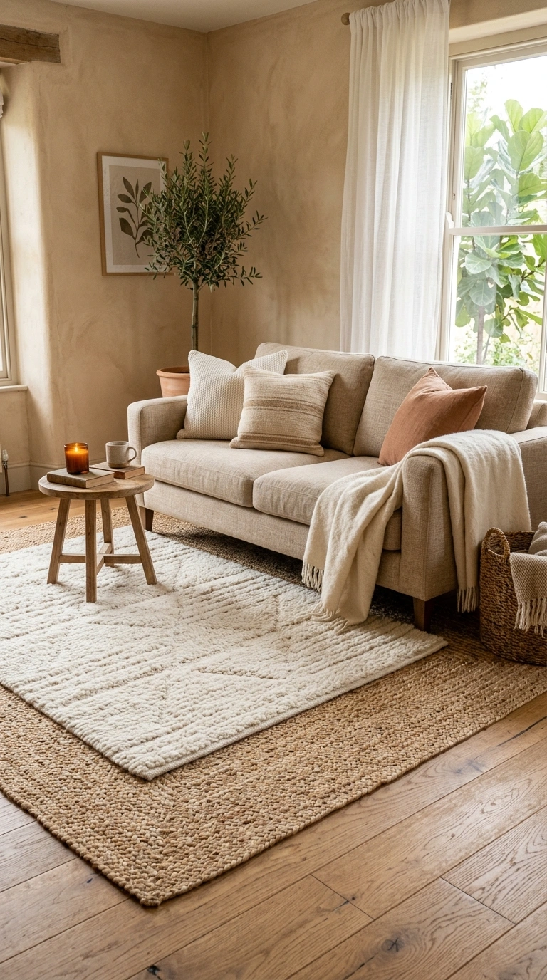
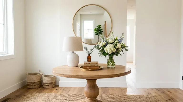
A natural jute or sisal rug, in its raw, undyed tone, grounds a room in this style far better than a patterned or brightly colored rug would. Layer a smaller, softer wool or cotton rug on top of a larger jute one in a seating area, which adds both visual layering and a softer surface underfoot in the spot where people actually sit. Choose a jute rug with a simple, flat weave rather than a heavily textured or braided one if you want the room to lean slightly more modern, or choose a chunkier braided jute for a more relaxed, cottage leaning version of the same style. This layered rug approach also helps define a seating area within an open floor plan, giving the space a sense of structure without needing a single wall or divider to do it.
A neutral room does not have to mean a boring one, and the difference almost always comes down to texture and small, considered detail rather than a bigger color palette. Try picking just two or three of these ideas to start, maybe a jute rug, a set of linen pillows, and one ceramic vase, and build the rest of the room around them over time. The goal is a space that feels easy and sun touched, the kind of room that looks like it came together slowly and naturally rather than all at once.
FAQs
Q1: What colors are used in California coastal interior design? A1: The palette centers on warm neutrals like sand, oat, and soft greige rather than stark white or flat beige. A small, muted accent color like faded sea glass blue is often added in small doses through pillows or ceramics.
Q2: How is California coastal style different from traditional nautical decor? A2: Traditional nautical decor leans on navy stripes, anchors, and rope details, while California coastal style skips those themes entirely in favor of natural materials, sun bleached wood, and a soft, neutral palette with texture doing most of the visual work.
Q3: What furniture materials fit a California coastal look? A3: Bleached or whitewashed oak, woven rattan and cane, and linen upholstery all fit this style well. Avoid dark, heavily lacquered wood or shiny, formal fabrics like velvet or satin, which pull a room in a more traditional direction.
Q4: How do you keep a neutral coastal room from looking boring? A4: Lean on texture rather than color, mixing linen, rattan, jute, and ceramic finishes within the same room. Layering different textures at a similar color value keeps the eye interested even when the overall palette barely changes.
Q5: What rug works best for a coastal neutral living room? A5: A natural jute or sisal rug in its undyed tone works as a strong base layer, especially when topped with a smaller, softer wool or cotton rug in the seating area for added comfort and visual layering.