15 Serene Wall Colors to Make Your Home Feel More Relaxing
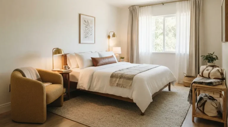
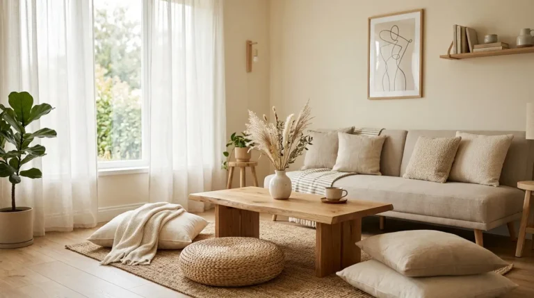
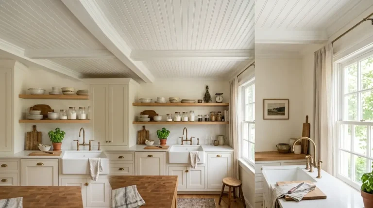
Paint color changes how a room feels faster than almost anything else you can do to your home. You can walk into two rooms with the exact same furniture, and the one with a soft, muted wall color will feel calmer every single time. The trick is choosing shades that are not too bright, not too stark, and not too cold. The colors on this list all share one thing in common: they are muted, meaning they have a bit of gray mixed in rather than being pure, saturated hues. That softness is what makes a room feel like a place to unwind instead of a place that keeps your eyes busy. Whether you are repainting a bedroom, a living room, or a home office, these 15 wall colors are a good place to start. Test a small swatch on your wall first, since lighting changes how every one of these looks throughout the day.
1. Soft Sage Green
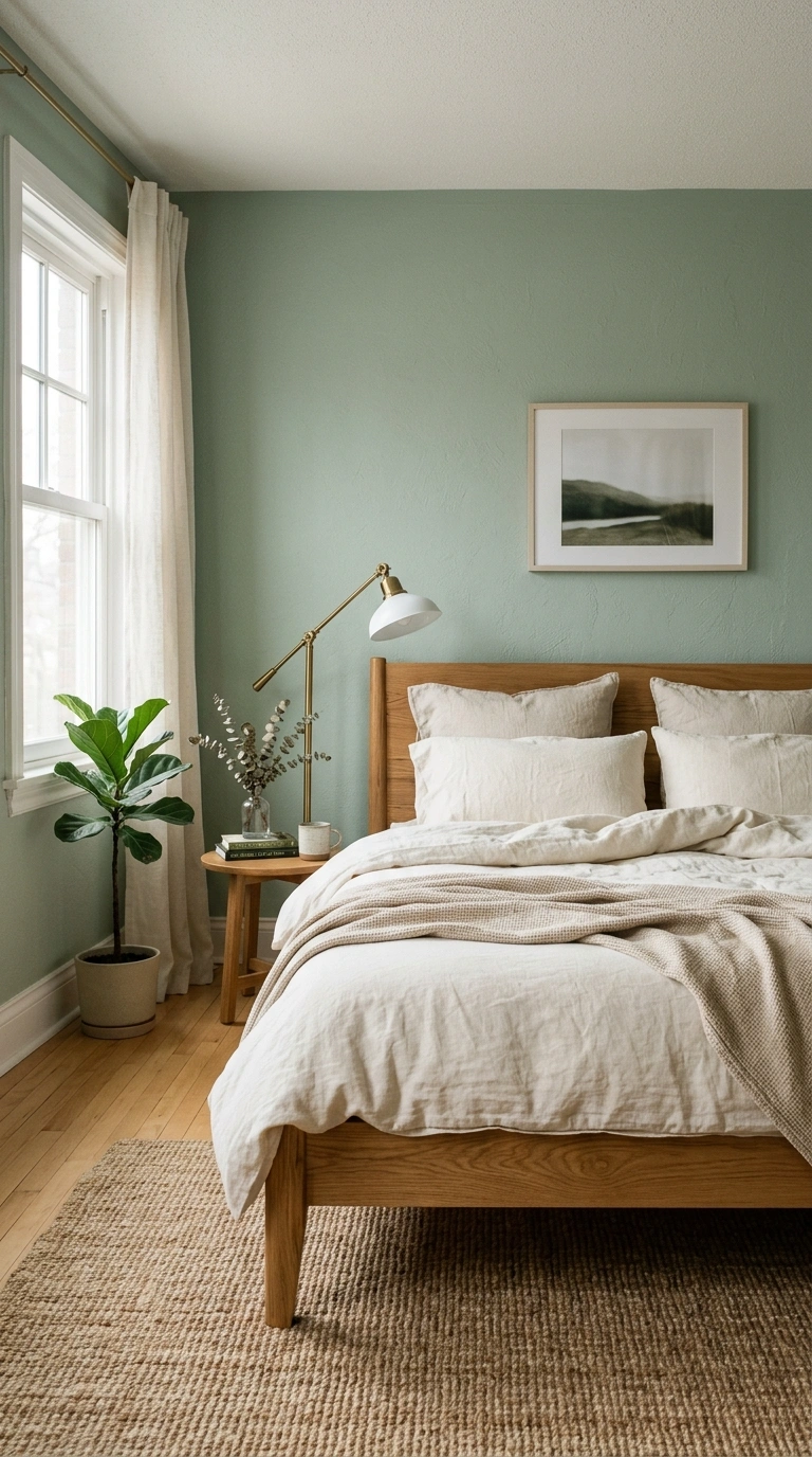
Soft sage green is one of the most popular calming colors right now, and for good reason. It reads as green in some light and almost gray in others, which gives it a quiet, adaptable quality. This shade works beautifully in bedrooms and living rooms, especially when paired with warm wood furniture and cream textiles. Because sage green has gray undertones, it never feels as loud as a brighter grass green might. It photographs well in both morning and evening light, staying soft rather than turning neon under artificial bulbs. Pair it with brass hardware and natural fiber rugs for a grounded, organic feel. This color works particularly well in rooms that get plenty of natural light, since the gray undertone can look a little flat in a very dark room. If you are nervous about committing to a full room, start with a single accent wall to see how the color lives in your space throughout the day.
2. Warm Greige
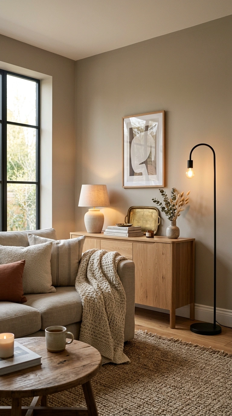
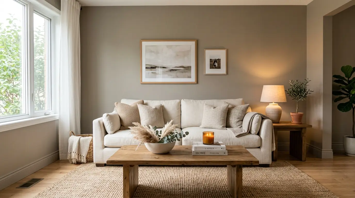
Warm greige sits right between gray and beige, and it is one of the most flexible neutral colors you can put on a wall. It avoids the coldness that pure gray sometimes carries while still feeling more modern than a classic tan. This shade works in almost any room and pairs well with both warm and cool toned furniture, which makes it a safe choice if you are not sure what your final decor style will be. Warm greige looks especially good with black metal accents, woven textures, and a mix of wood tones. It tends to look different depending on the time of day, appearing more beige in morning light and more gray in the evening, so test it on your actual wall before committing to a full room. This color is a strong choice for living rooms and hallways where you want a calm backdrop that will not clash with existing furniture.
3. Dusty Blue
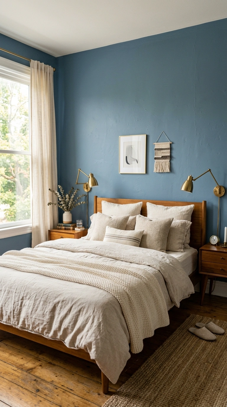
Dusty blue has a soft, faded quality that feels more like worn denim than a bright ocean blue. It works especially well in bedrooms, since blue tones are known to have a calming effect that can help with sleep. Choose a shade with gray undertones rather than a true, saturated blue to keep the room feeling soft instead of cold. Pair dusty blue walls with warm wood furniture, brass or matte black fixtures, and cream or oatmeal textiles to balance the coolness of the color. This shade also works nicely in bathrooms, where it pairs well with white tile and natural light. Dusty blue tends to look best in rooms with good natural light, since it can read a little flat or gray in a room that only gets artificial lighting. It is a gentle way to bring color into a space without straying too far from a neutral palette.
4. Muted Terracotta
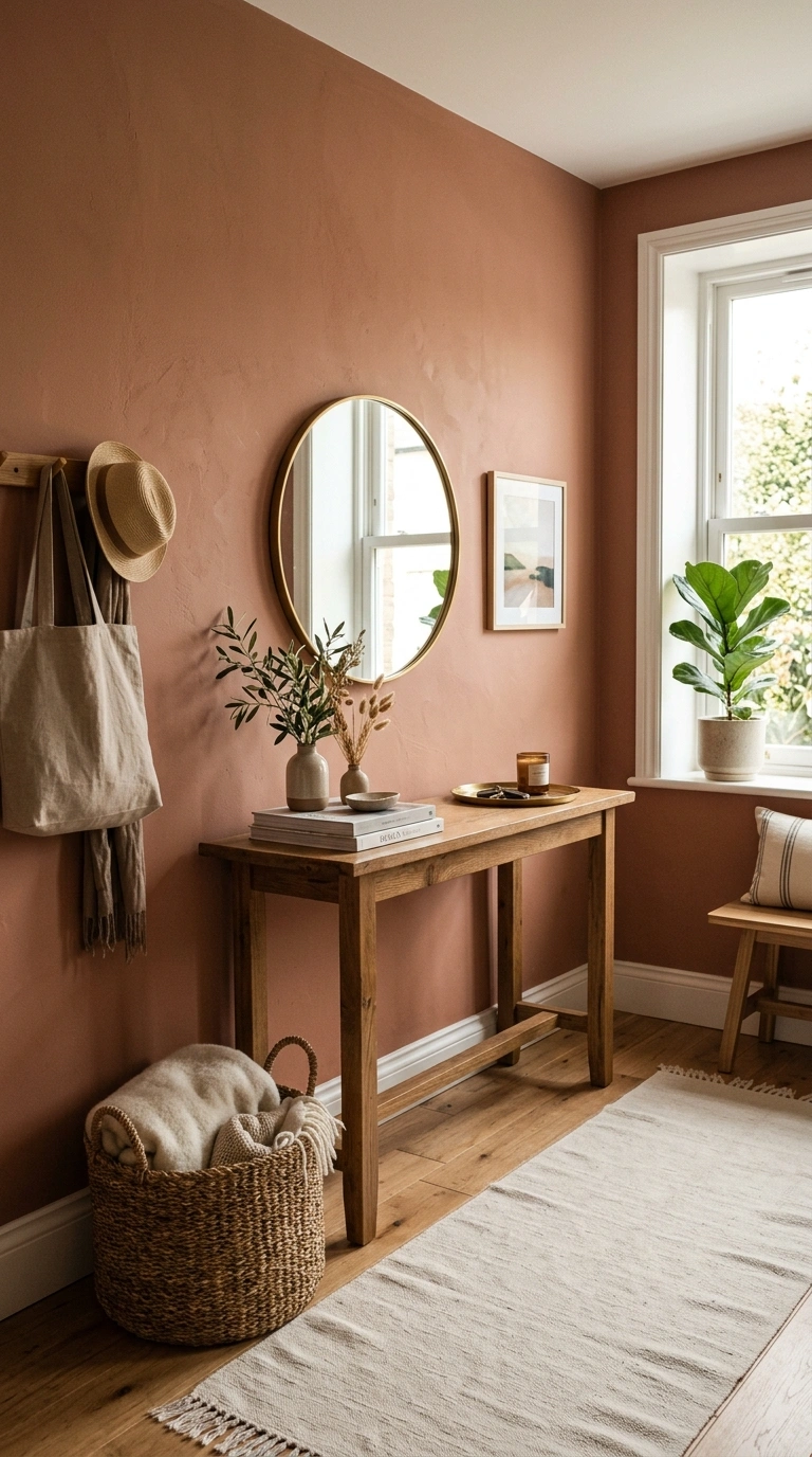
Muted terracotta brings warmth into a room without feeling overly bright or busy. This softened, dusty version of terracotta reads more like sun bleached clay than a bold orange, which is what makes it feel calming rather than energetic. It works especially well in dining rooms, entryways, and living rooms where you want a bit of color without going too bold. Pair it with warm wood tones, cream linens, and woven baskets for a grounded, natural look. This color also pairs surprisingly well with sage green and dusty blue if you want to use more than one shade in your home, since all three share a similar muted, earthy quality. Muted terracotta looks richest in rooms with warm lighting, so consider swapping in warm toned bulbs if your fixtures currently use cool white light. It is a good option if you find plain white or beige walls too boring but still want a relaxing feel.
5. Warm Ivory
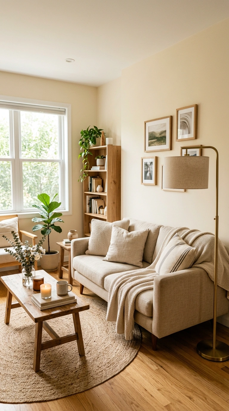
Warm ivory is a softer, cozier alternative to bright white, and it is one of the easiest colors to live with long term. Unlike stark white, which can feel cold or clinical under certain lighting, warm ivory has just enough yellow or beige undertone to feel inviting instead. This color works in every room of the house and serves as an excellent backdrop for other colors, whether you are adding sage green bedding, terracotta accents, or dusty blue textiles. Warm ivory reflects light well, which makes it a smart choice for smaller rooms or spaces without much natural light, since it helps the room feel brighter without going stark white. Pair it with natural wood furniture and warm metal fixtures for a soft, welcoming look. This color rarely goes out of style, which makes it a safe long term choice if you plan to change your furniture or accent colors more often than your walls.
6. Soft Clay Pink
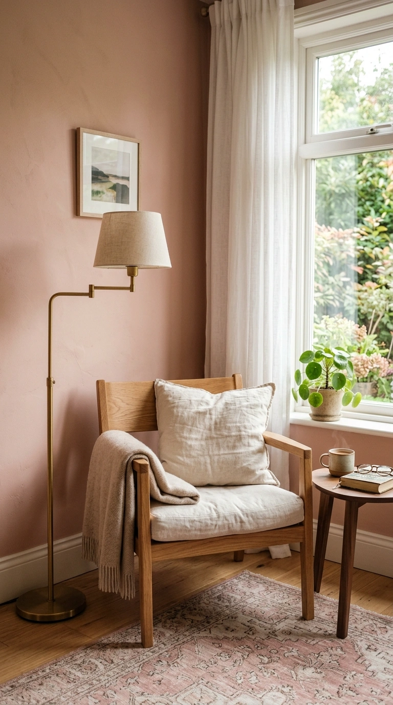
Soft clay pink is a muted, dusty shade that reads more like sun warmed terracotta than a traditional pink. It has enough brown and beige undertone to feel sophisticated and calming rather than sweet or bright. This color works beautifully in bedrooms and reading nooks, where you want a bit of warmth and softness without going bold. Pair it with warm wood furniture, brass accents, and cream linens to let the color feel grounded rather than overly feminine. Soft clay pink also pairs nicely with sage green if you want to combine two colors in one room, since the warm and cool undertones balance each other out. This shade tends to look its best in natural daylight, so it is worth testing a swatch throughout the day before committing to a full wall or room. It is a good option for anyone who wants a soft, romantic feel without a traditional pastel pink.
7. Pale Eucalyptus
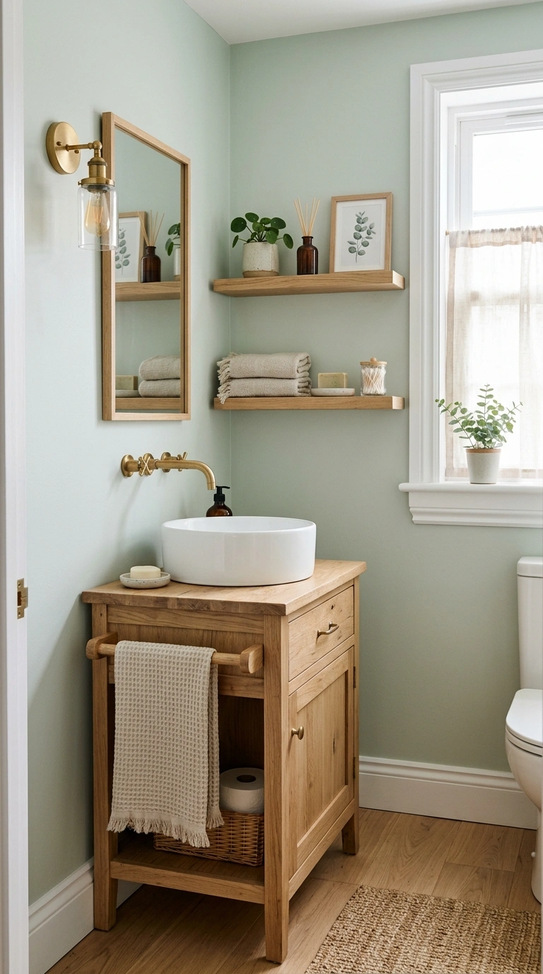
Pale eucalyptus is a lighter, more washed out cousin of sage green, with a slightly cooler and more gray undertone. This shade feels airy and fresh, making it a strong choice for bathrooms, kitchens, and smaller bedrooms where you want the room to feel more open. Because it leans lighter than standard sage green, pale eucalyptus works well even in rooms without much natural light, since it will not darken the space the way a deeper green might. Pair it with white trim, natural wood accents, and simple linen textiles for a clean, calm look. This color also works nicely as a whole home neutral if you want a subtle hint of green throughout your space without committing to a bolder shade in every room. It photographs beautifully in bright, naturally lit spaces and tends to look most true to its actual color in daylight rather than warm artificial lighting.
8. Weathered Denim Blue
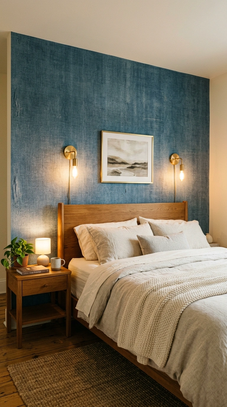
Weathered denim blue is a deeper, more grounded shade than dusty blue, with enough gray mixed in to keep it from feeling too saturated or nautical. This color works especially well as an accent wall in a living room or primary bedroom, giving the space a cozy, enveloping feel without making the room feel smaller. Pair it with warm wood furniture, brass lighting, and cream or oatmeal textiles to keep the room from feeling too cool overall. Weathered denim blue also works nicely in a home office or study, since deeper blue tones are associated with focus and calm at the same time. This shade tends to look best with warm lighting in the evening, so consider pairing it with warm toned bulbs rather than cool white ones. It is a good choice if you want more depth and drama than a lighter pastel blue while still keeping the overall feel relaxing.
9. Soft Oatmeal Tan
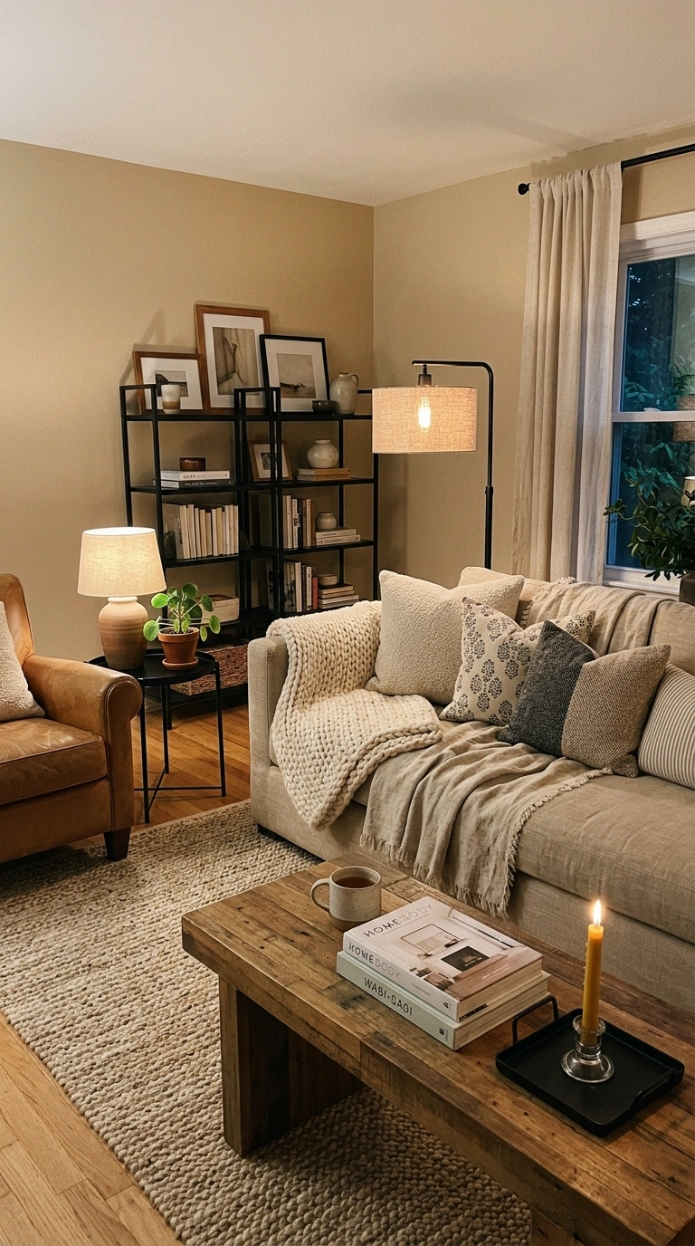
Soft oatmeal tan is a warm, grounded neutral that feels cozy without being as dark as a traditional brown. This color works well in living rooms and bedrooms, especially when layered with textures like linen, wool, and natural wood. Because it sits between beige and light brown, oatmeal tan pairs easily with almost any accent color, whether you want to add sage green, dusty blue, or terracotta accessories later. This shade tends to look warmer in the evening under lamp light and slightly more neutral during the day, which gives a room a nice sense of movement throughout the day without changing anything. Pair it with black or brass metal accents and a mix of wood tones for a layered, collected look. Soft oatmeal tan is a strong choice for anyone who wants a neutral wall color that still feels warm and inviting rather than plain or builder grade.
10. Muted Lavender Gray
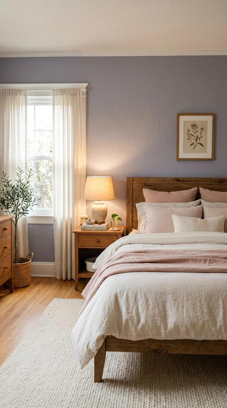
Muted lavender gray is a soft, barely there purple with enough gray mixed in to keep it feeling sophisticated rather than sweet. This color works especially well in bedrooms, where a hint of purple has a naturally calming, restful quality. Because the lavender tone is so muted, it reads mostly as a soft gray in most lighting, only showing its purple undertone in direct daylight or next to warm colored textiles. Pair it with white trim, warm wood furniture, and cream or blush colored bedding for a soft, restful look. This shade also works nicely in a bathroom, paired with white tile and brass fixtures. Muted lavender gray tends to look best in rooms with a mix of natural and warm artificial light, since cool white bulbs can make the purple undertone feel colder than intended. It is a good option for anyone who wants a slightly unexpected neutral instead of standard gray or beige.
11. Warm Taupe
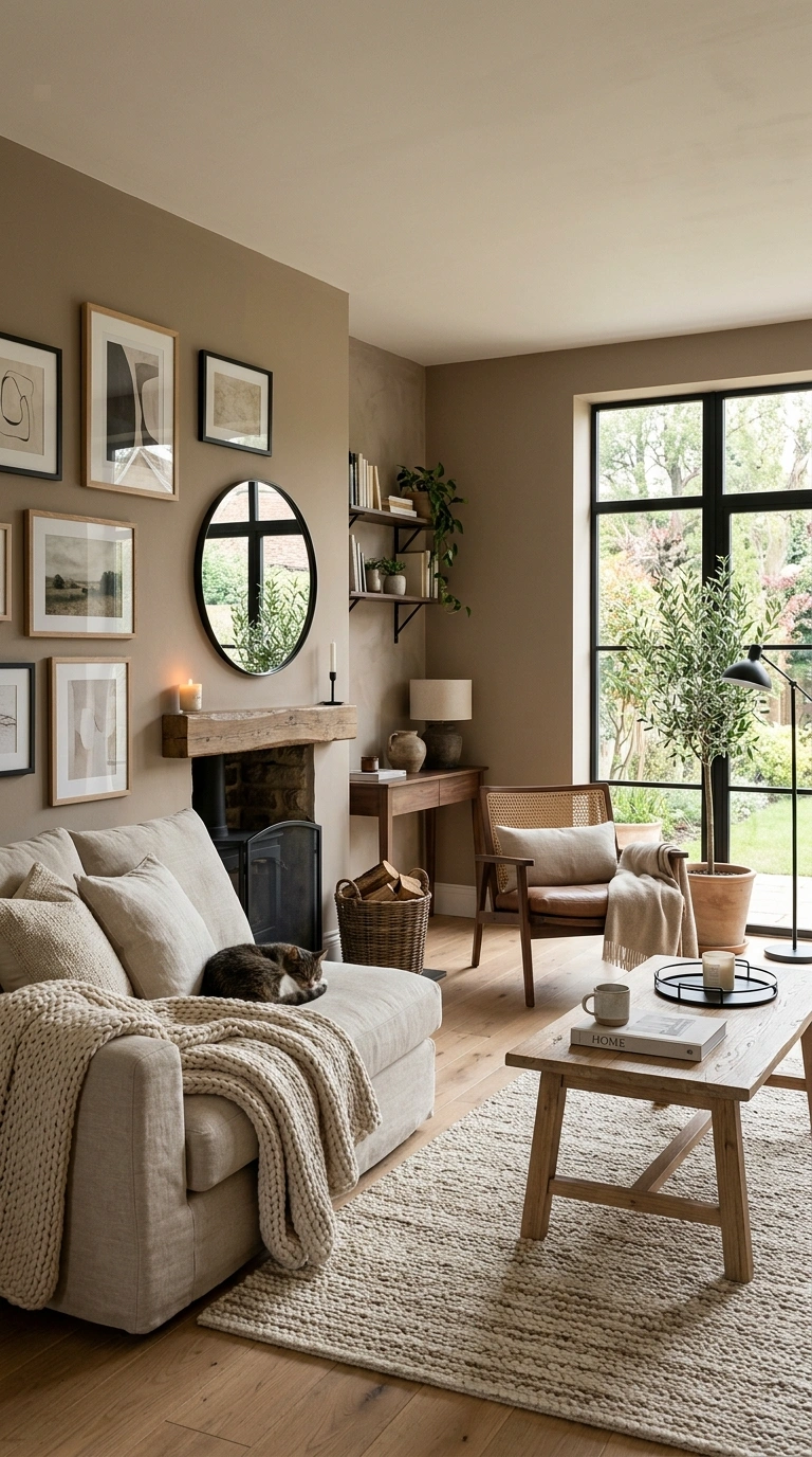
Warm taupe is a classic, dependable neutral that leans slightly brown rather than gray, giving it a cozy, grounded feel. This color works in nearly every room of the house and serves as an excellent backdrop for bold furniture or artwork, since it stays quiet without disappearing into the background. Pair warm taupe with cream textiles, black metal accents, and a mix of wood tones for a layered, collected living room or bedroom. This shade tends to look consistent throughout the day, making it a safe choice if your room gets uneven natural light. Warm taupe also pairs nicely with sage green or dusty blue if you want to introduce a second color through furniture or textiles later. It is one of the more timeless options on this list, since taupe has remained a popular neutral for decades and shows no signs of feeling dated anytime soon.
12. Soft Stone Gray
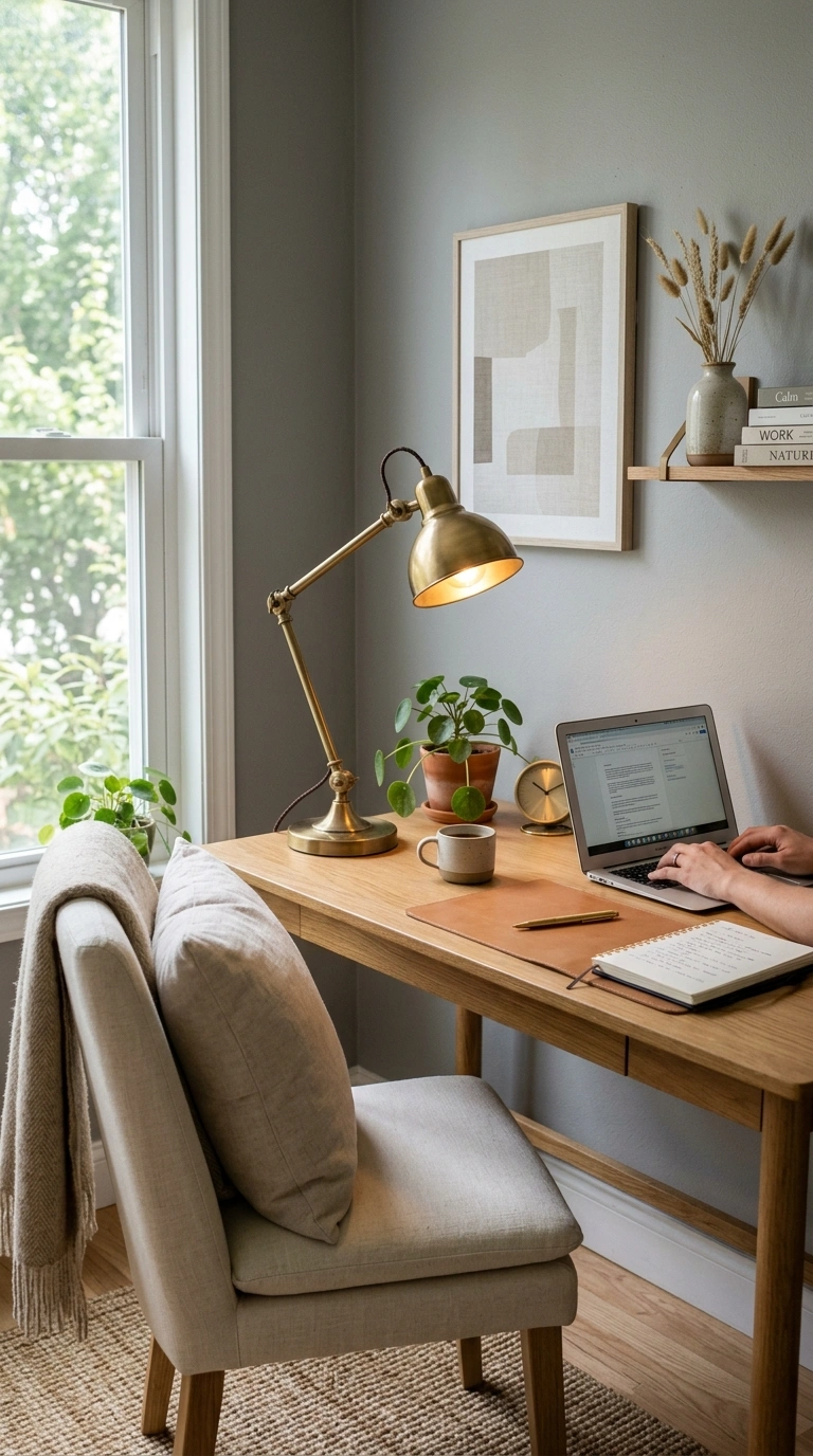
Soft stone gray is a warmer, softer alternative to a cool toned charcoal or slate gray, with just enough warmth to keep it from feeling cold. This color works especially well in living rooms and home offices, where you want a calm, focused backdrop that still feels current. Pair it with warm wood furniture, brass or matte black fixtures, and layered textiles in cream and oatmeal tones to keep the room from feeling too monochromatic. Soft stone gray photographs well in both natural and artificial light, making it a reliable choice if your room does not get consistent daylight throughout the day. This shade also pairs nicely with muted terracotta or soft clay pink if you want to add a warmer accent color later. It is a good middle ground for anyone who likes gray but finds true cool gray tones too sterile or corporate feeling for a home.
13. Pale Sage Mist
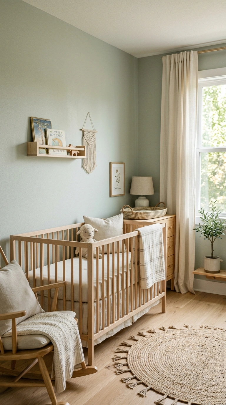
Pale sage mist is a lighter, airier version of sage green, closer to a whisper of color than a true green wall. This shade works beautifully in small bedrooms, nurseries, or bathrooms where you want the calming effect of sage green without darkening the room. Because it is so light, pale sage mist pairs well with both warm and cool toned furniture, making it a flexible choice if your decor style is still evolving. Add depth to the room through textiles and furniture in deeper sage, cream, and natural wood tones so the wall color does not feel like the only source of interest in the space. This shade looks best in rooms with good natural light, since a lack of light can make very pale colors look washed out or gray. It is a gentle, easy to live with option for anyone who wants a hint of color without a bold commitment.
14. Warm Almond
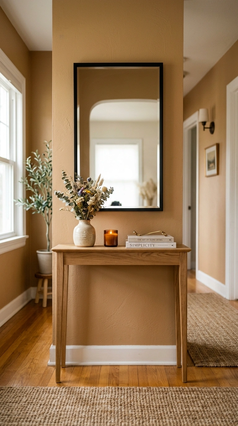
Warm almond is a soft, warm neutral that sits between beige and light brown, similar to oatmeal but with a slightly smoother, more polished feel. This color works well in living rooms, hallways, and bedrooms where you want a warm backdrop that still reads as neutral. Pair it with black metal accents, natural wood furniture, and layered cream textiles for a soft, welcoming look. Warm almond tends to photograph consistently well in both daylight and lamp light, which makes it a safe choice if you are not sure how much natural light your room gets throughout the year. This shade also works nicely as a whole home color if you want consistency from room to room without the starkness of pure white. It is a good option for anyone who wants their home to feel calm and put together without leaning into a specific color trend that might feel dated later.
15. Soft Fog Blue
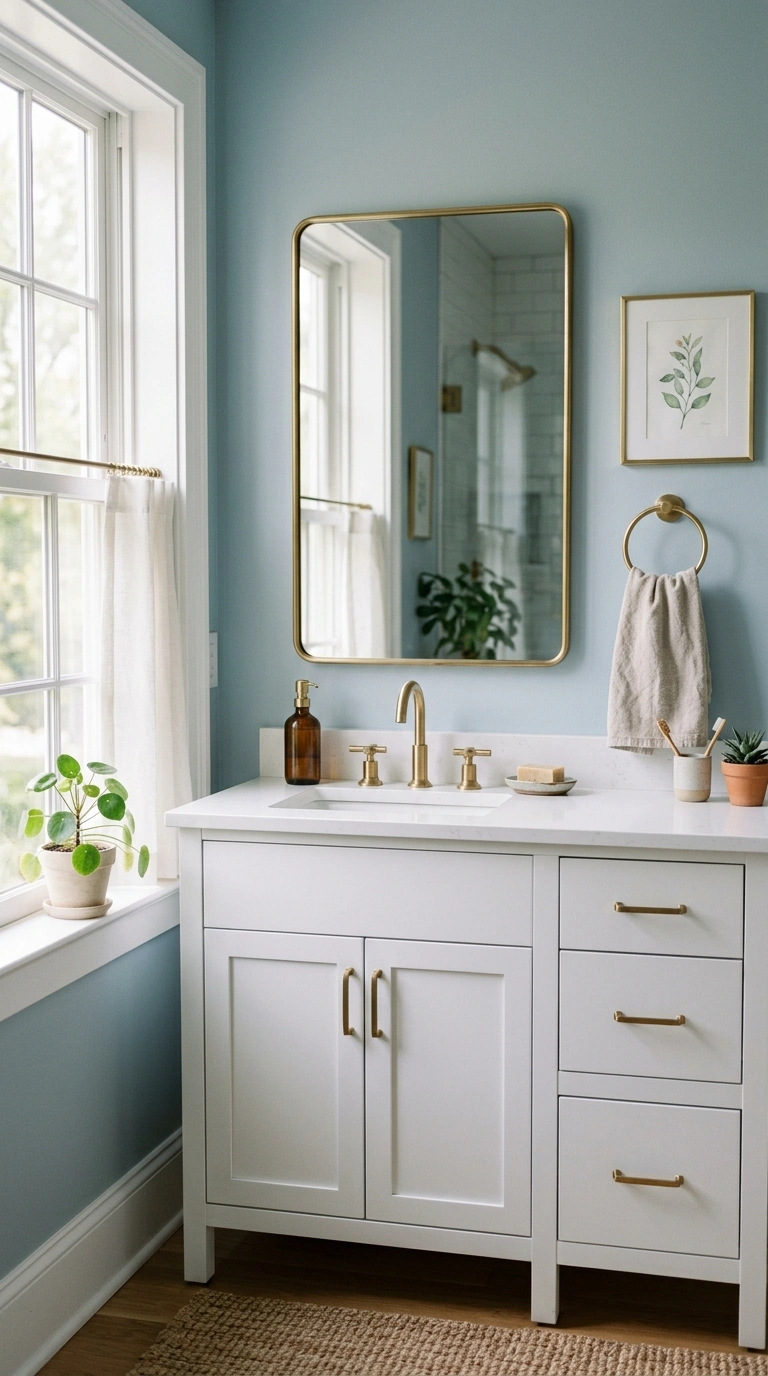
Soft fog blue is a hazy, almost gray shade of blue that feels more like an overcast sky than a bright, clear one. This color works especially well in bedrooms and bathrooms, where a hint of blue supports a calm, restful mood without feeling cold or sterile. Because the blue is so muted, soft fog blue pairs easily with warm wood tones, brass fixtures, and cream textiles, keeping the overall room from feeling too cool. This shade tends to shift subtly throughout the day, appearing more gray in the morning and slightly more blue in the evening under warm lamp light. Pair it with white trim and simple linen curtains for a clean, uncomplicated look. Soft fog blue is a good choice for anyone who wants the calming benefits associated with blue tones but finds traditional sky blue or navy too bold or too dark for their space.
Painting a room does not have to be an all or nothing decision. Try a sample swatch on your wall first and watch how it changes throughout the day before committing to a full room. Save your favorite shades here so you have them ready the next time you are standing in the paint aisle trying to remember which one you liked.